_PACKAGING
Cecilia's Farm Fruit Smoothie Bars
How I blended some of my favourite design ingredients together to create the perfect packaging for Fruit Smoothie Bars.
Cecilia’s Farm is a six-generation family business that has established the legacy of producing some of the world’s best dried fruit. This family farm has secured the reputation for creating unique modernised dried fruit products out of the most luxurious raw produce to appeal to a broadening market. They continue to innovate and expand their product lines to meet the demands of consumers who are looking for healthier snacks.
Rendering
@MF3D
Printer
masterpackcape.co.za
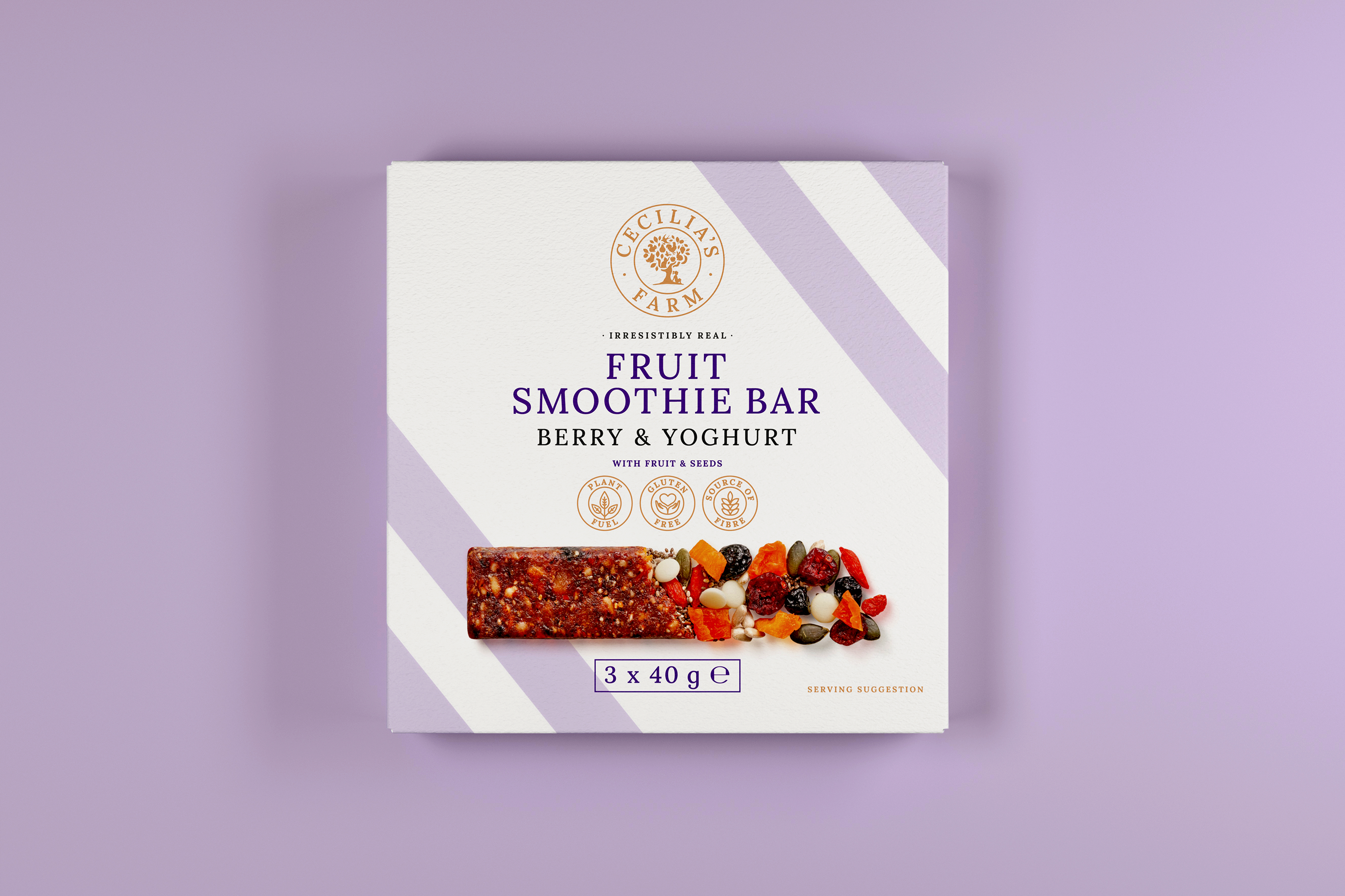
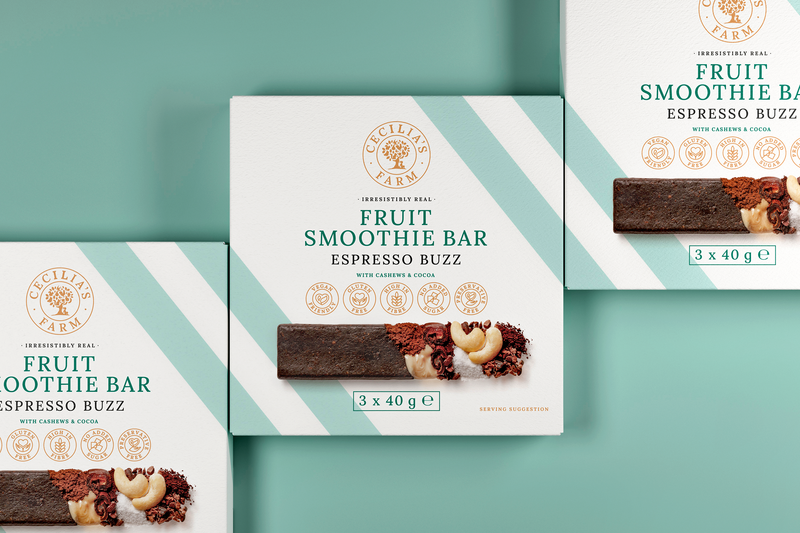
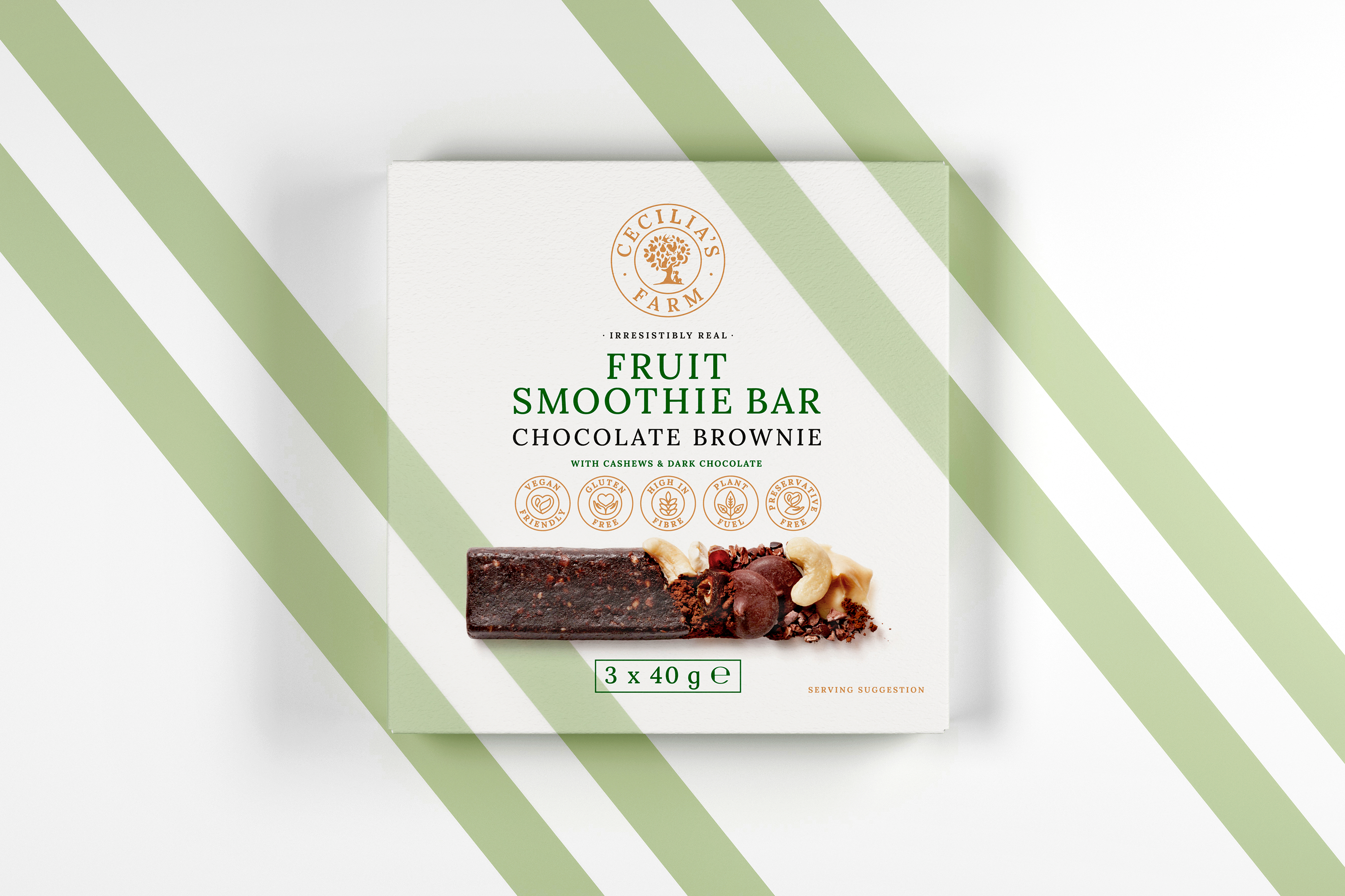
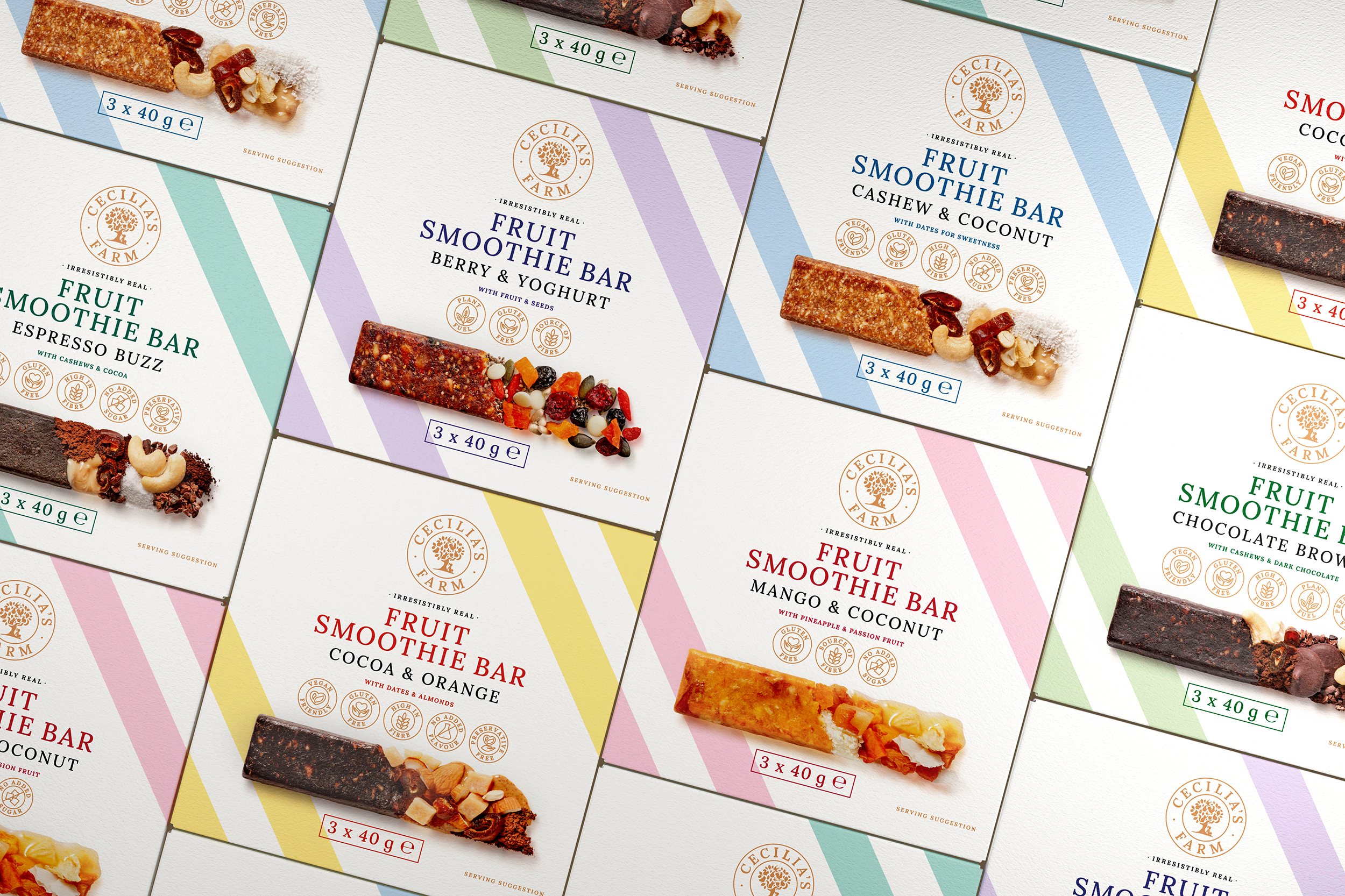
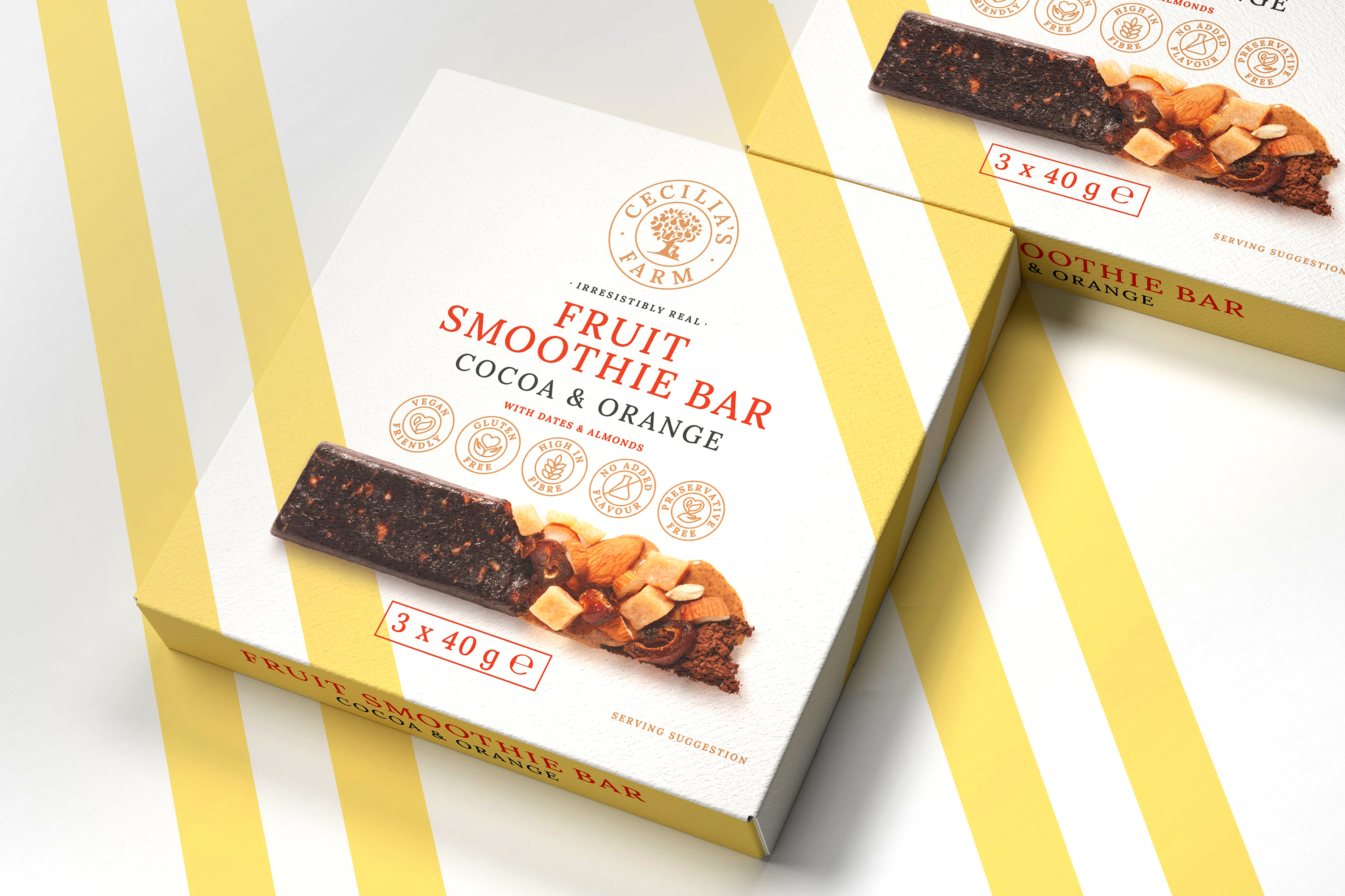
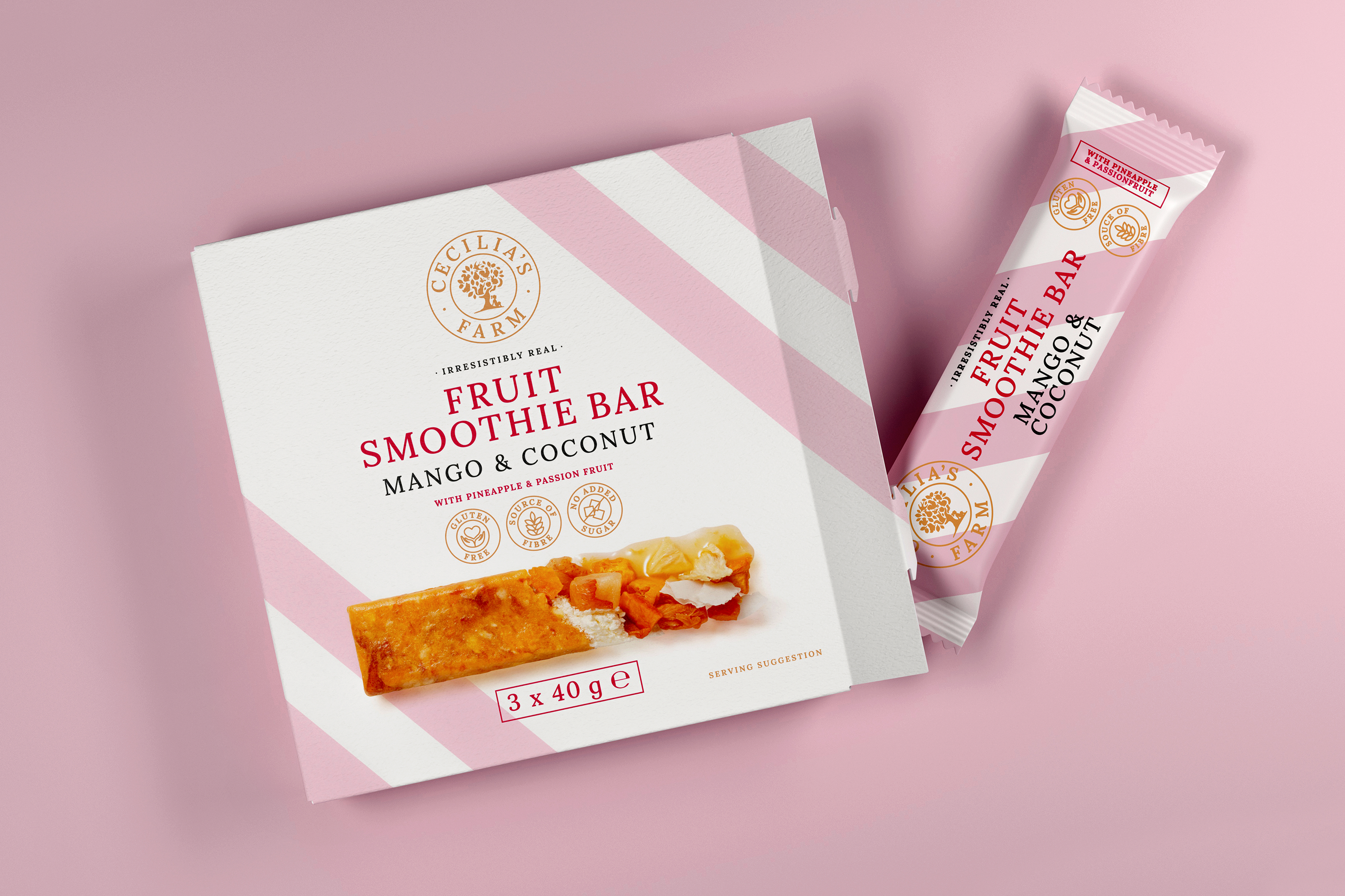
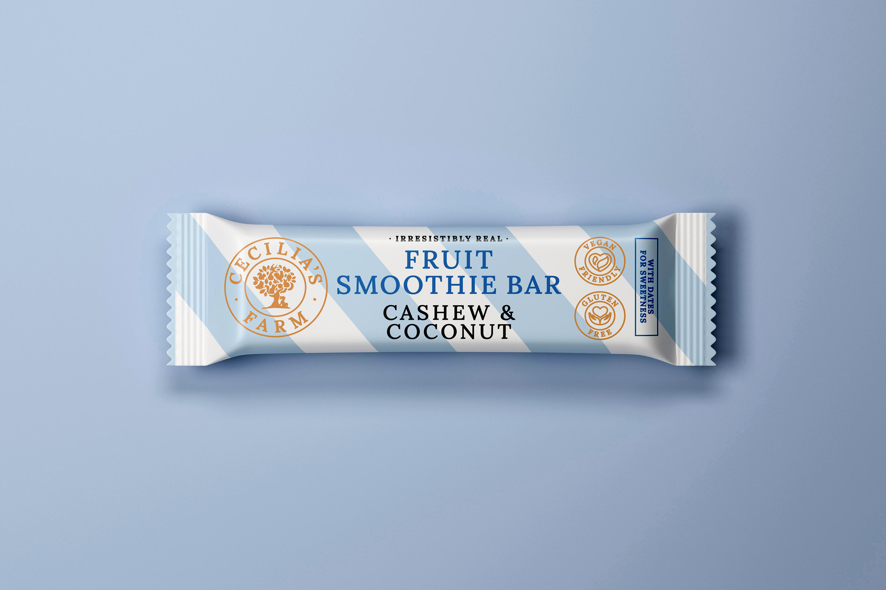
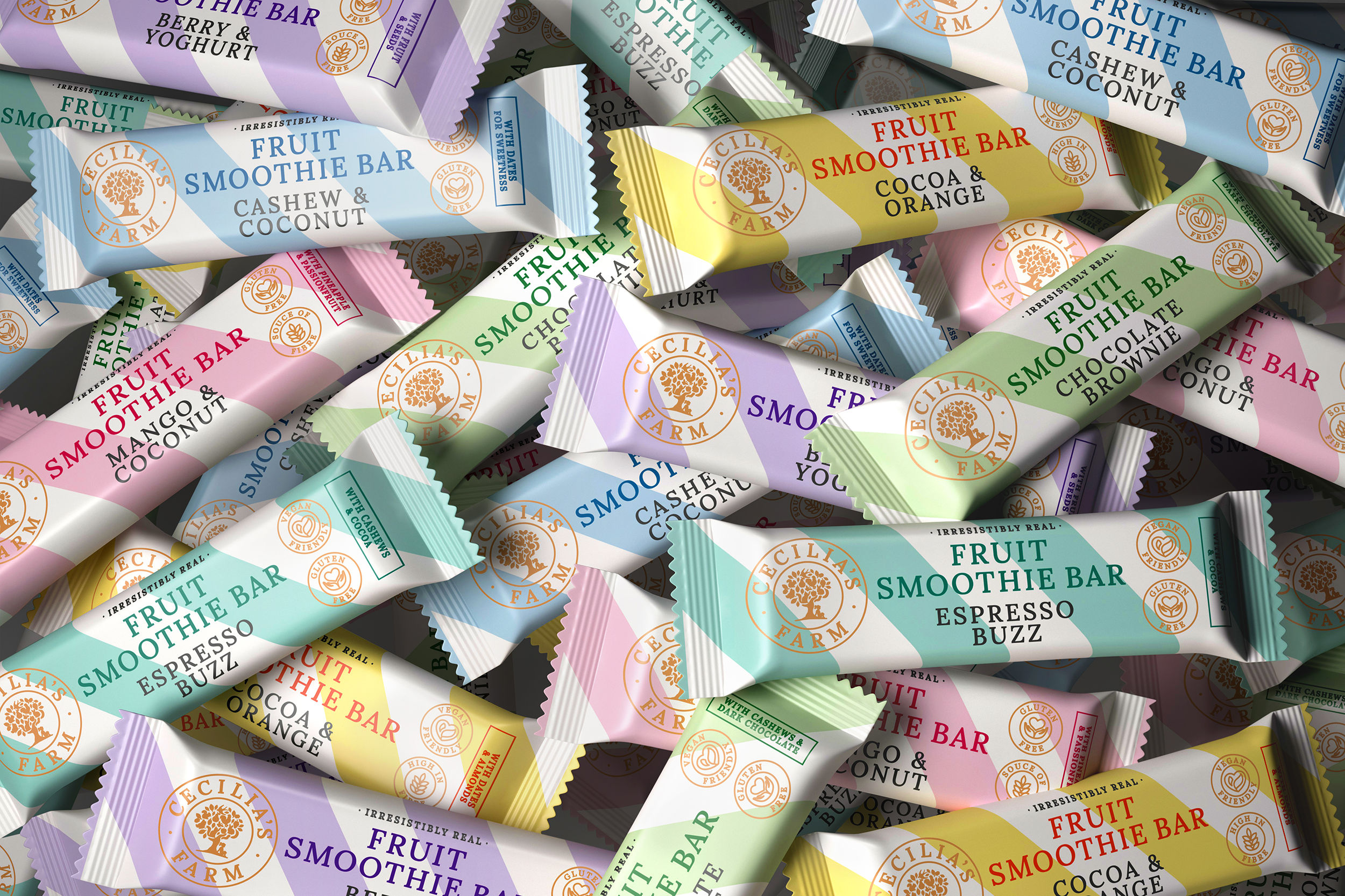
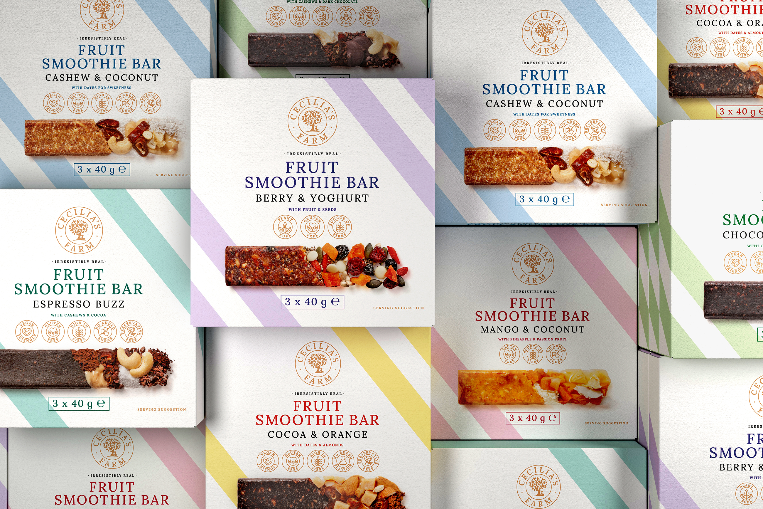
Cecilia's Farm wanted me to create a packaging concept that was modern and premium looking. The strategic direction and packaging execution was to situate them as a world leader in the dried fruit industry so I opted for clean lines and photography instead of the market trend of favouring quirky illustration-style packaging. For these bars, I also wanted to veer away from the competition, which often highlights comical illustrations, or the slap-dash approach of clear wrapping with a generic looking label.
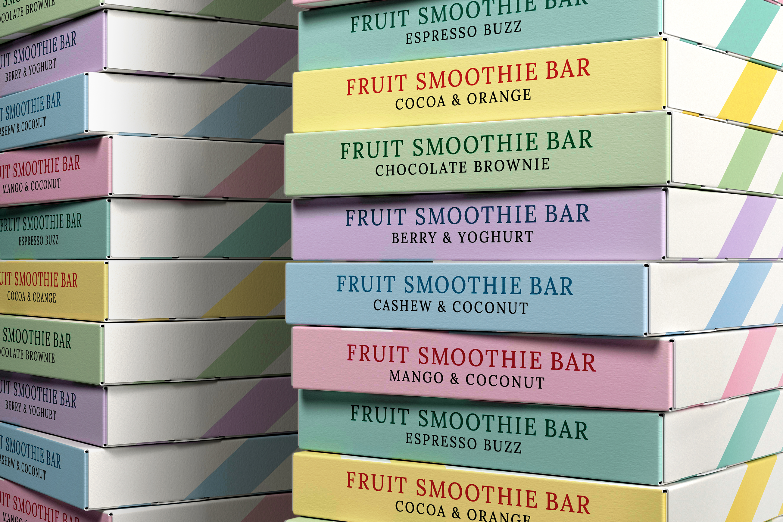
I used elegant typography and bold colours so that the product text stood out. However, I contrasted this with a more muted brown for the company logo and ingredients. This develops a colour relationship between Cecilia’s Farm and their commitment to what goes inside each bar.
The Fruit Smoothie Bars have a contemporary feel through the matt high quality boxes, the trendy Nordic pastel shades, and the striking diagonal lines. As with all Cecilia’s Farm products, I utilised world-class food photography that doesn’t just show consumers what’s in each bar, but showcases the ingredients and product.