_PACKAGING_STRATEGY
Galitos
How I added spice and flavour to a rebrand, creating a saucy little number.
Galito’s was founded in the small town of Nelspruit, South Africa, in 1996, and has expanded across South Africa and internationally. Galito’s is fast becoming the dominant chicken brand for the African masses.
Rendering
@MF3D
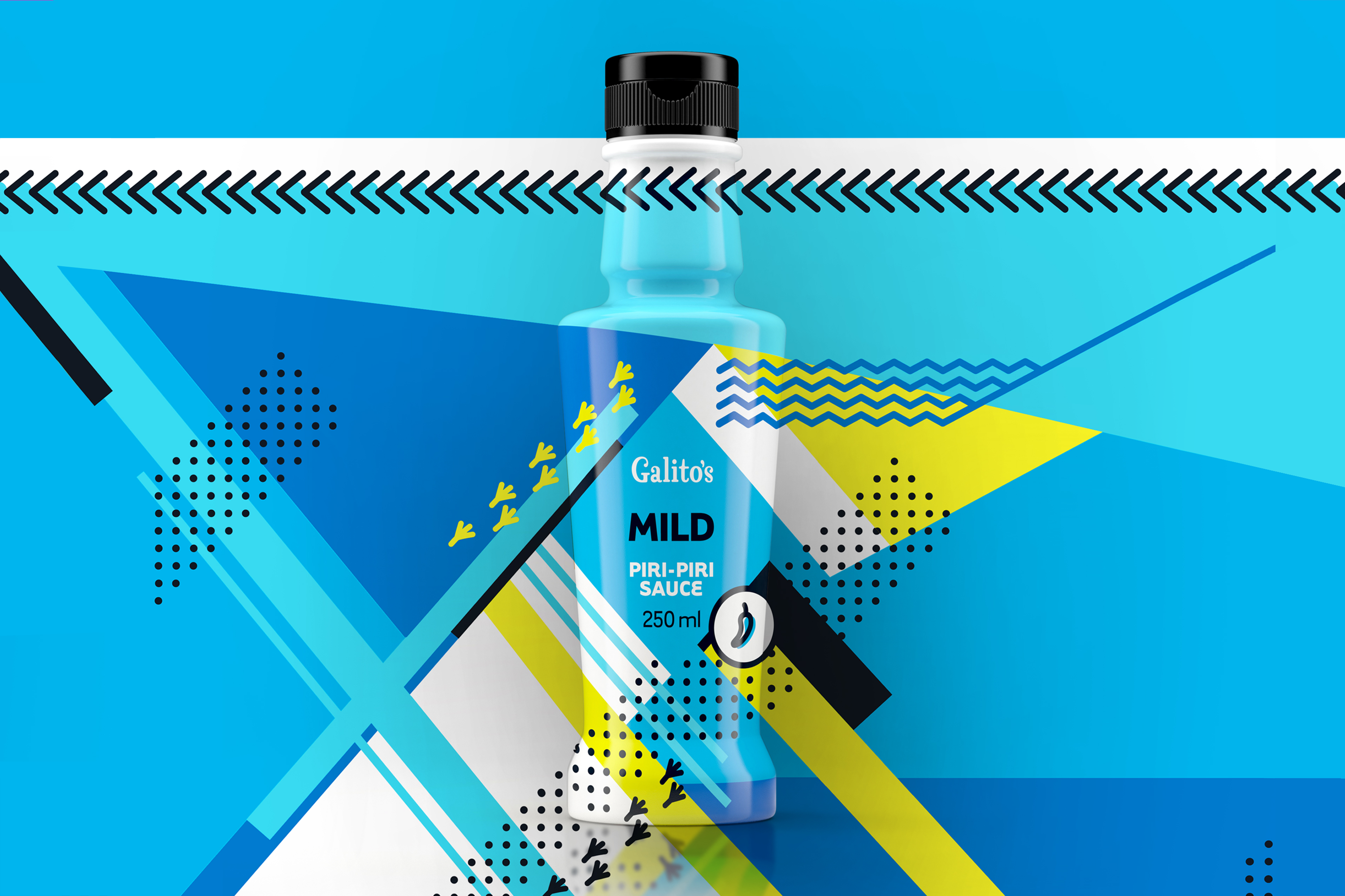
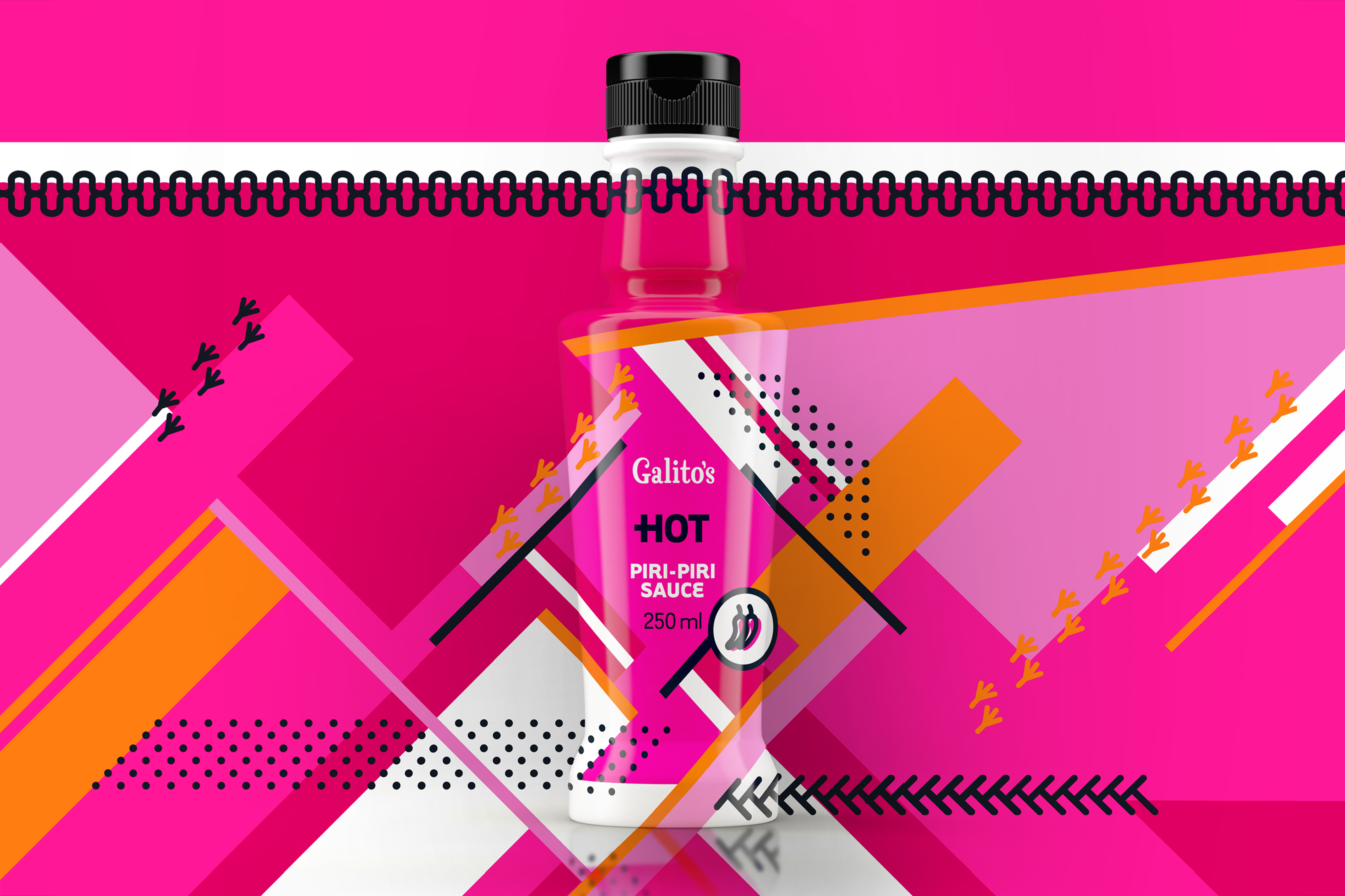
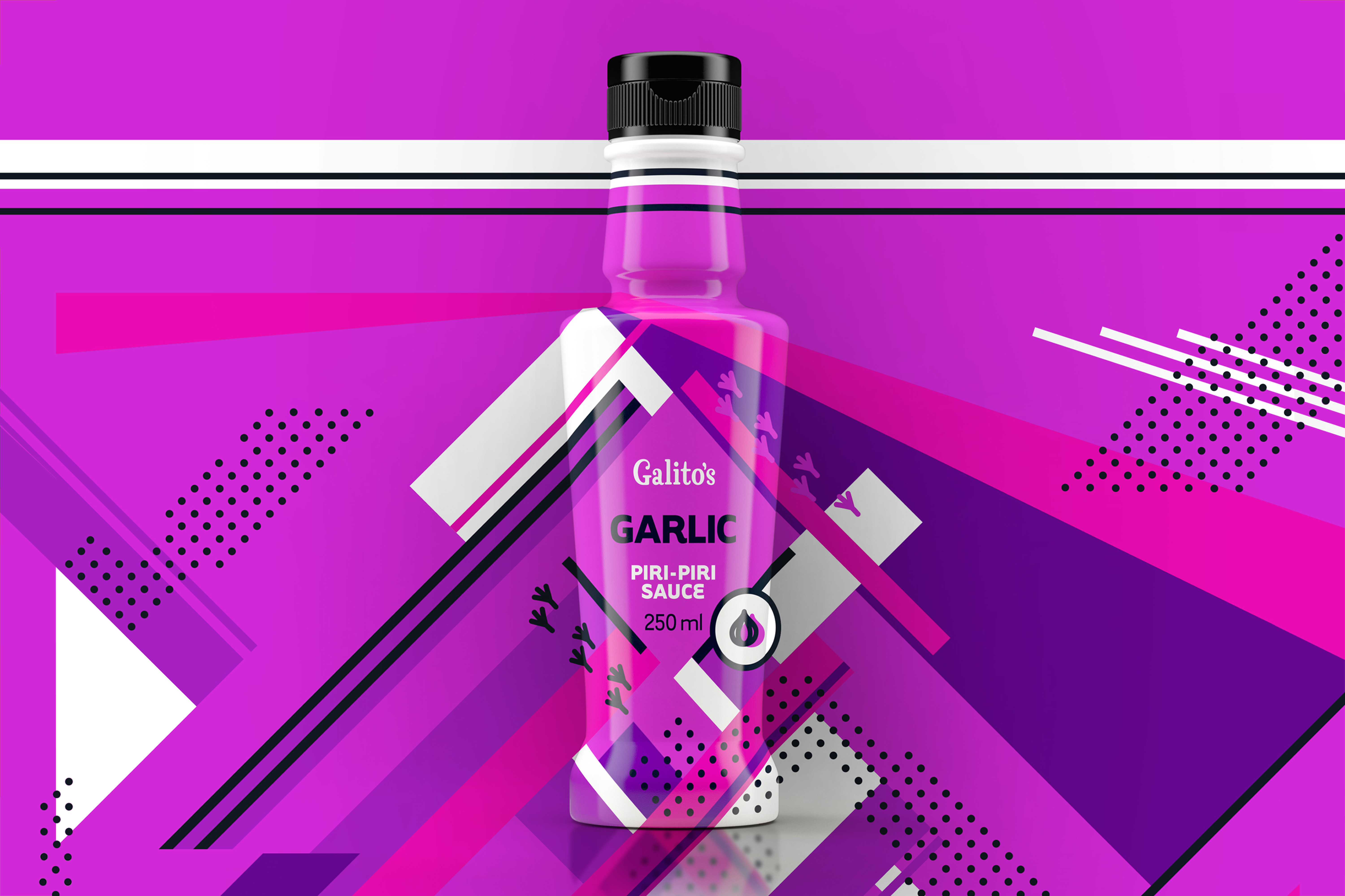
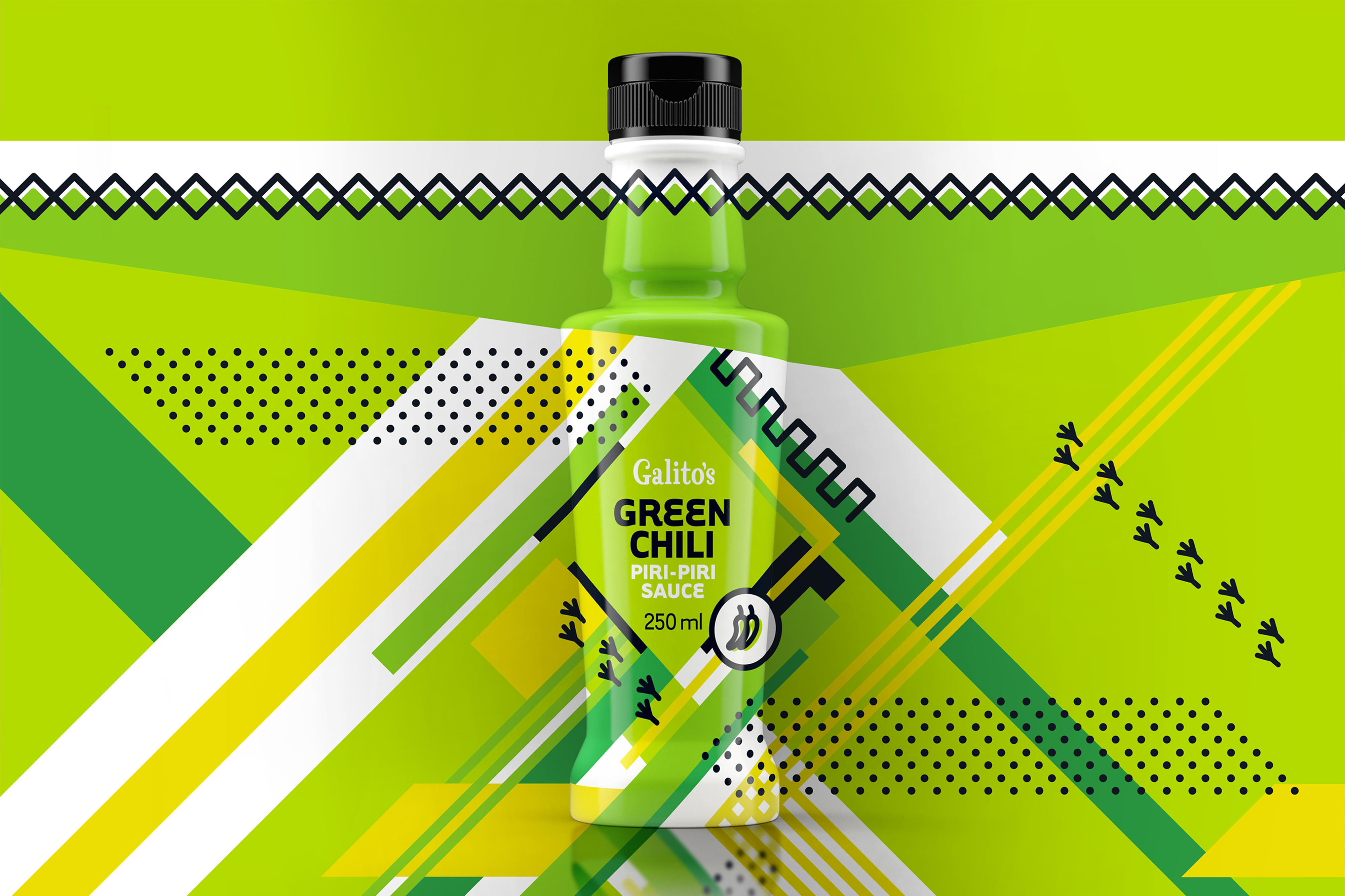
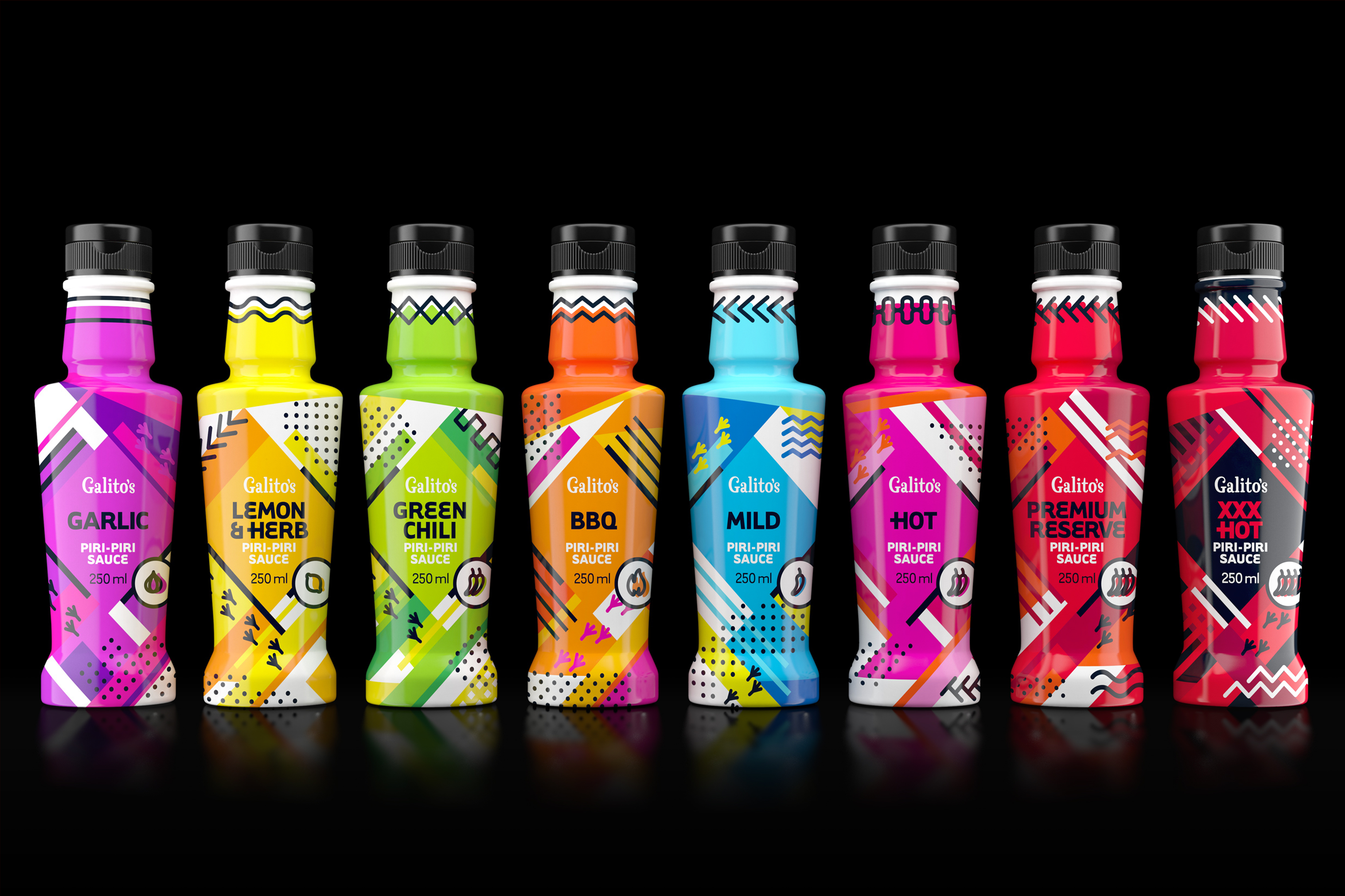
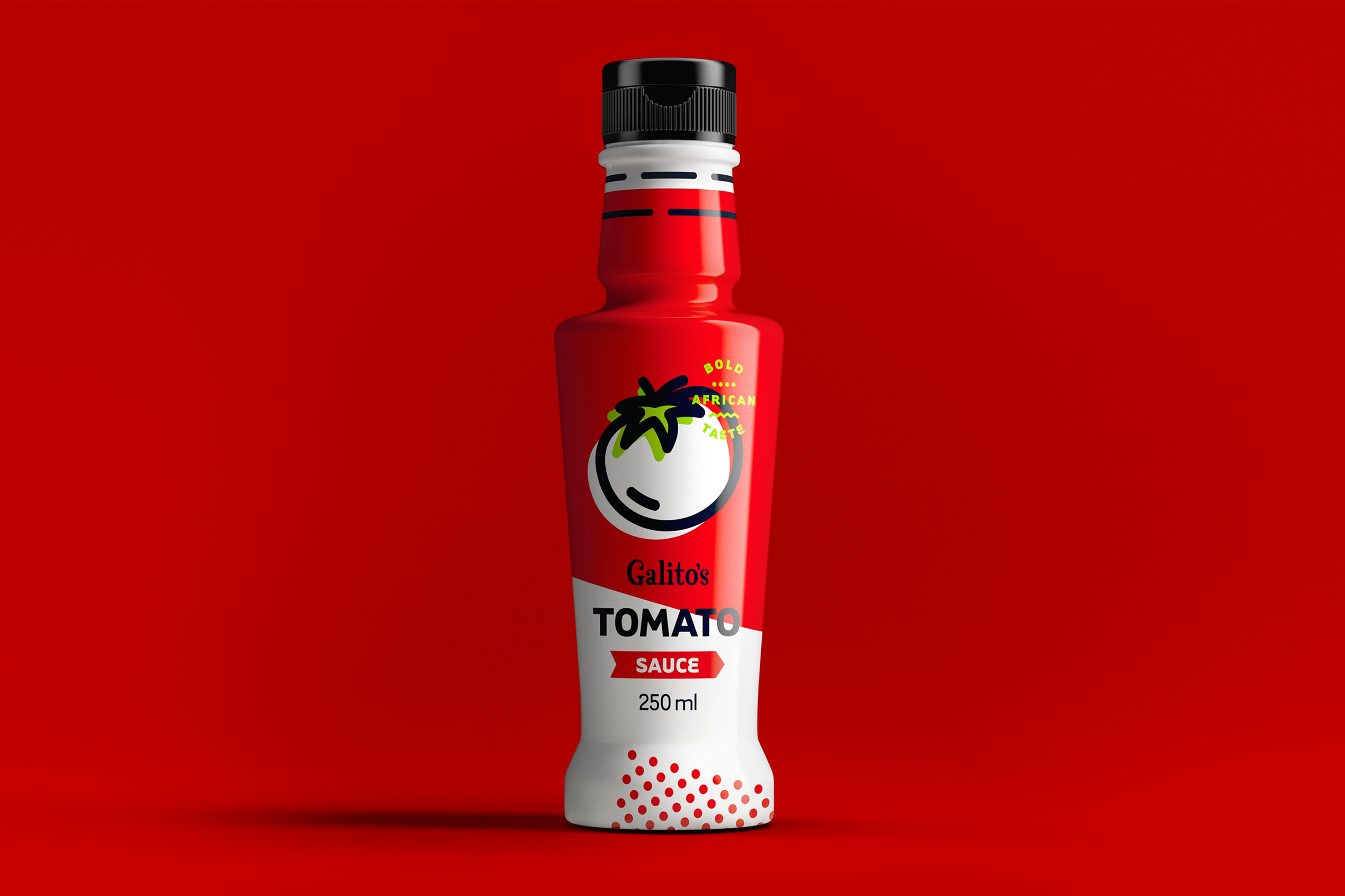
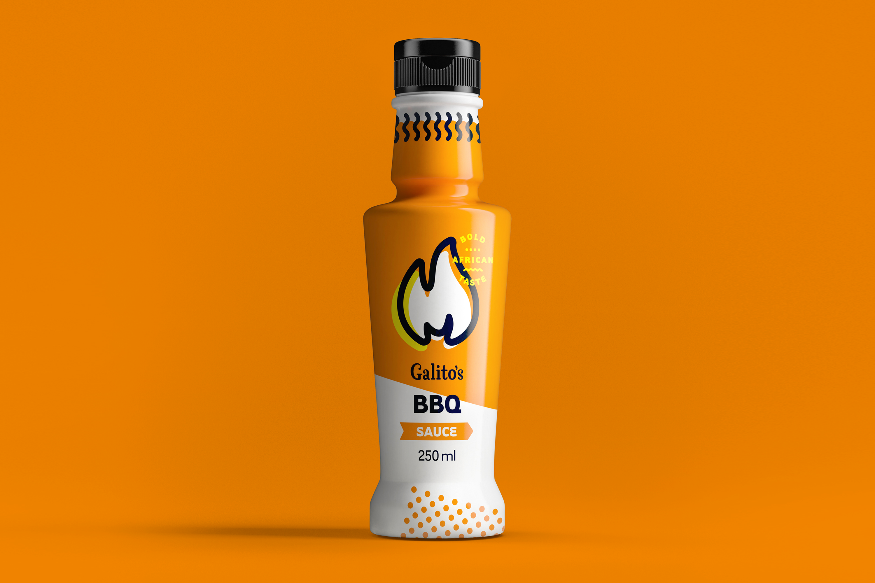
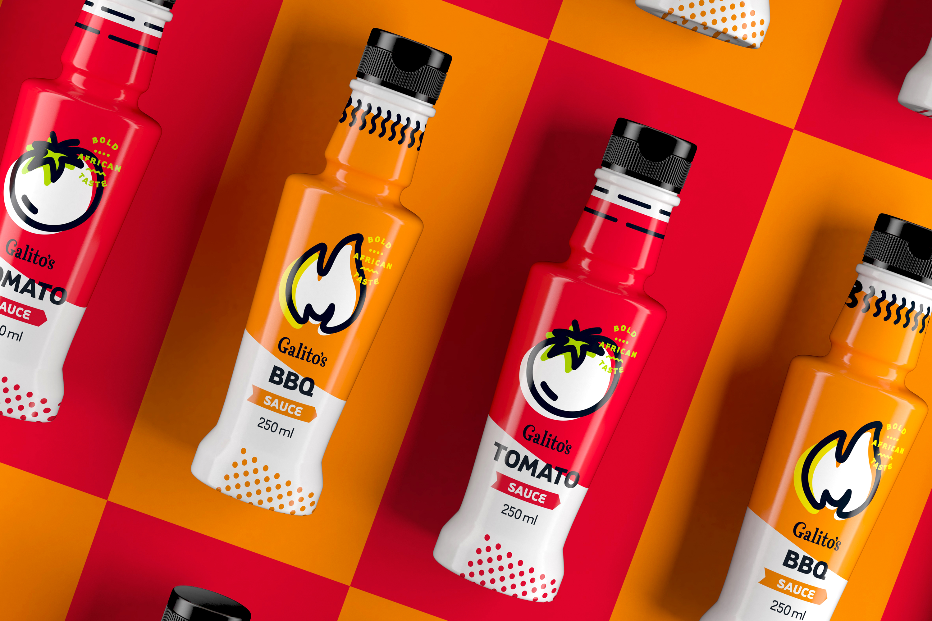
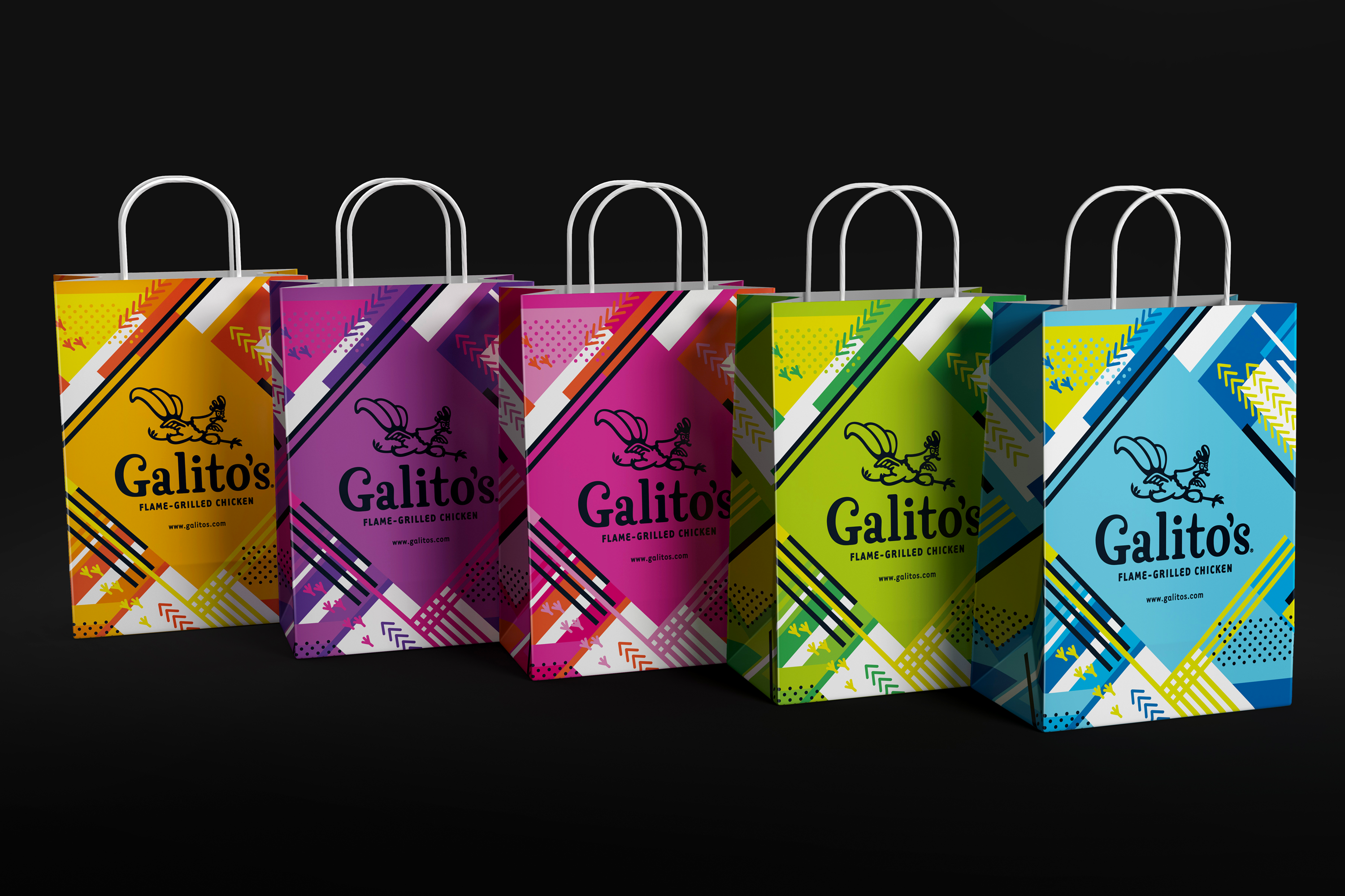
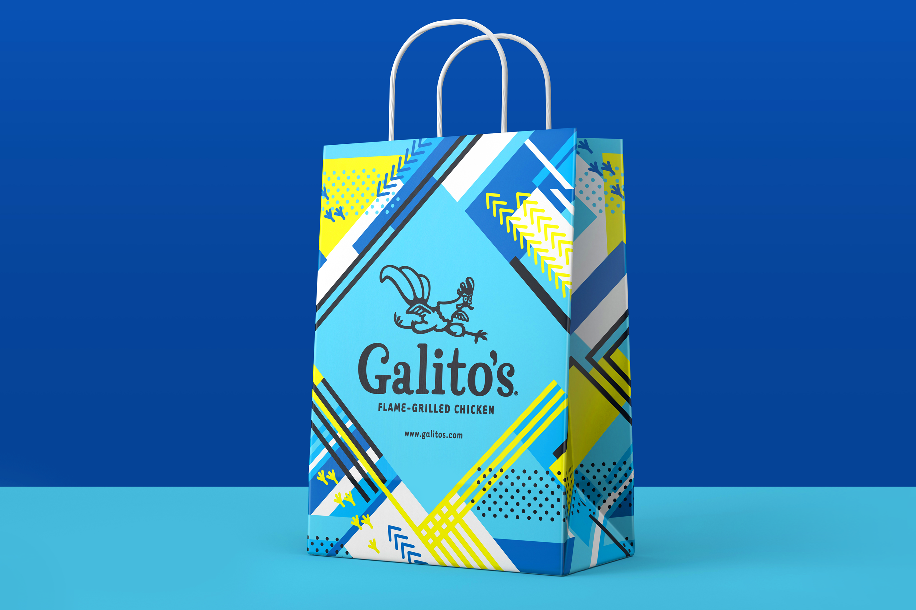
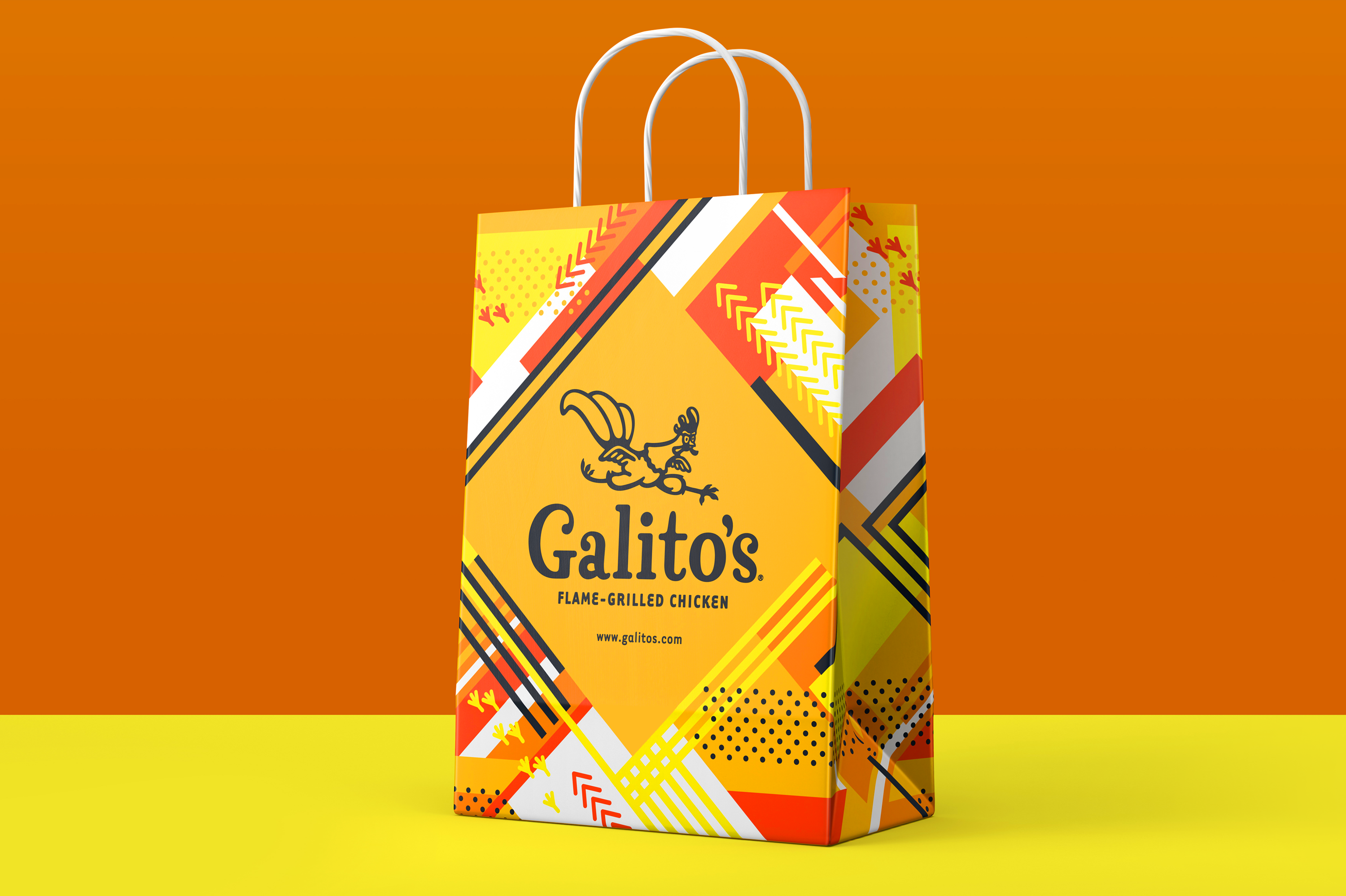
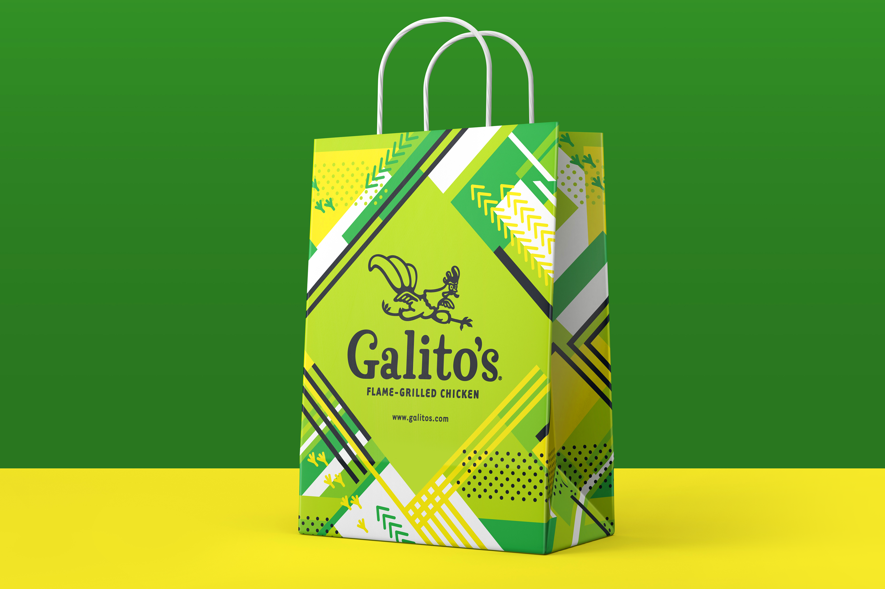
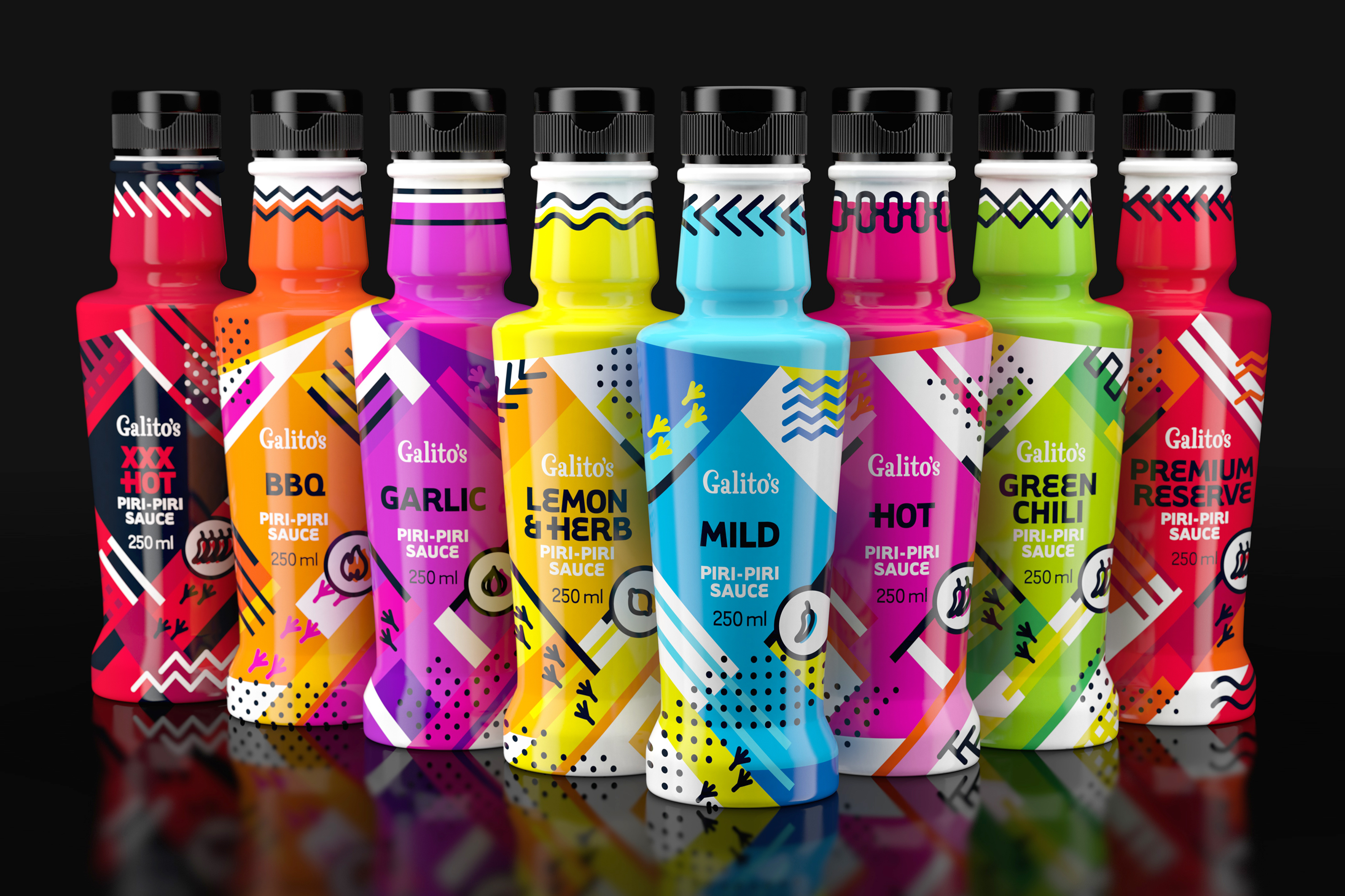
The Galito's rebrand is something I'd like to shout about. Galito's expanded and developed a unique range of chicken sauces but the previous packaging design was dark and a little intimidating.
I took an exciting new direction by going bold and bright and using modern iconography, lively colours, and playful graphics. The combination of these elements creates movement and intrigue to immediately engage the consumer.
The design works because the elements as a whole don't compete. The condiments range maintains all the character of the core range. Still, it is executed simply with a focus on strong iconography and simple colour to visually communicate across language barriers.
All in all, it's a fun design that makes you feel good, and the colours pop on the shelf guaranteeing that you'll see the brand no matter where it's placed.