_PACKAGING
Golden Toast
How I gave this iconic German brand something to celebrate and toast about.
Golden Toast is Germany's oldest bread brand, established in 1960 by the German Bakery Company, Lieken. The brand heritage, wide product offering and great taste have made it a favourite in German households.
Renderings
@MF3D
Photography
@storm
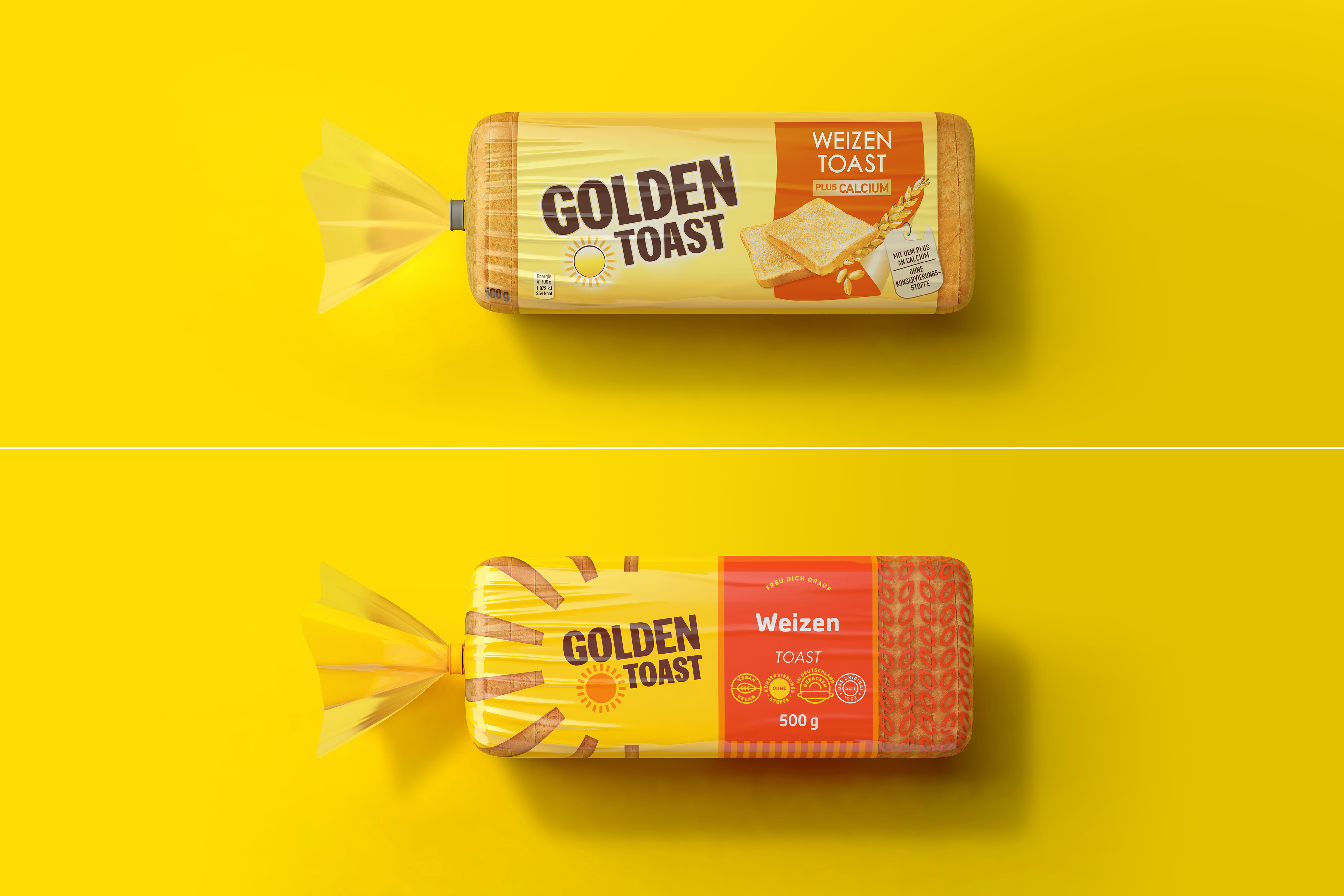
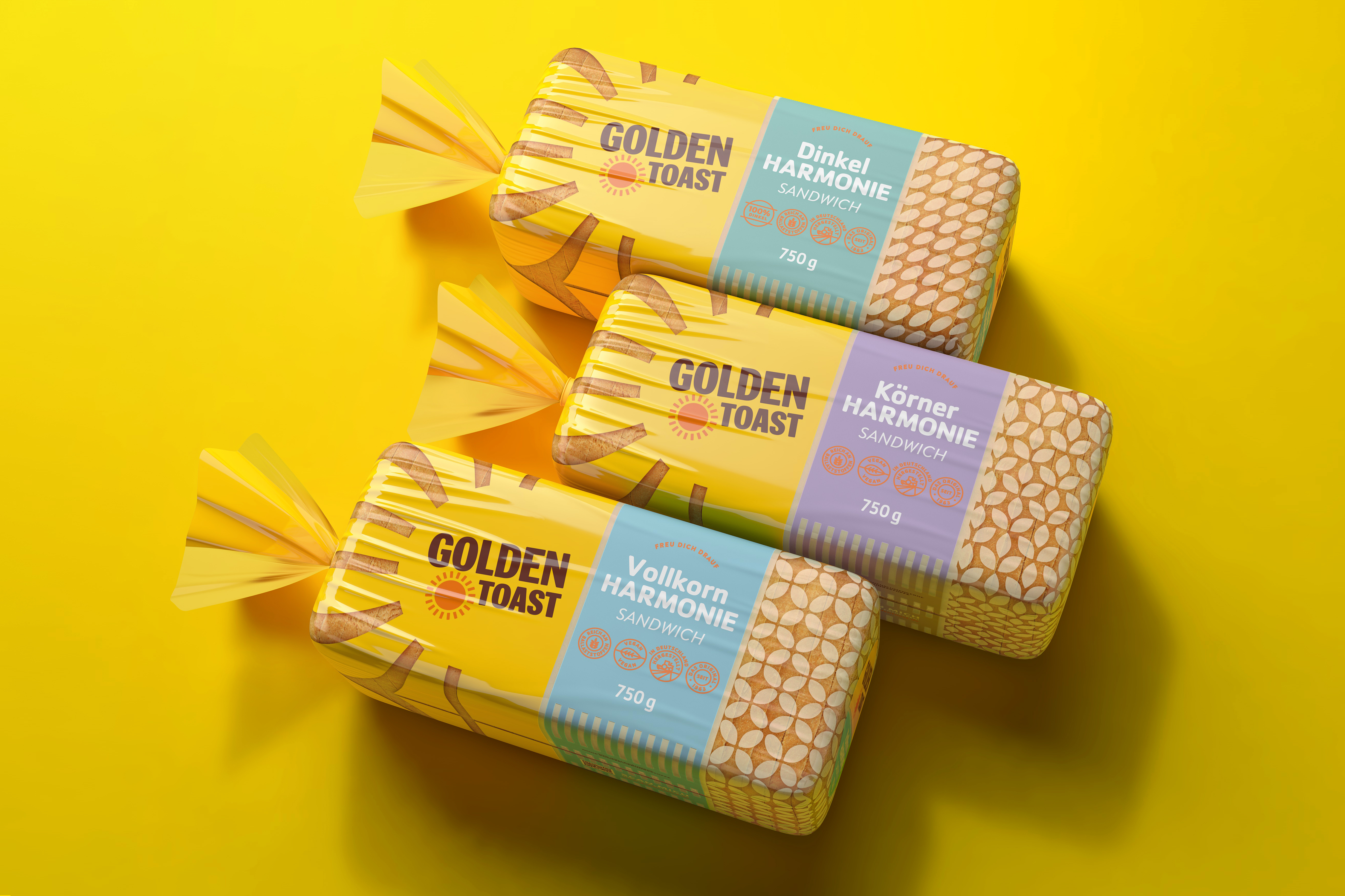
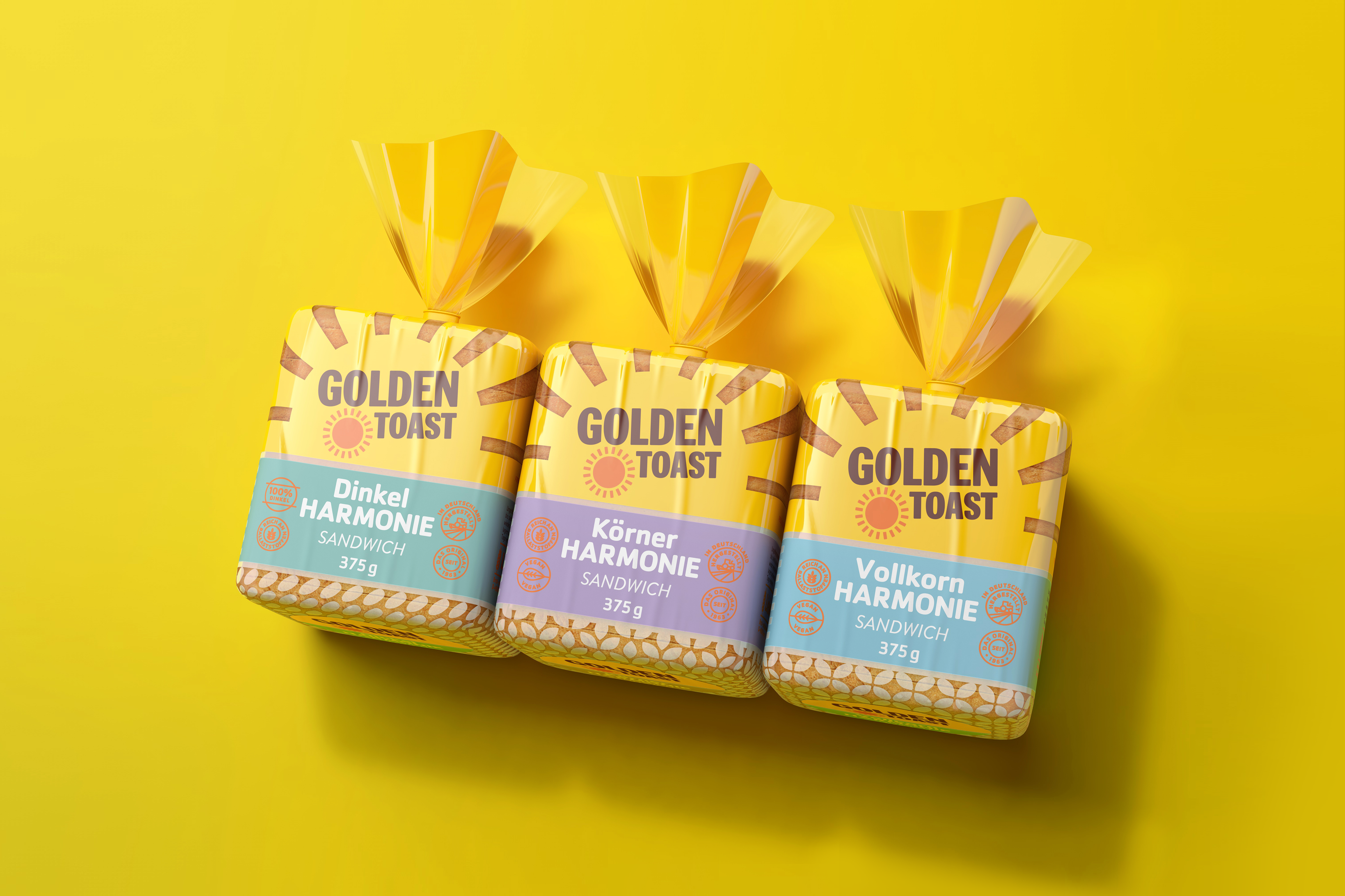
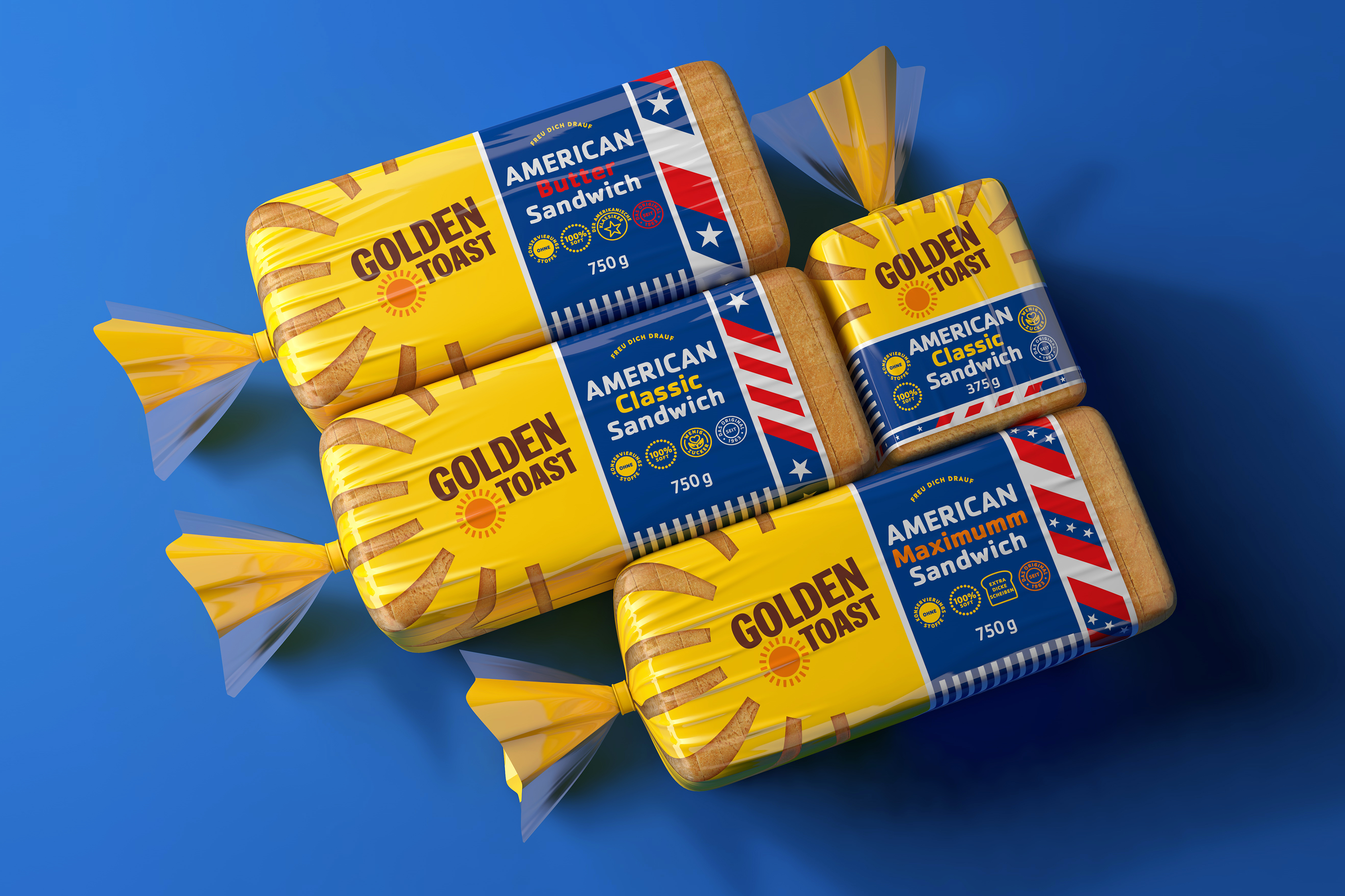
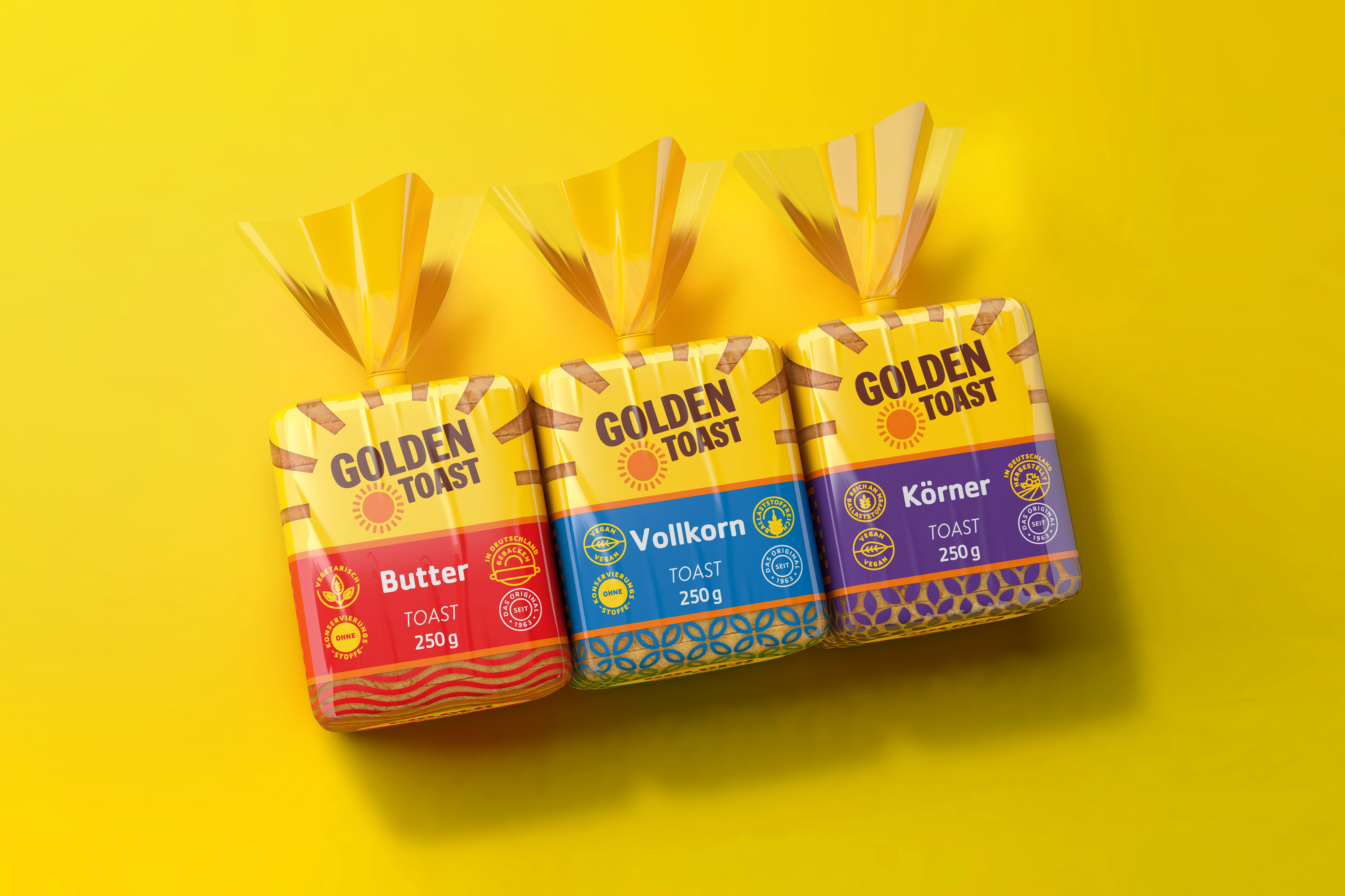
Germany’s oldest bread brand has expanded into a broad range of bread that’s a household favourite in Germany. Golden Toast is known, trusted, and valued as a timeless favourite. Over the years the packaging has remained unchanged so the client required a rebrand to visually align it with the times, but without alienating the broad customer base.
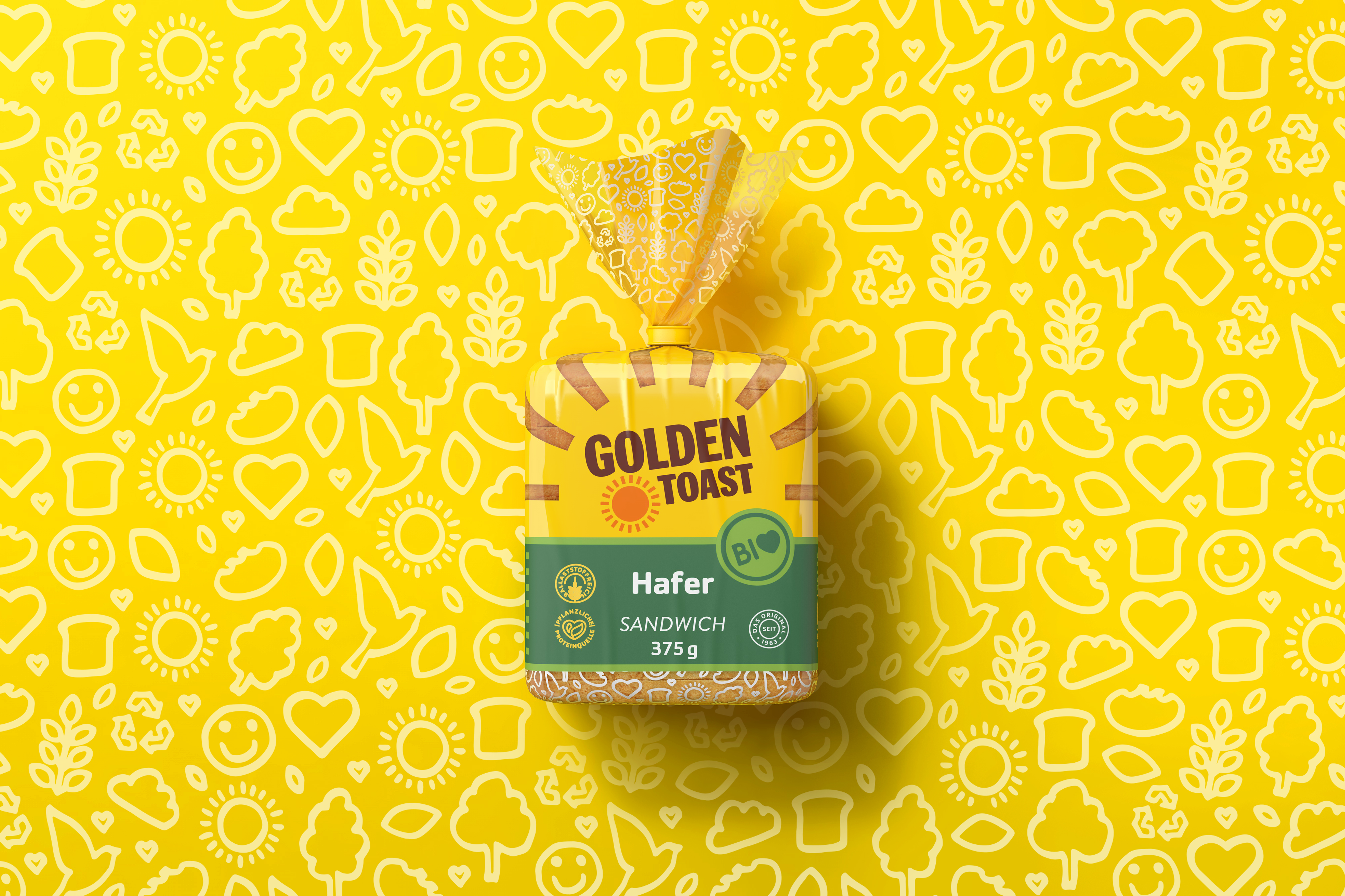
The client wanted the logo to remain unchanged. However, Ginger Storm brought the essence of the brand into the 21st century by bringing healthy, fun, cheerful, friendly, and family-orientated brand values to the forefront of the packaging.
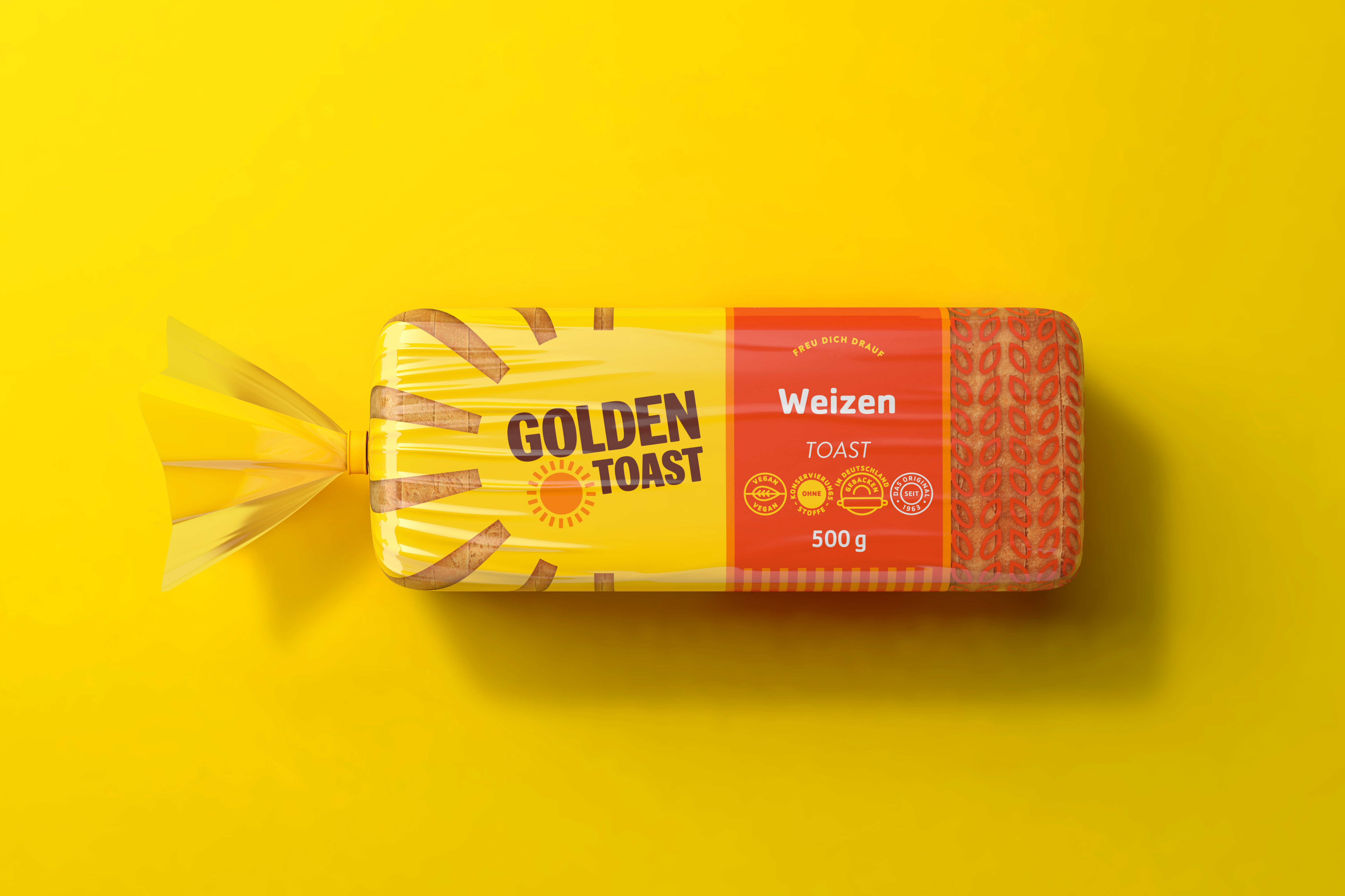
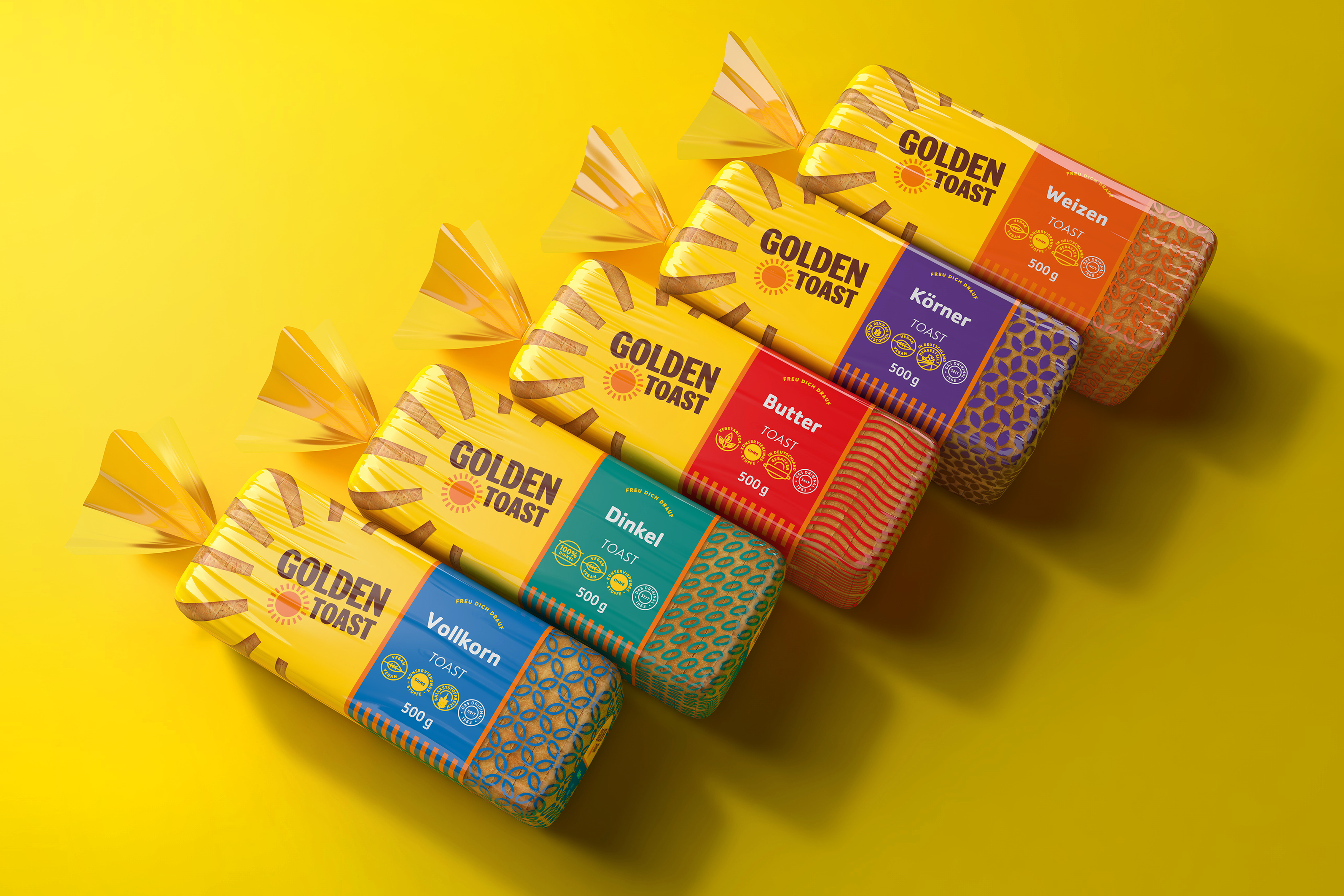
Ginger Storm aimed to capitalise on the brand's golden sun icon by making it the dominant and recognisable feature. I created a bold effect by housing the logo with rays that reach the top of the packaging. This strategy aligned the recognisable elements of the brand with the playfulness and vibrancy that forms the foundation of the brand architecture.
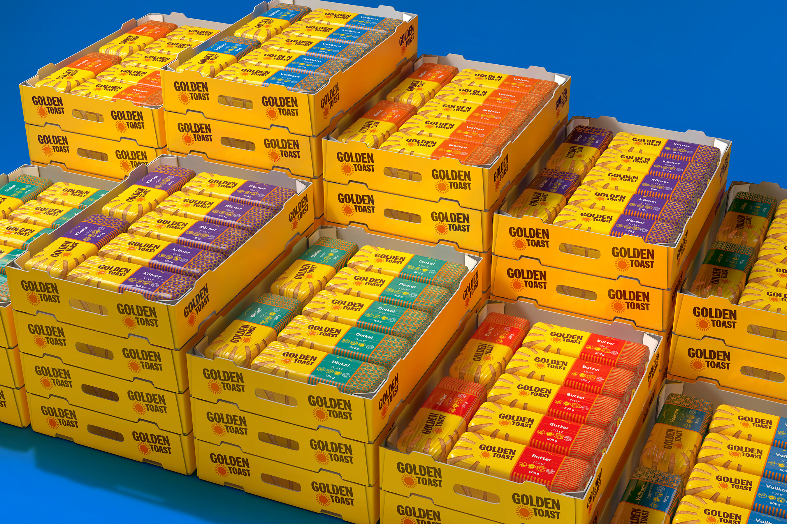
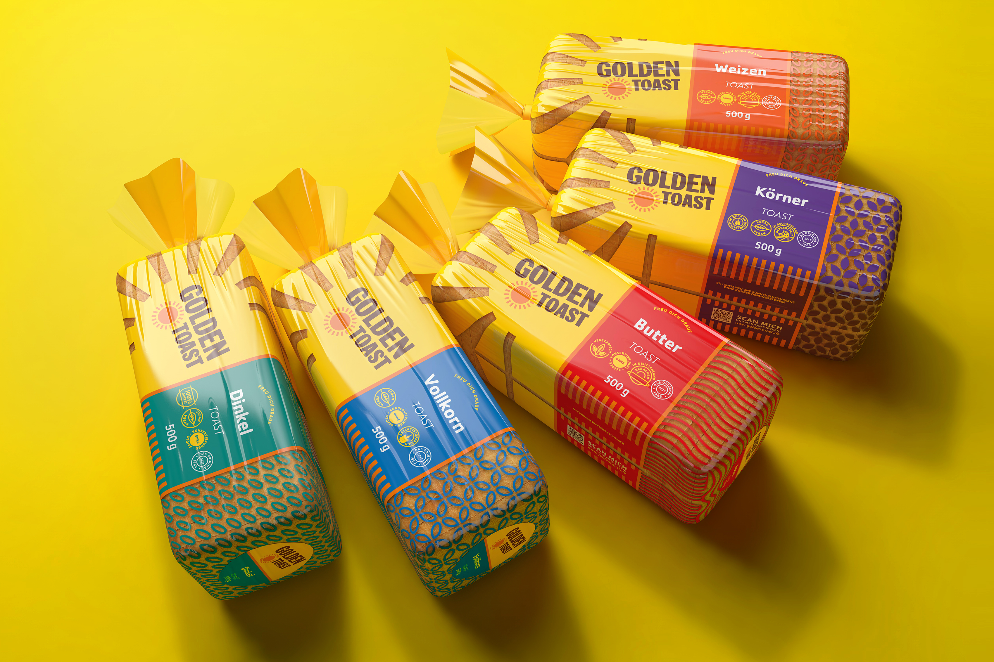
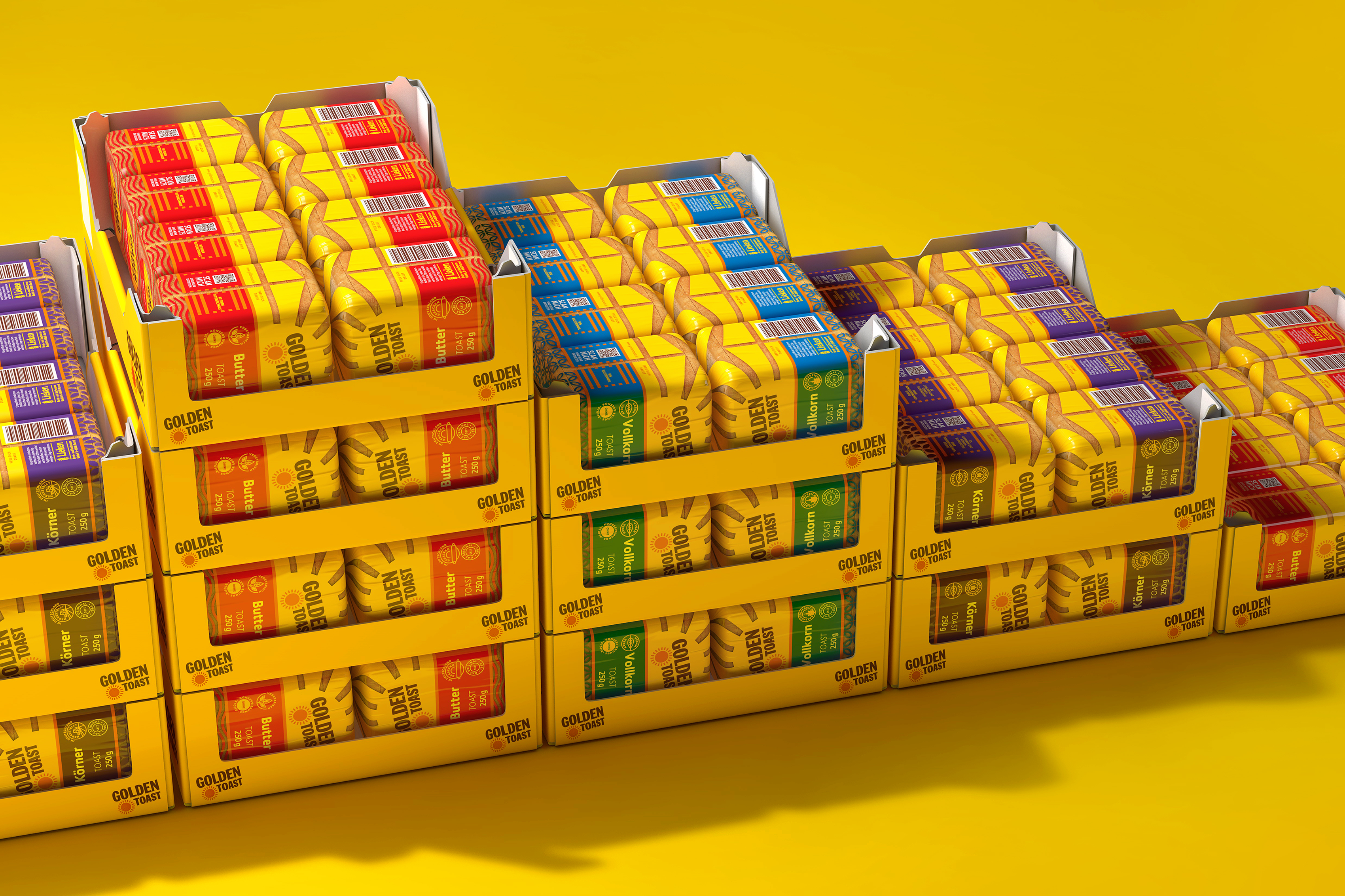
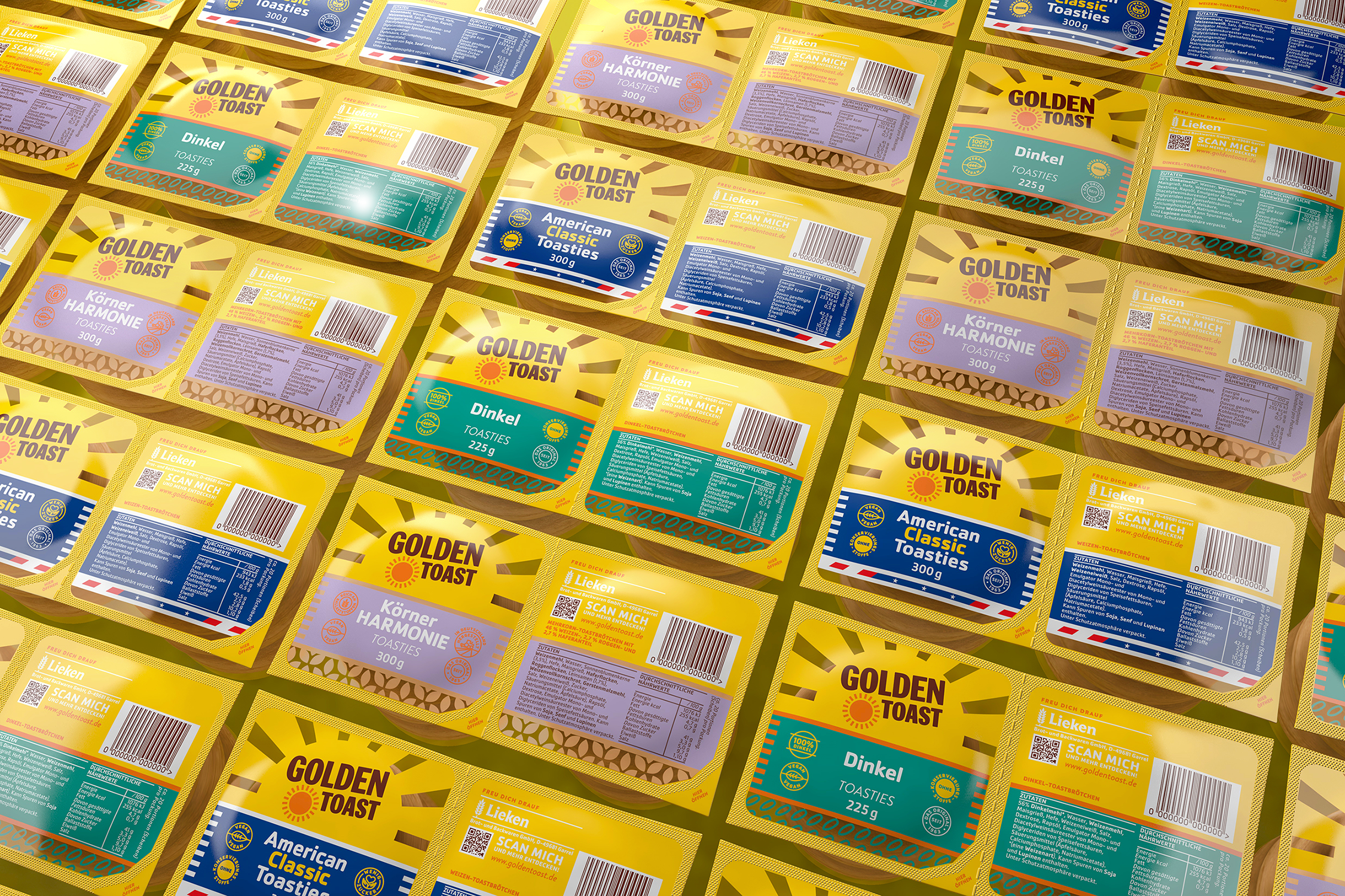
The various flavours and category lines are differentiated by vibrant colour banding, print executions, and unique graphic patterns. Strong iconography also creates character and conveys the product's health benefits.
The packaging architecture allows for easy communication of product offerings across multiple categories, sub-categories, and flavours. Customers can now easily navigate through the product range via structure, colour, and typography.