_PACKAGING_STRATEGY_LOGO
Importers Coffee
How Ginger Storm created packaging that resulted in a 60% increase in sales.
Importers Coffee Merchants is the oldest coffee brand in the Western Cape. They import premium quality coffees from the world’s leading equatorial coffee-growing regions and hand roast the beans.
The Importer's brand and coffee bags were completely redesigned after poor performance on retail shelves.
Photography
@russsmithphotography
Rendering
@MF3D
A comprehensive brand strategy was created for all packaging categories and tiering. This enabled strong brand communication and consistency with individual personality and flair.
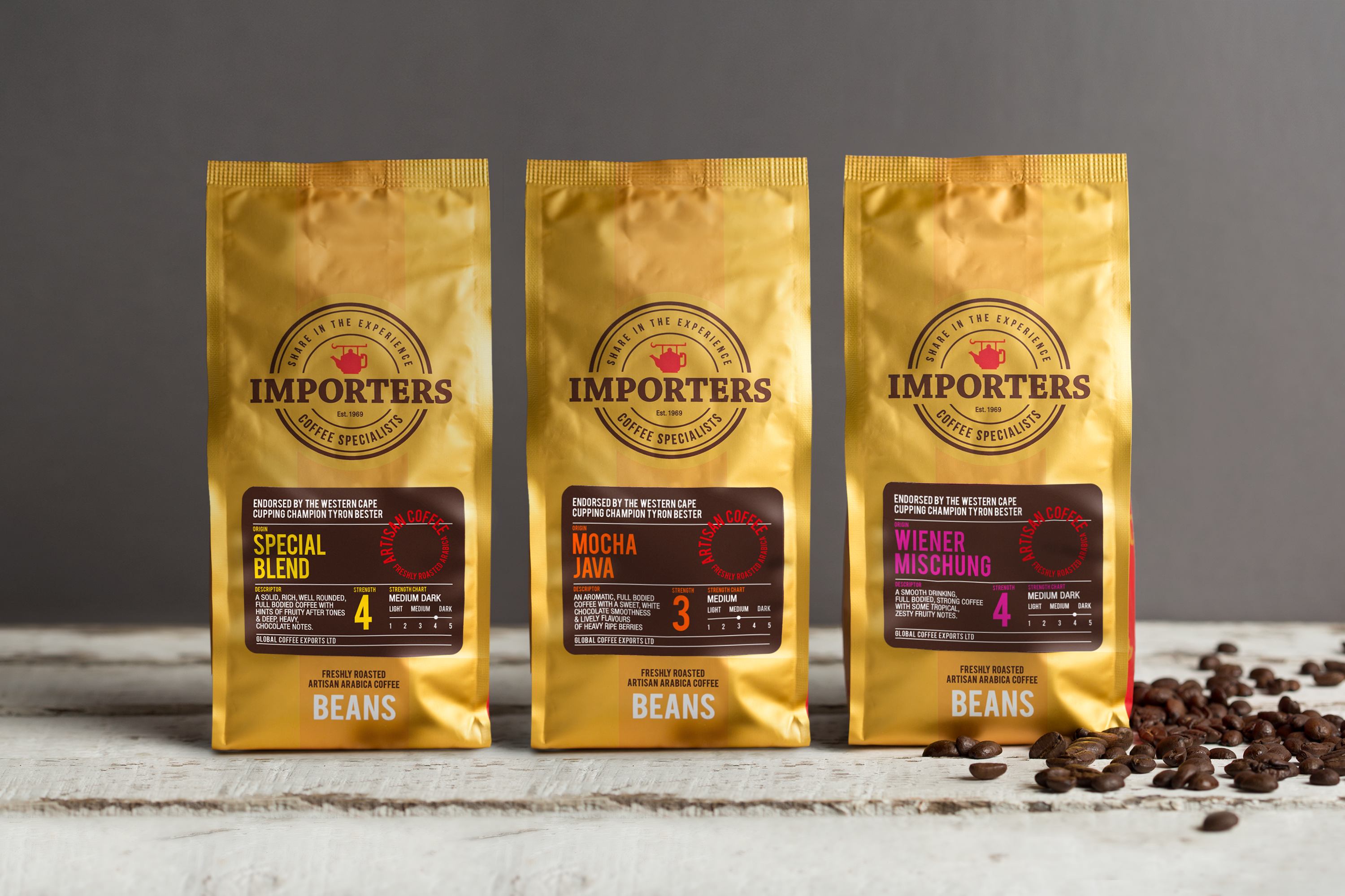
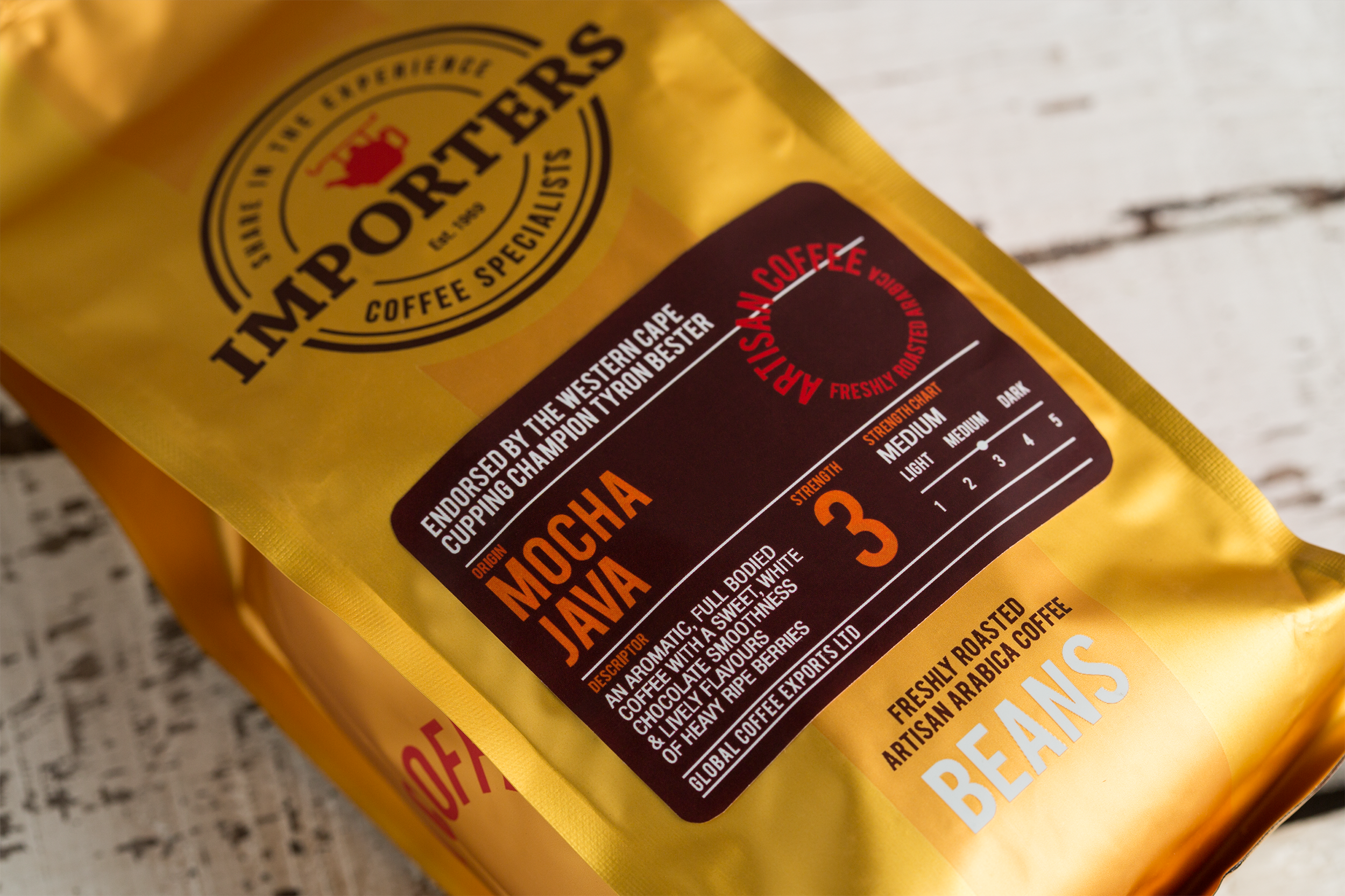
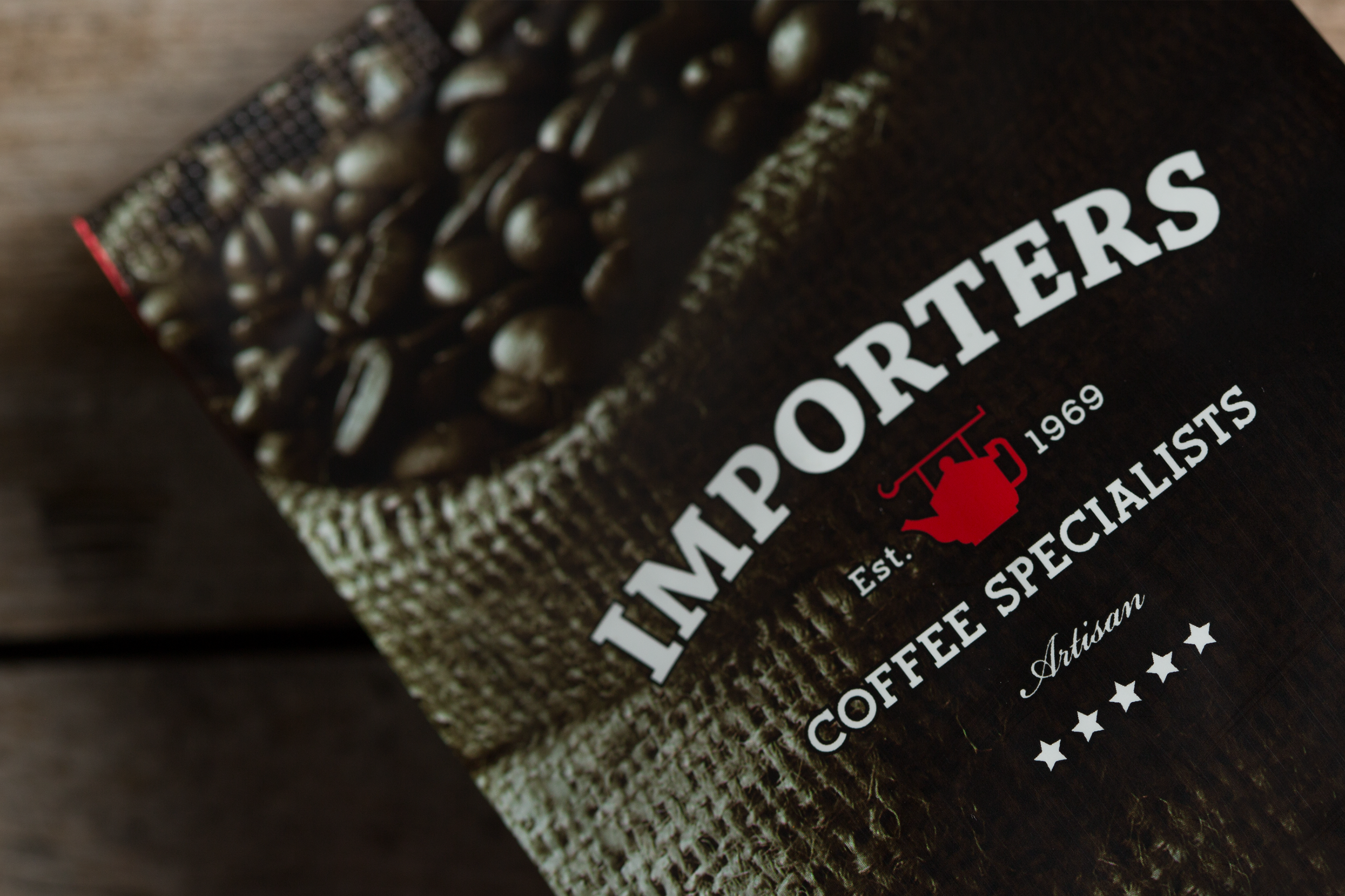
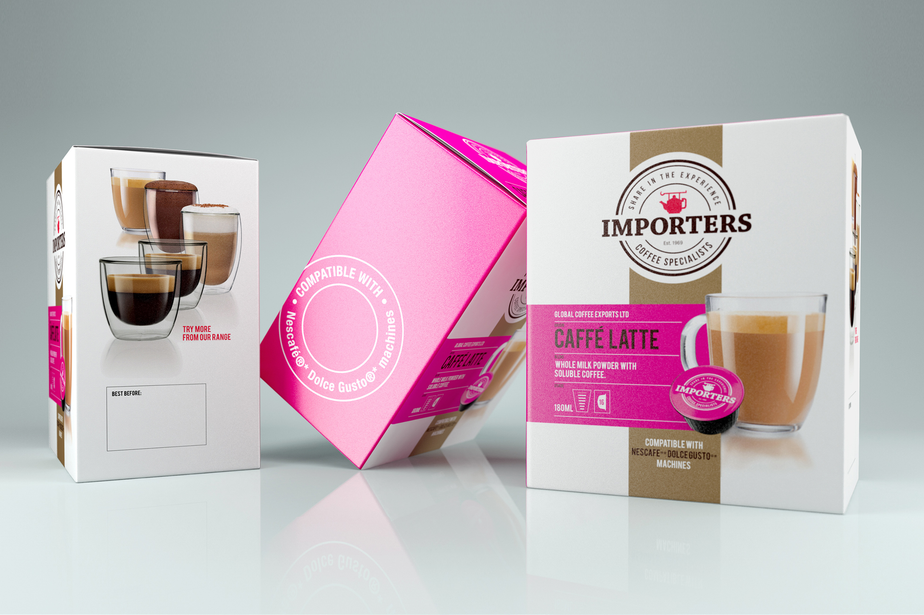
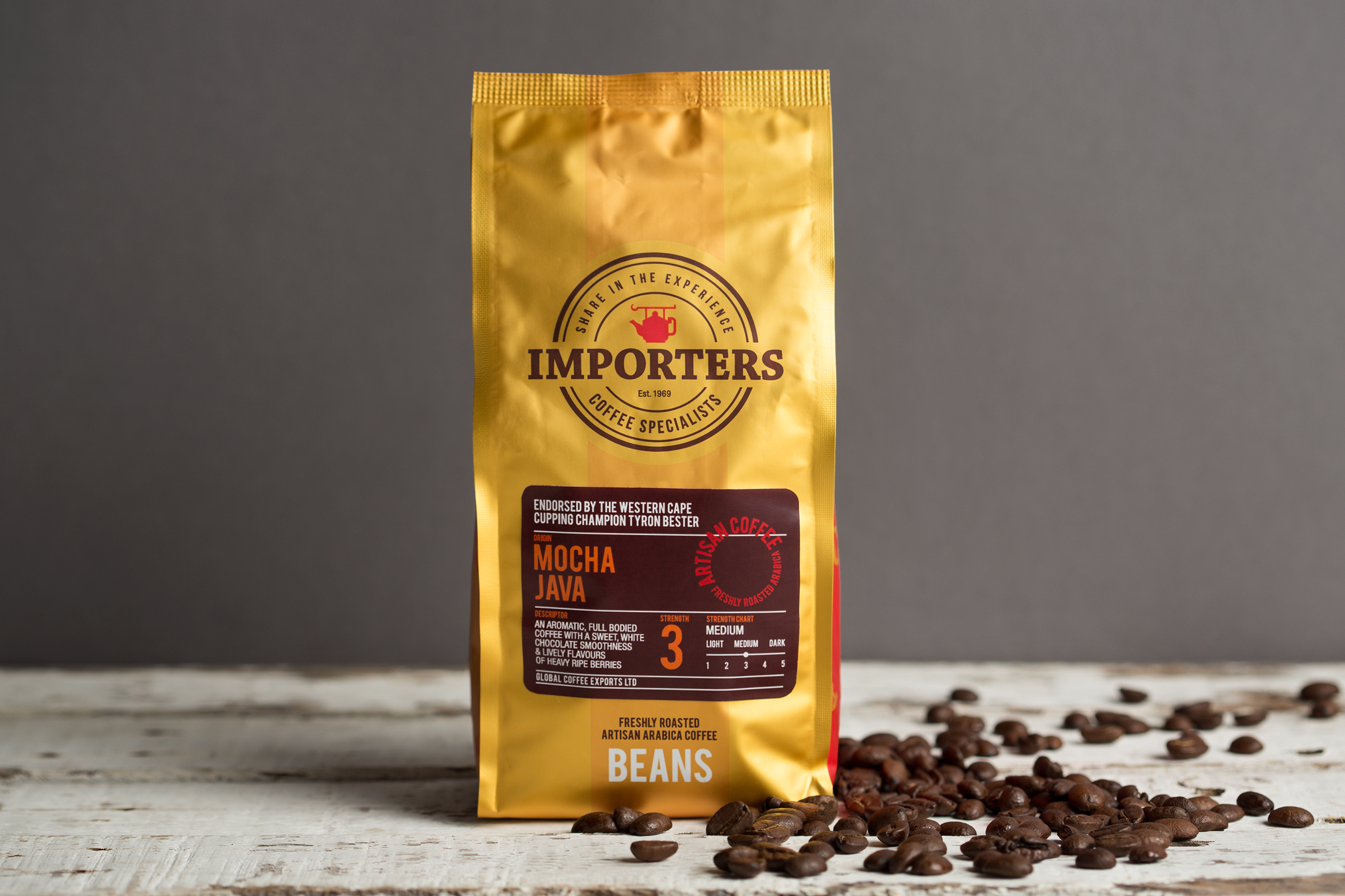
For the core coffee packaging range I designed a new, more legible, and bold logo which has nods to the old-world heritage of merchant trading and coffee manufacturing. The logo was designed to be placed on the signature gold colour with clear communication and impact.
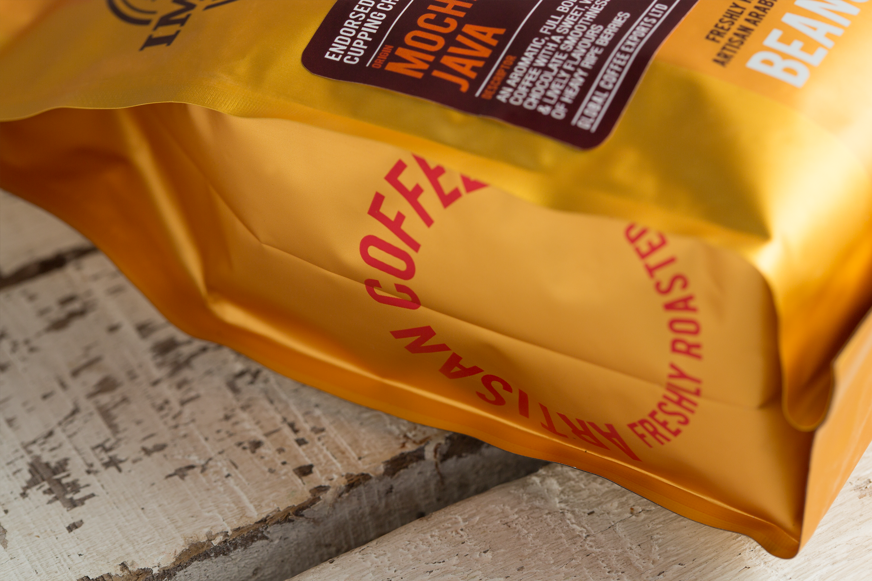
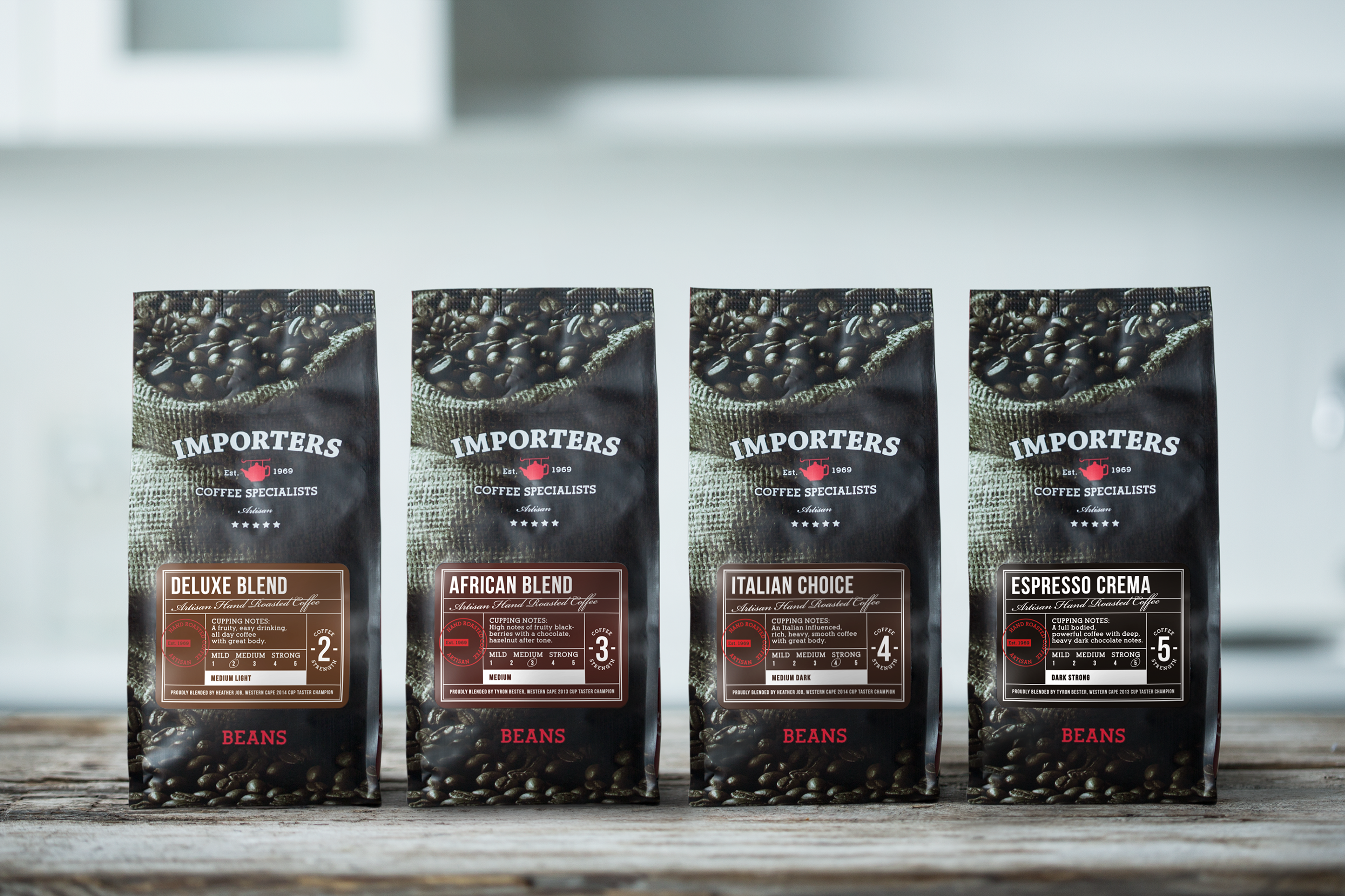
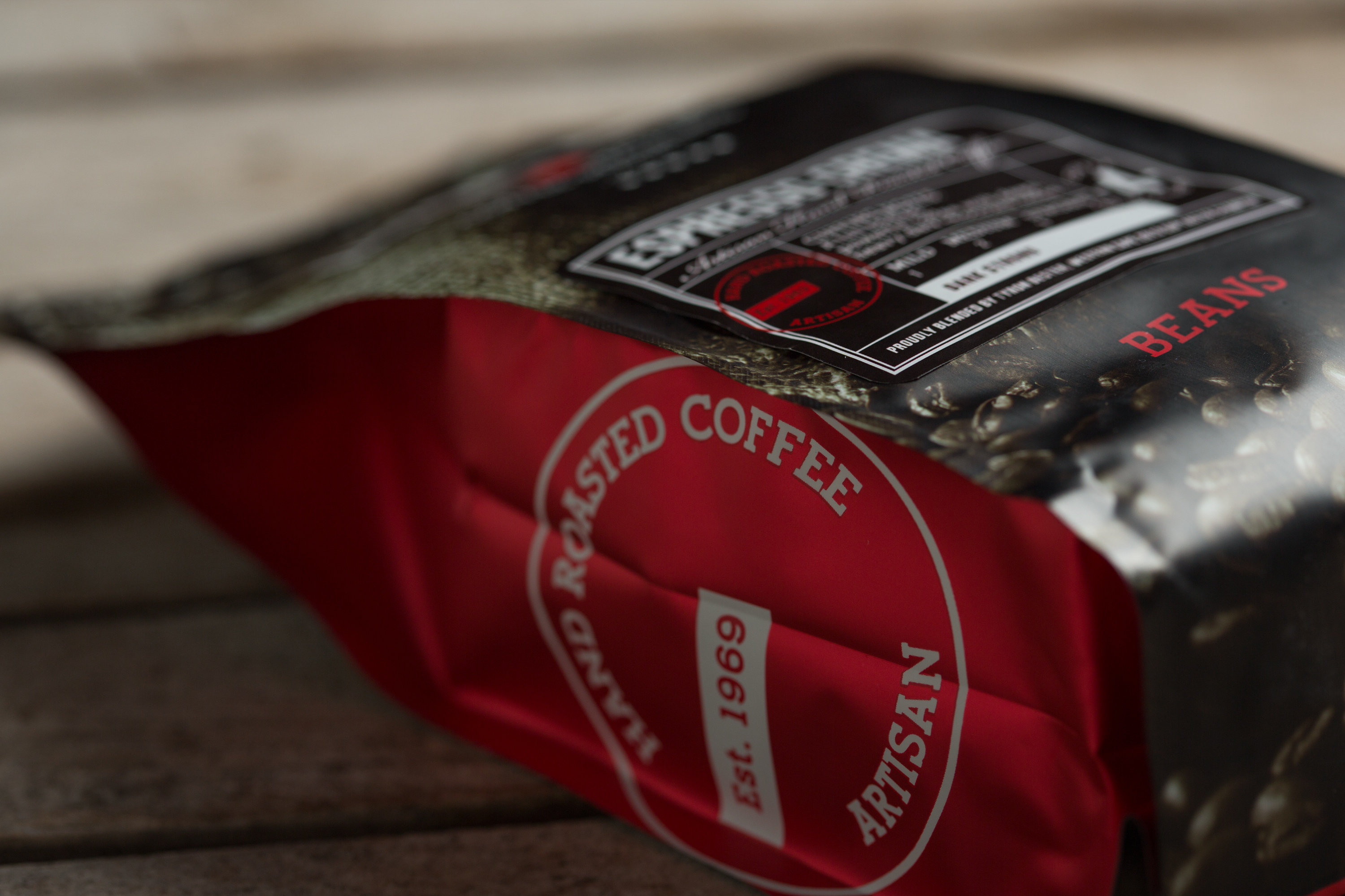
The iconic teapot was given a refresh and became a symbolic feature for the brand. The signature gold packaging was retained but I modernised it and added a darker gold band to highlight the logo. The addition of clean, structured labelling and crafted typography maintained the old-world roots but had a contemporary execution. Together with stamps to highlight important features, this beautifully put-together packaging resulted in a 60% increase in sales in the first six months of the product hitting retail shelves.
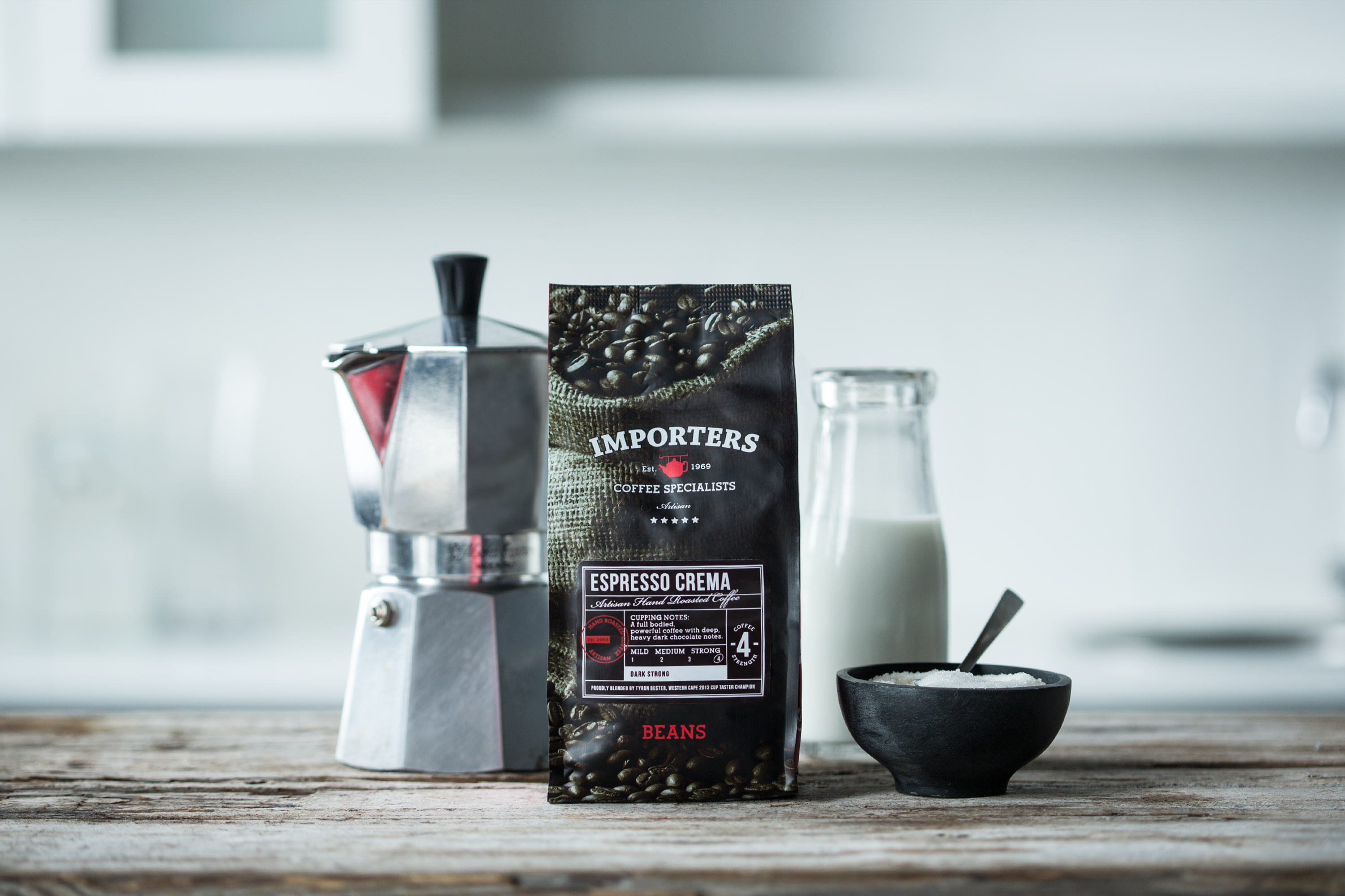
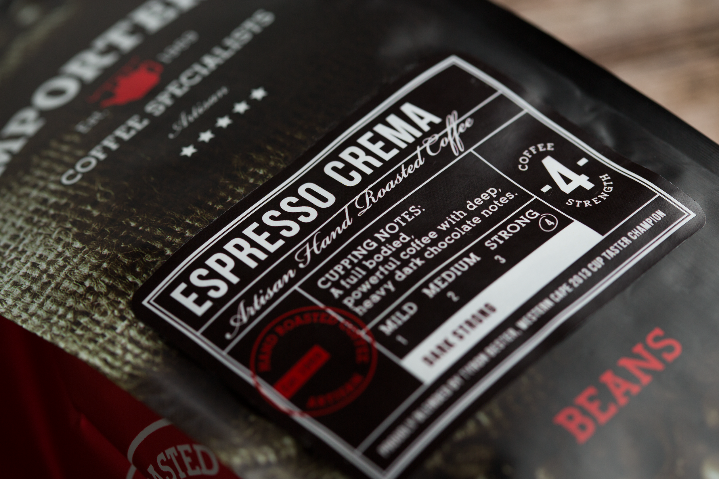
The Importers artisan, top-tier coffee range needed to be seen as premium and high quality with a deep-seated knowledge of the heritage and process of coffee brands of old. Darkly lit mood photography and sophisticated labelling and typography, reminiscent of original coffee labels, helped to achieve this. A more sophisticated version of the logo was created for this packaging to create interest and set this tier apart from the core range.
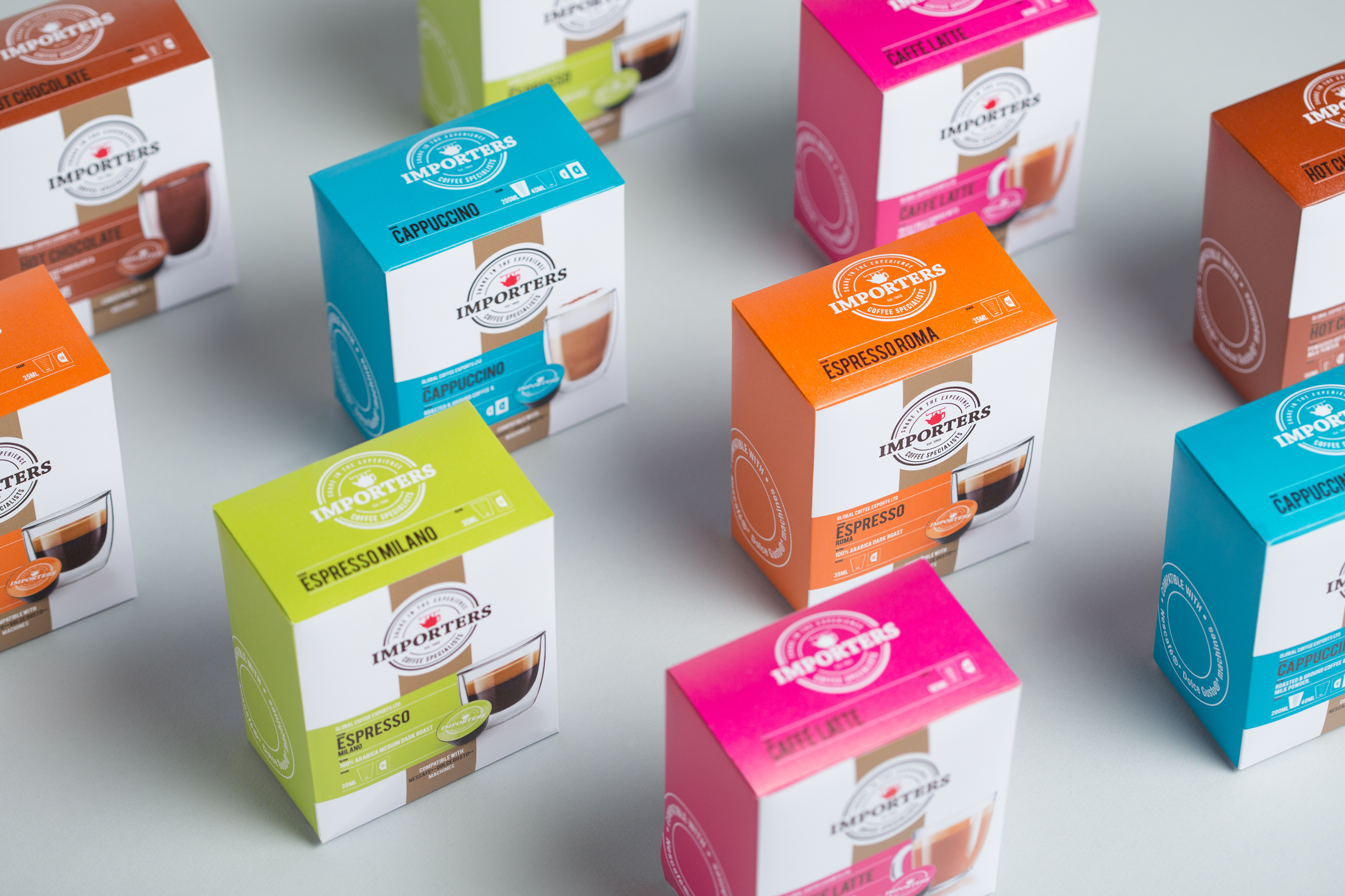
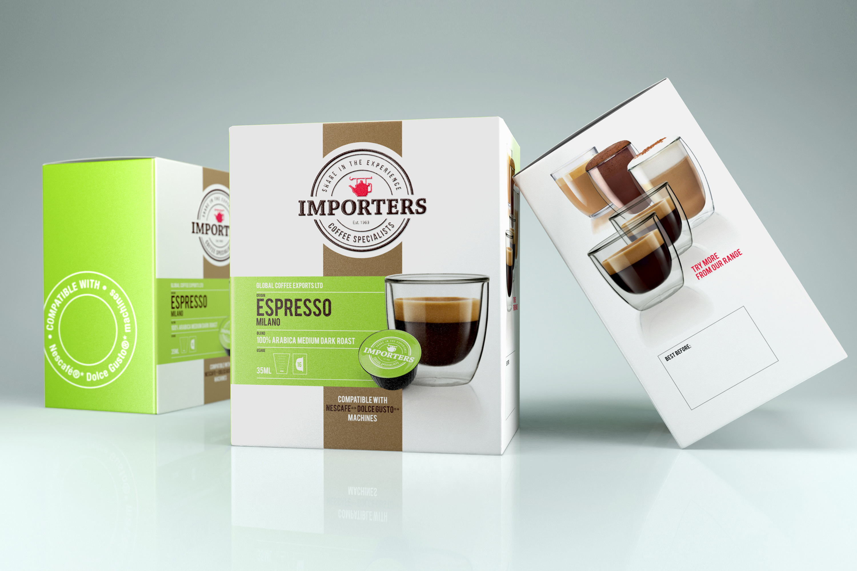
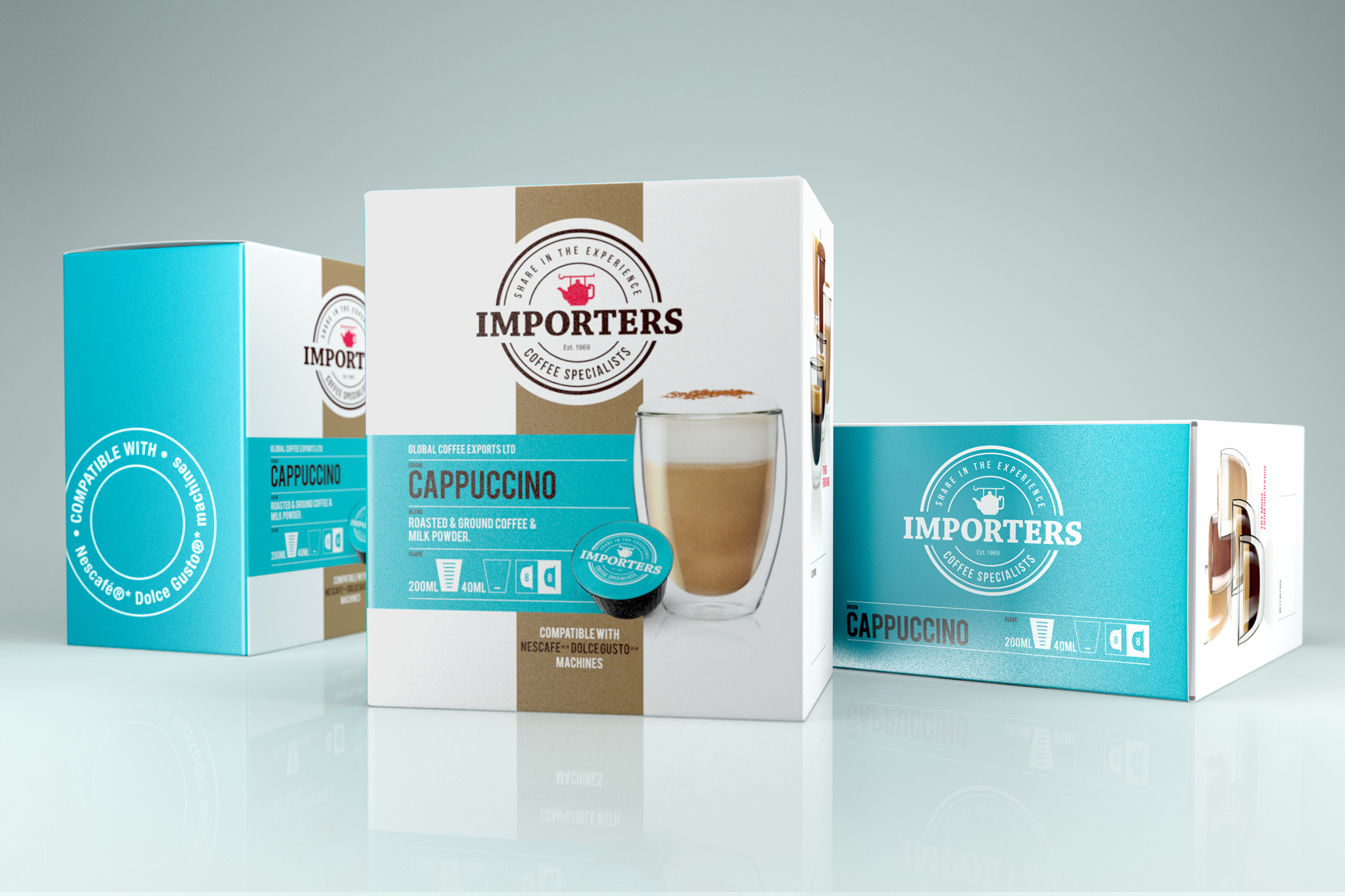
A new range of capsule boxes was designed, using bright, vibrant colours, beautiful photography and typography that lends itself to the range. The clean white background allows for breathing space on the shelf that draws the customer's eye and focuses on vibrant colours and modern, minimalistic espresso photography.