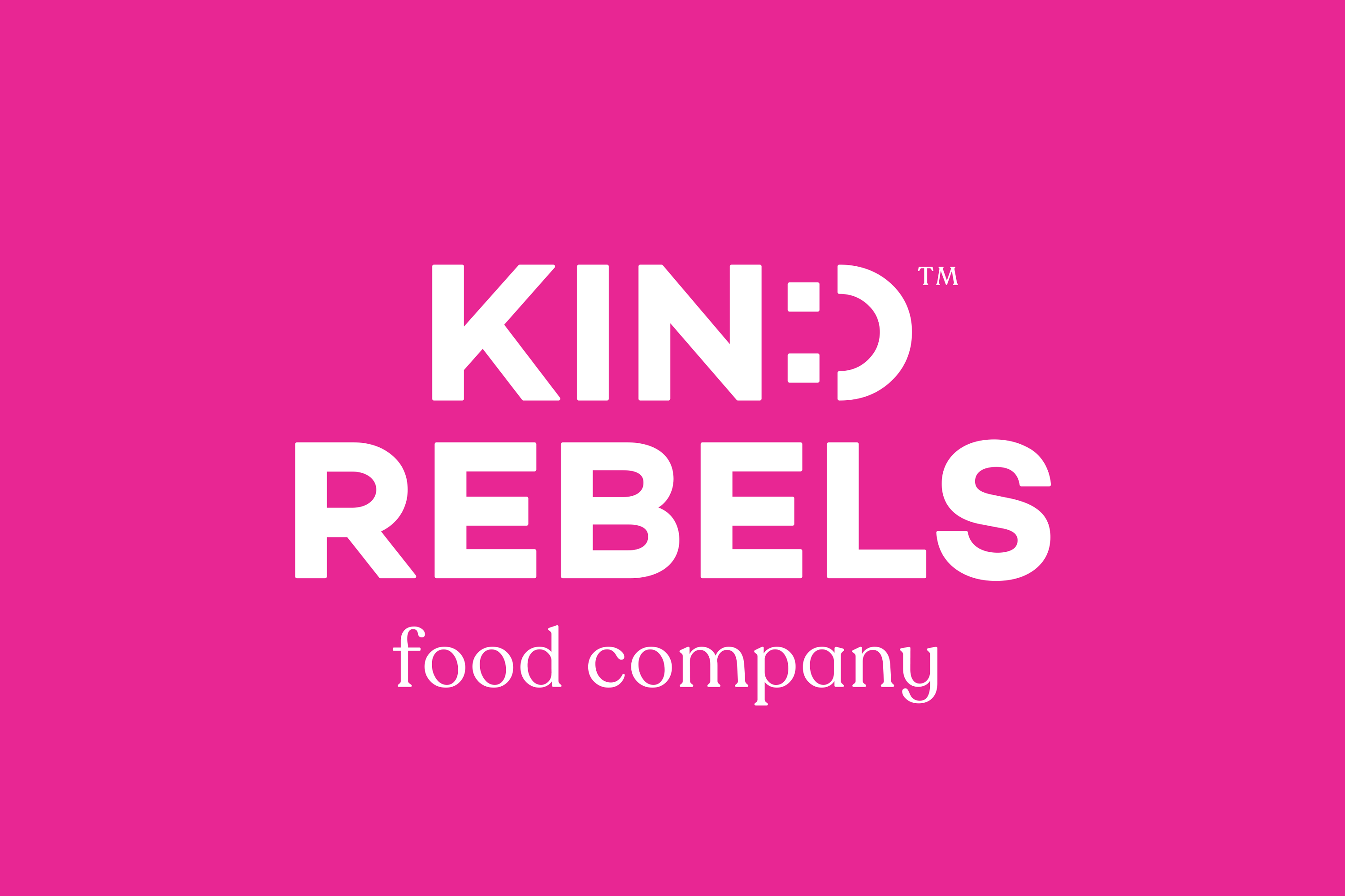
_IDENTITY_LOGO_PACKAGING
Kind Rebels Popcorn
As a rebel by heart, this is how I delved headfirst into the Kind Rebels design brief to prove that healthy snacking can be a riot.
Kind Rebels, a Cape Town-based brand, is the meeting of two minds– a flavour-perfectionist health food junkie and a nature-loving-engineer turned entrepreneur. Kind Rebels create nutritious, lifestyle-enabling snacks that are REAL good for you and don’t compromise on taste.
Rendering
@MF3D
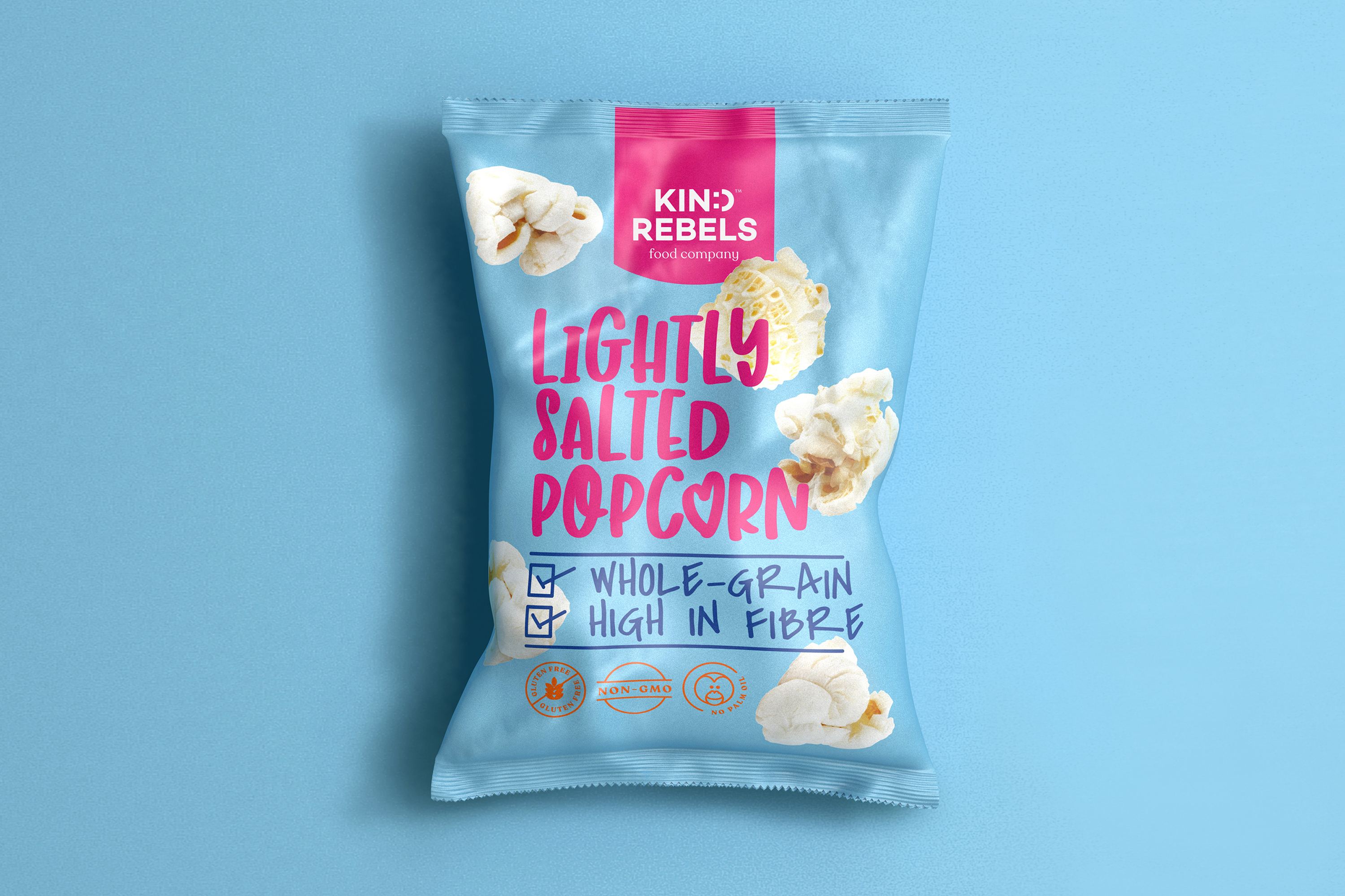
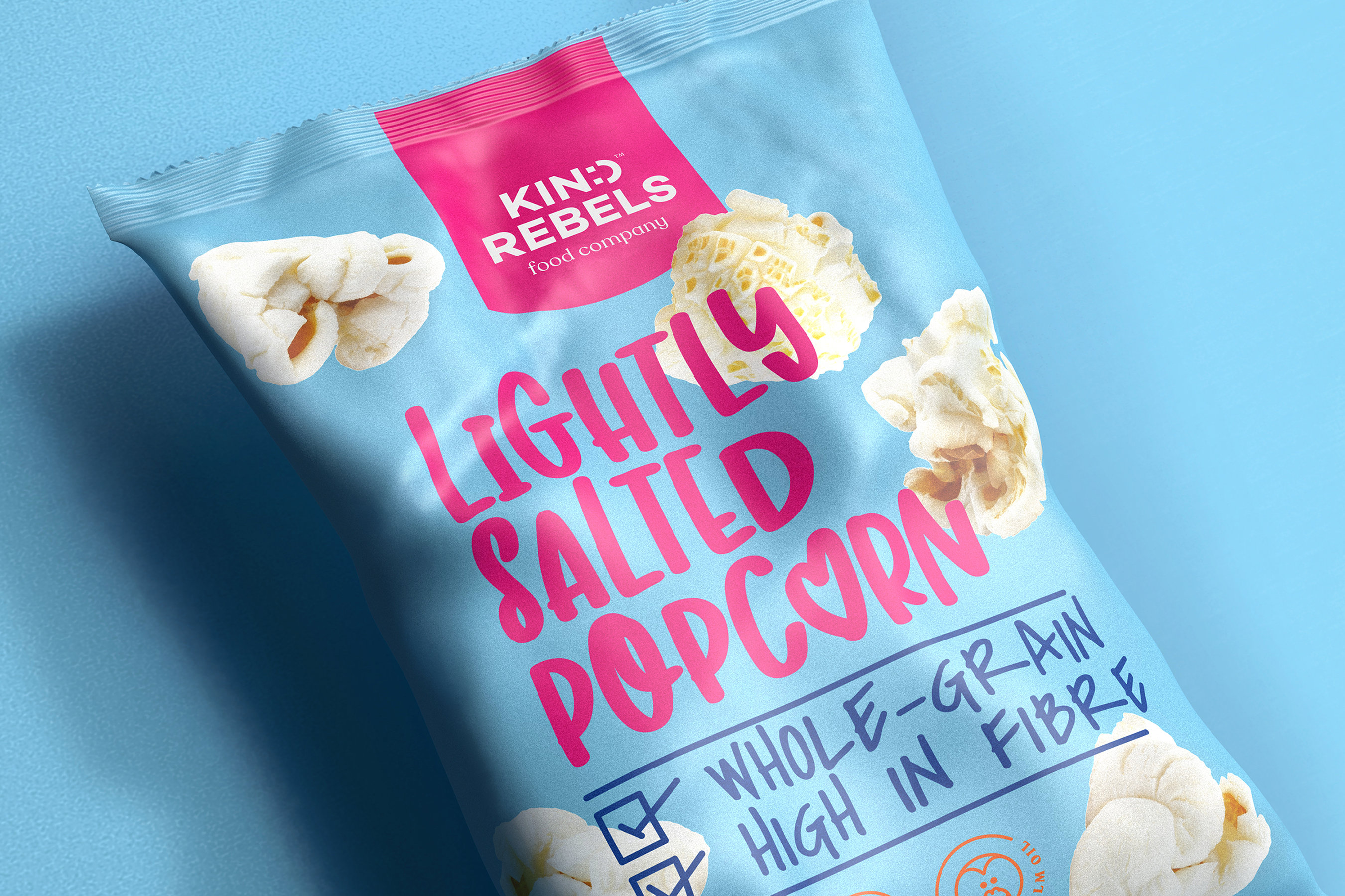
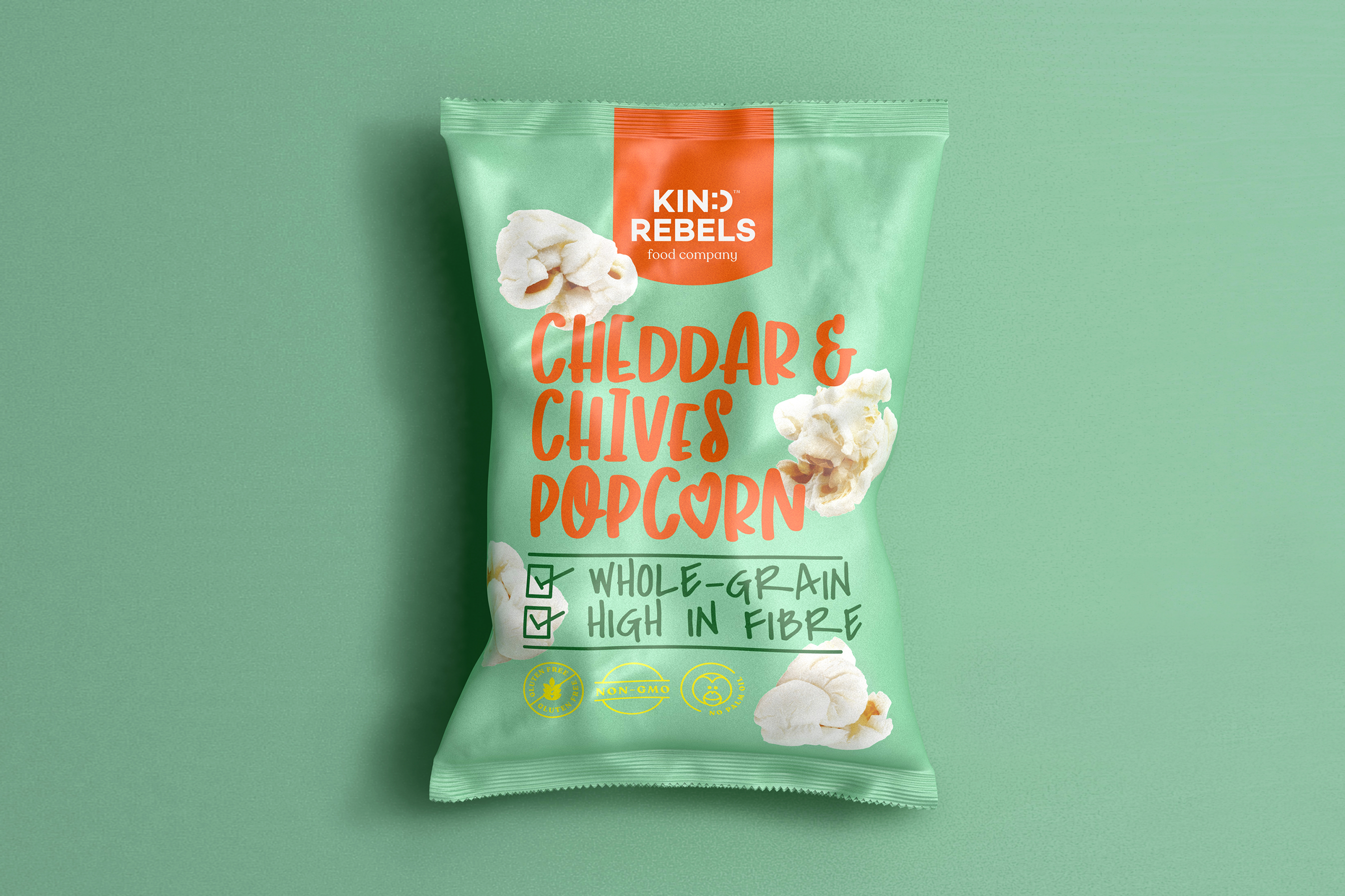
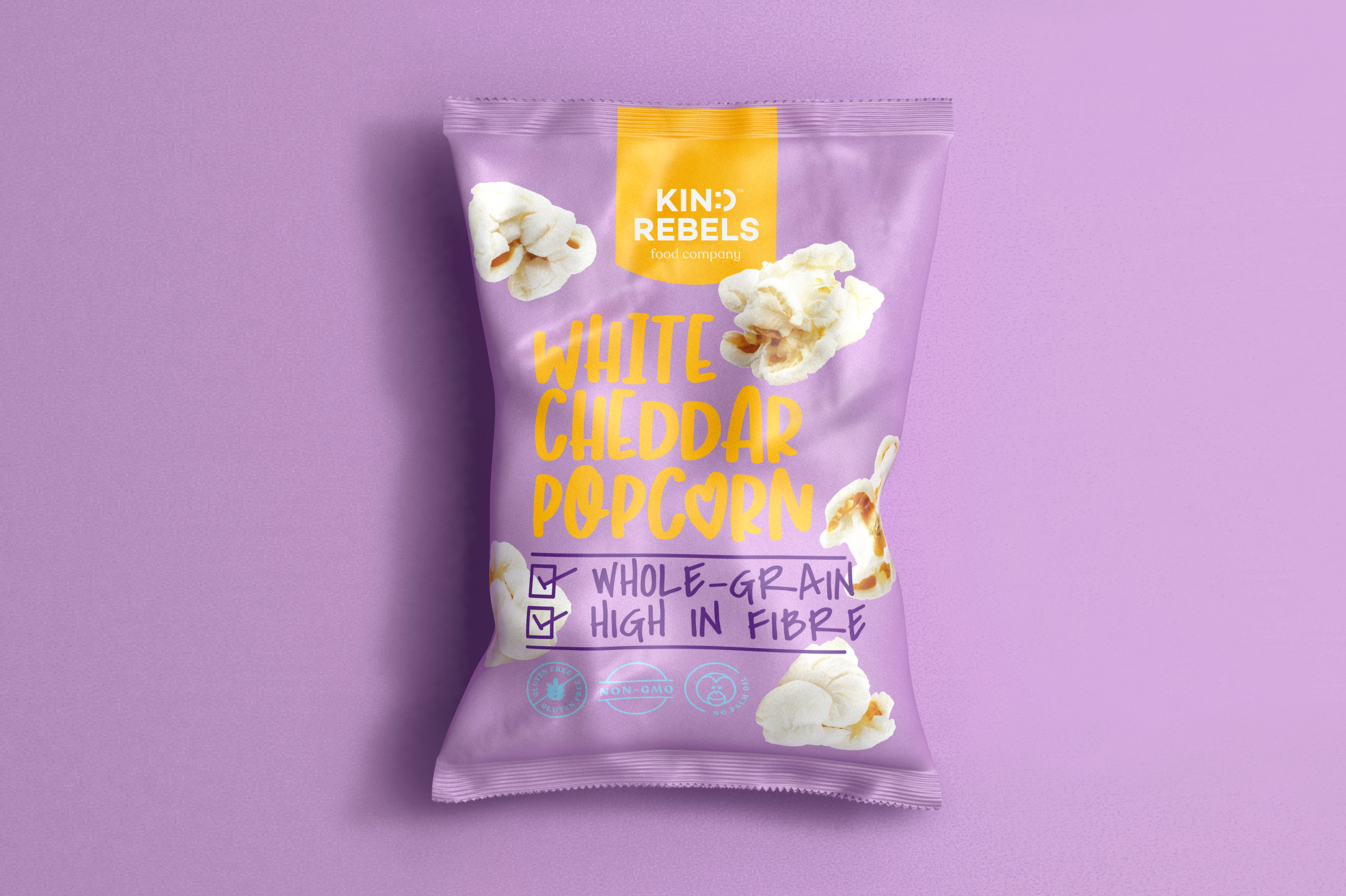
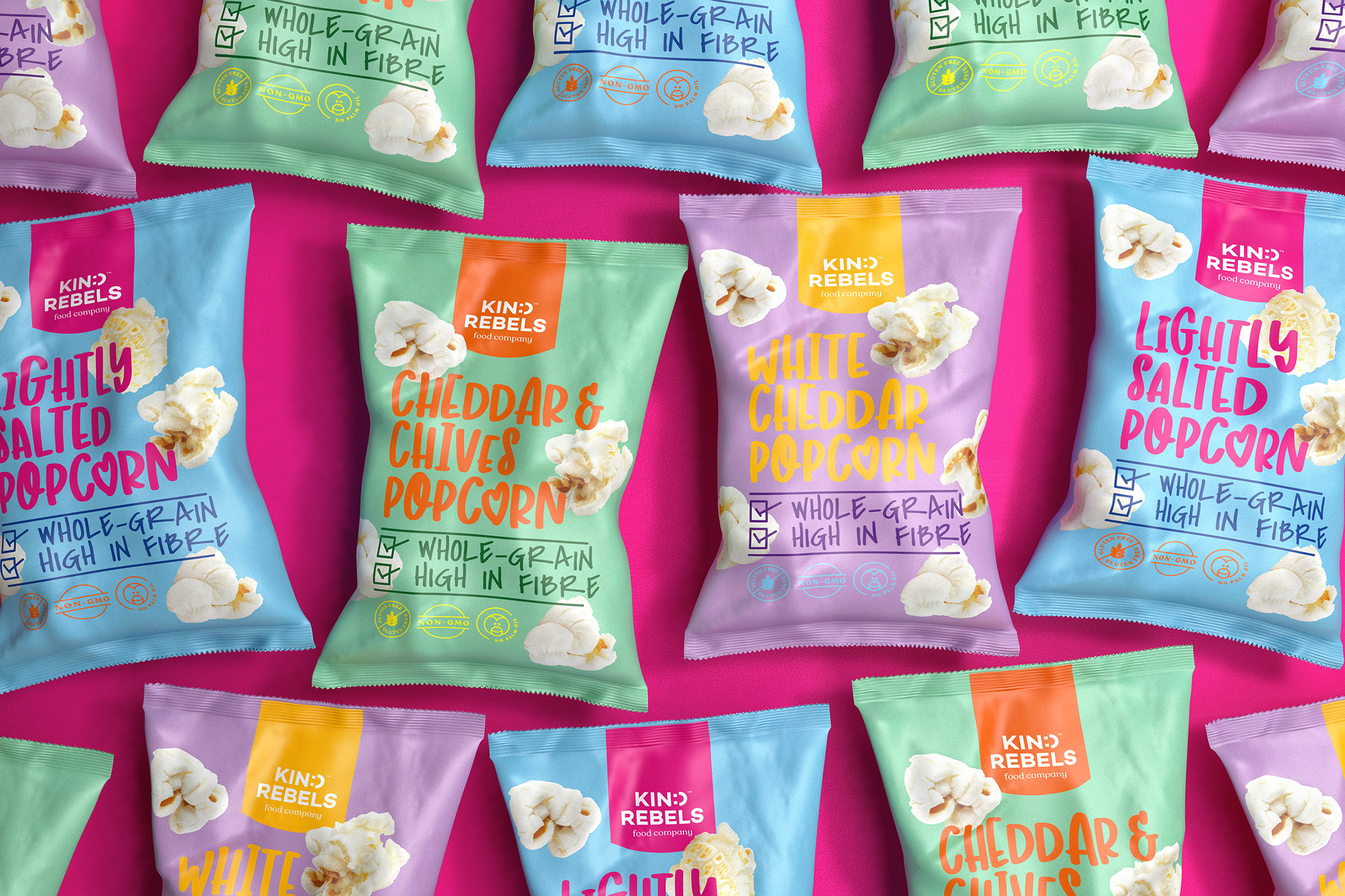
Ginger Storm was approached by Kind Rebels to create something fun, friendly, and different. They also wanted a clear message about health that wasn’t sanctimonious but rather sang to the consumers’ rebellious souls.
I created a logo that immediately encourages a “smile in mind”. I achieved this by simply referencing a smiley face within the ‘d’. The colour palette combines muted colours offset by striking and vibrant colour choices. The typography is friendly and fun, and the unique iconography stands loud and proud and engages the consumer. I wanted to develop a design with as much heart and soul as possible, so the photography of the popcorn literally flies around the pack to make the bag “pop” with energy and life.
Kind Rebels popcorn pops as the perfect choice for a modern, health-conscious buyer who is anything but boring.