_PACKAGING_STRATEGY_LOGO
Lieken Urkorn Classic
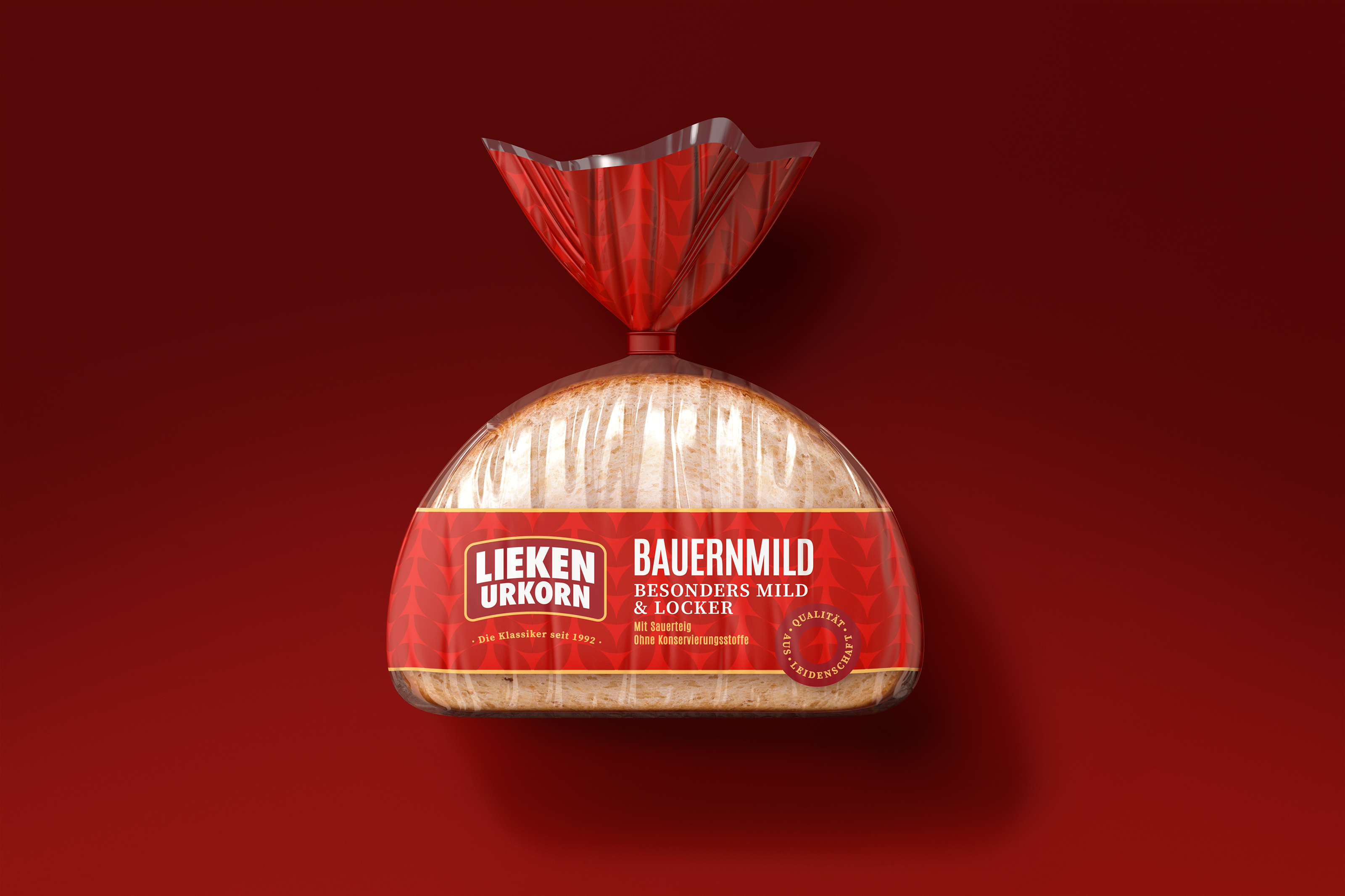
How I made this classic bread an absolute bread winner.
Lieken Urkorn is a success story that epitomises Germany’s pioneering spirit. Master baker Fritz Lieken’s inventiveness and entrepreneurial spirit changed the German baking industry. His vision to produce nutritious bread for the population is why they produce more than 500,000 tons of bread annually and have been trading for over 100 years.
Rendering
@MF3D
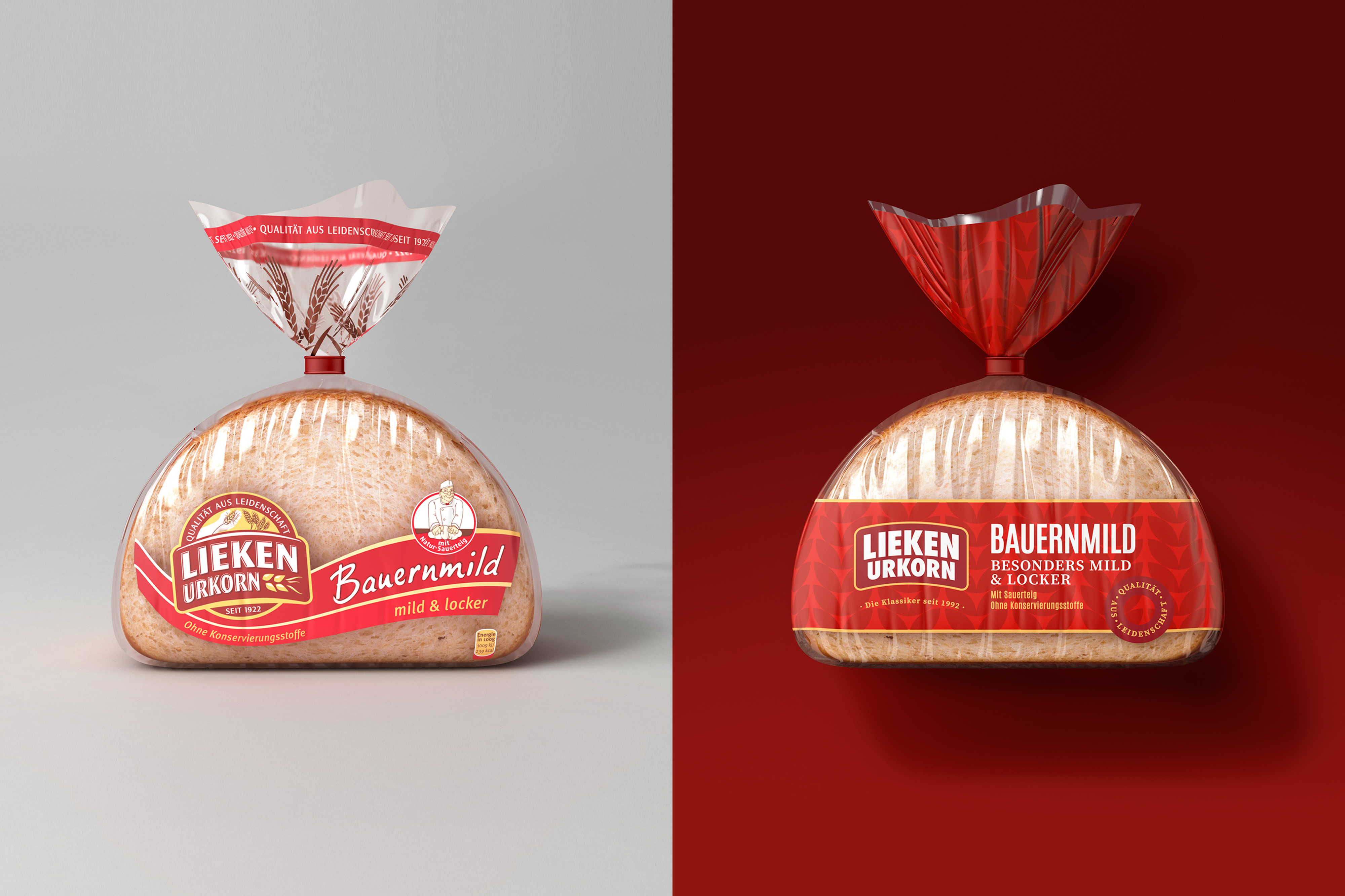
At the heart of their brand are tradition and quality, so heritage was something that needed to be celebrated. However, Germany’s oldest bread brand needed to modernise its packaging to compete against multiple new bread start-ups and broaden its appeal.
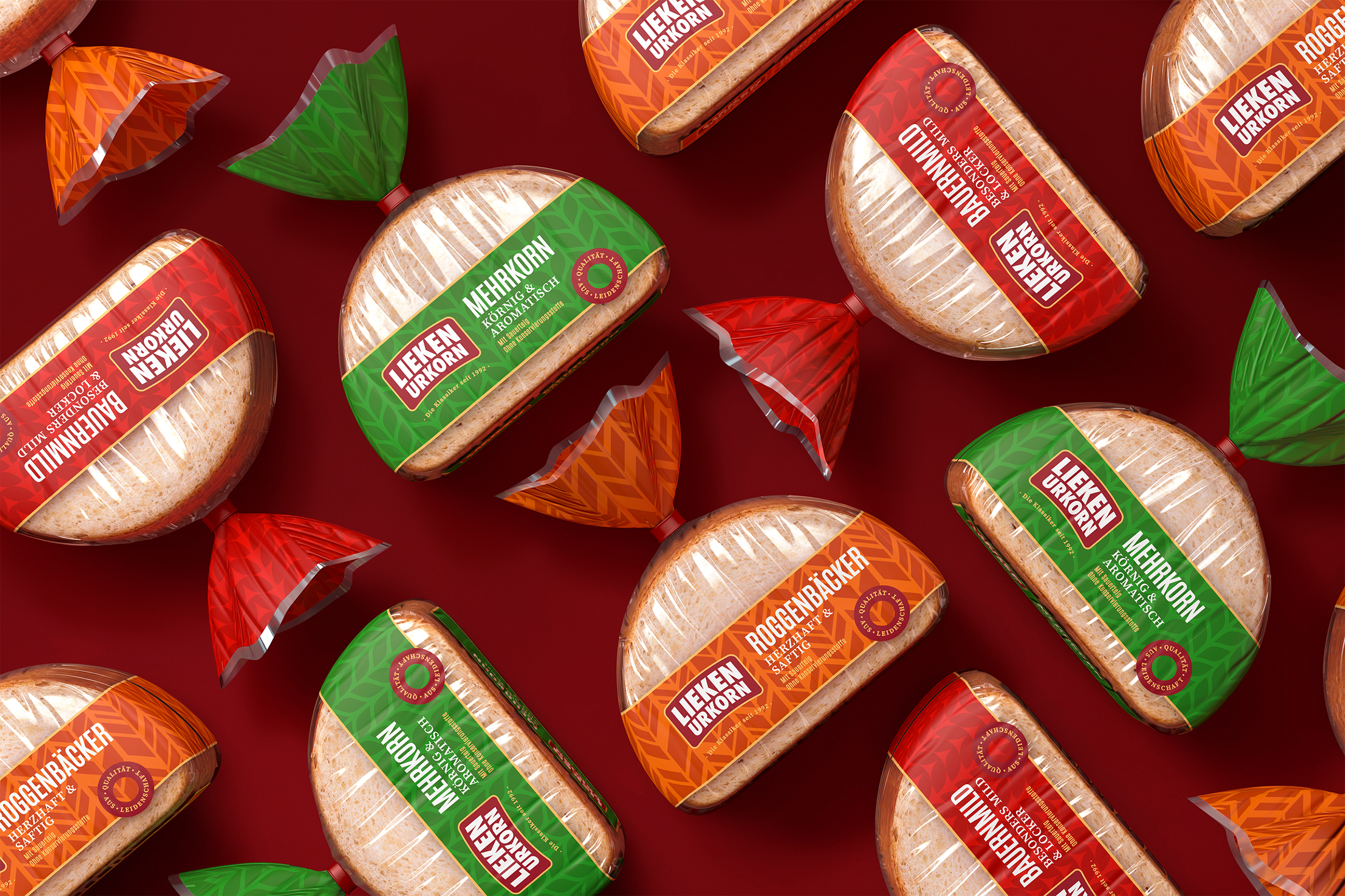
Typically, bread packaging is boring and formulaic. There’s an overabundance of clear packaging combined with dated wheat and ribbon illustrations, and illegible curly typography. Ginger Storm’s goal was to create a contemporary eye-catching design that showcased the product and had clear communication.
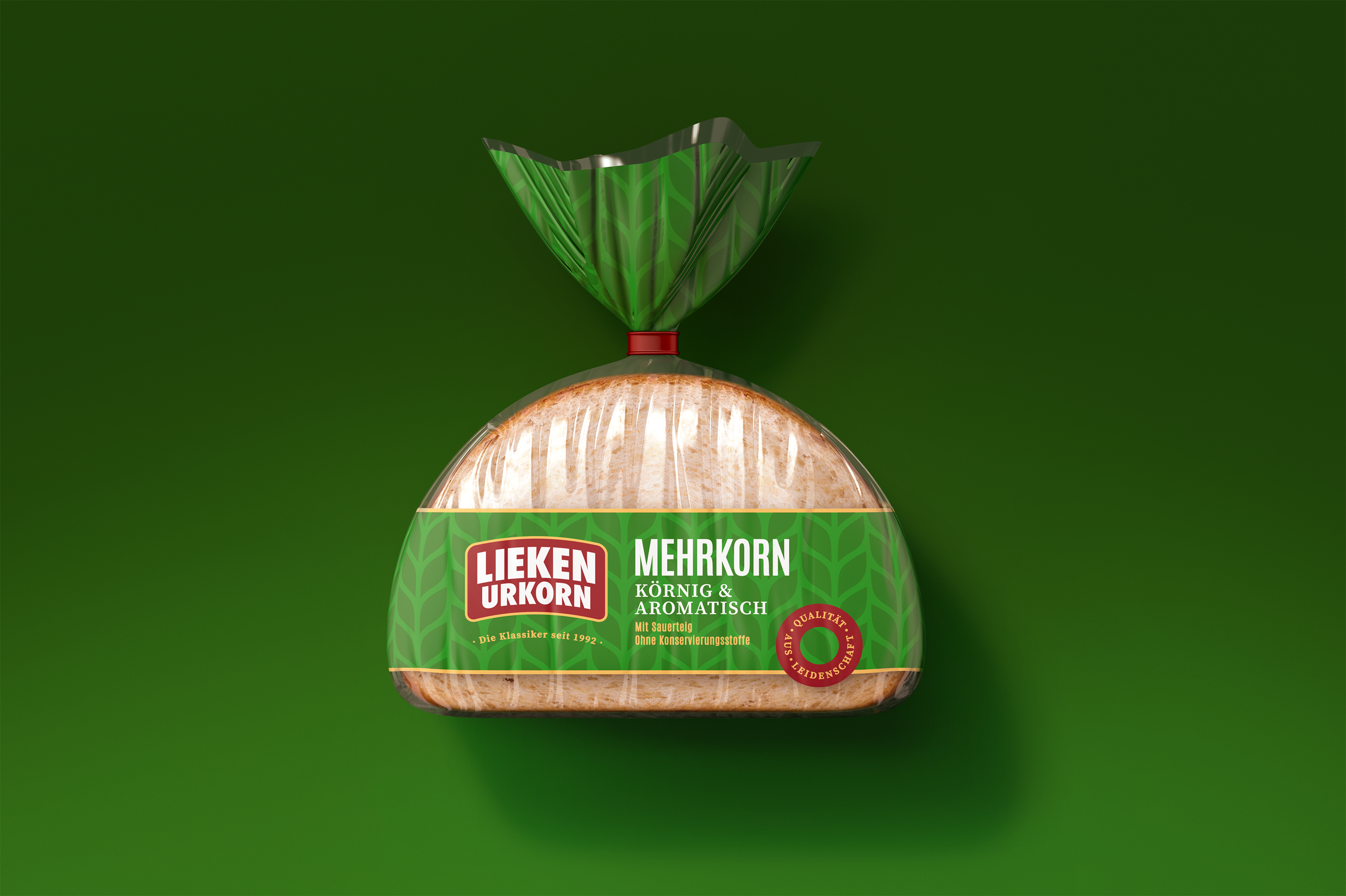
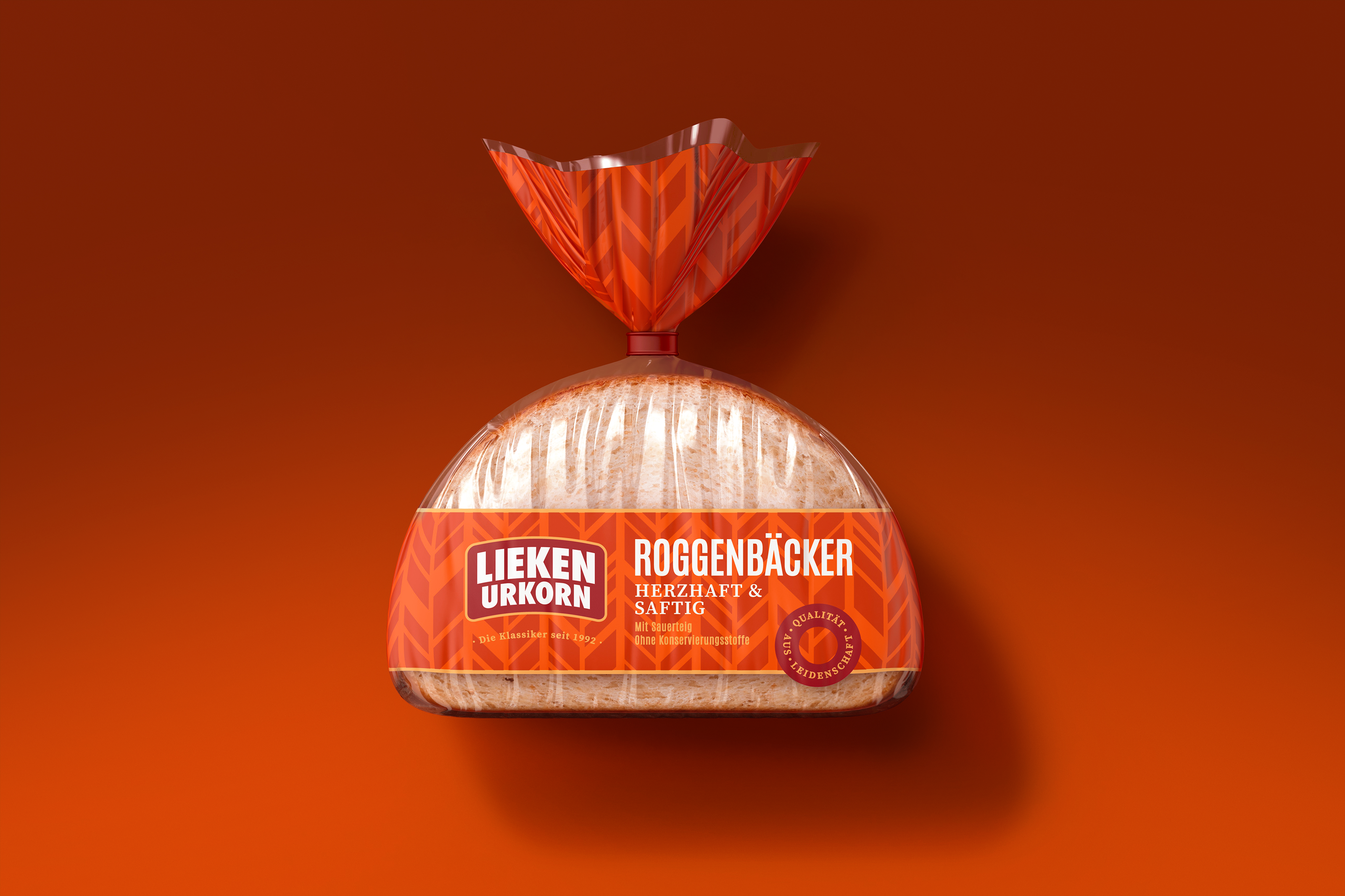
Simplifying the logo emphasised the brand name. However, I still maintained brand recognition and familiarity. I adopted a more modern, structured design by using linear banding and removing the ribbon and baker illustration. The bold typography is eye-catching and commanding for easy communication. I also balanced the modern typography with a more classic typeface for the tagline and quality assurance stamp; these flourishes maintain the traditional heritage.
Ginger Storm’s simple and effective changes, along with the use of vibrant colours for each variant, creates excitement and shelf presence, while also showing the brand’s evolution and innovation.