_PACKAGING_LOGO_STRATEGY
Luckybird Cordials
How I combined elements of luck with vibrant and bold design to tell the story of a contemporary beverage brand.
Sir Fruit is a premium fruit juice supplier with over 30 years in the South African market. Luckybird is a subsidiary of the Sir Fruit company that produces syrups, cordials, and alcoholic beverages. Their goal is to diversify the product range and offer consumers healthier alternatives to industry competitors who aren’t part of the fresh fruit category.
Photography
@russsmithphotography
The client wanted their brand story, a fable where a man learns about luck and perspective from a lucky bird, to be reflected in the design concept.
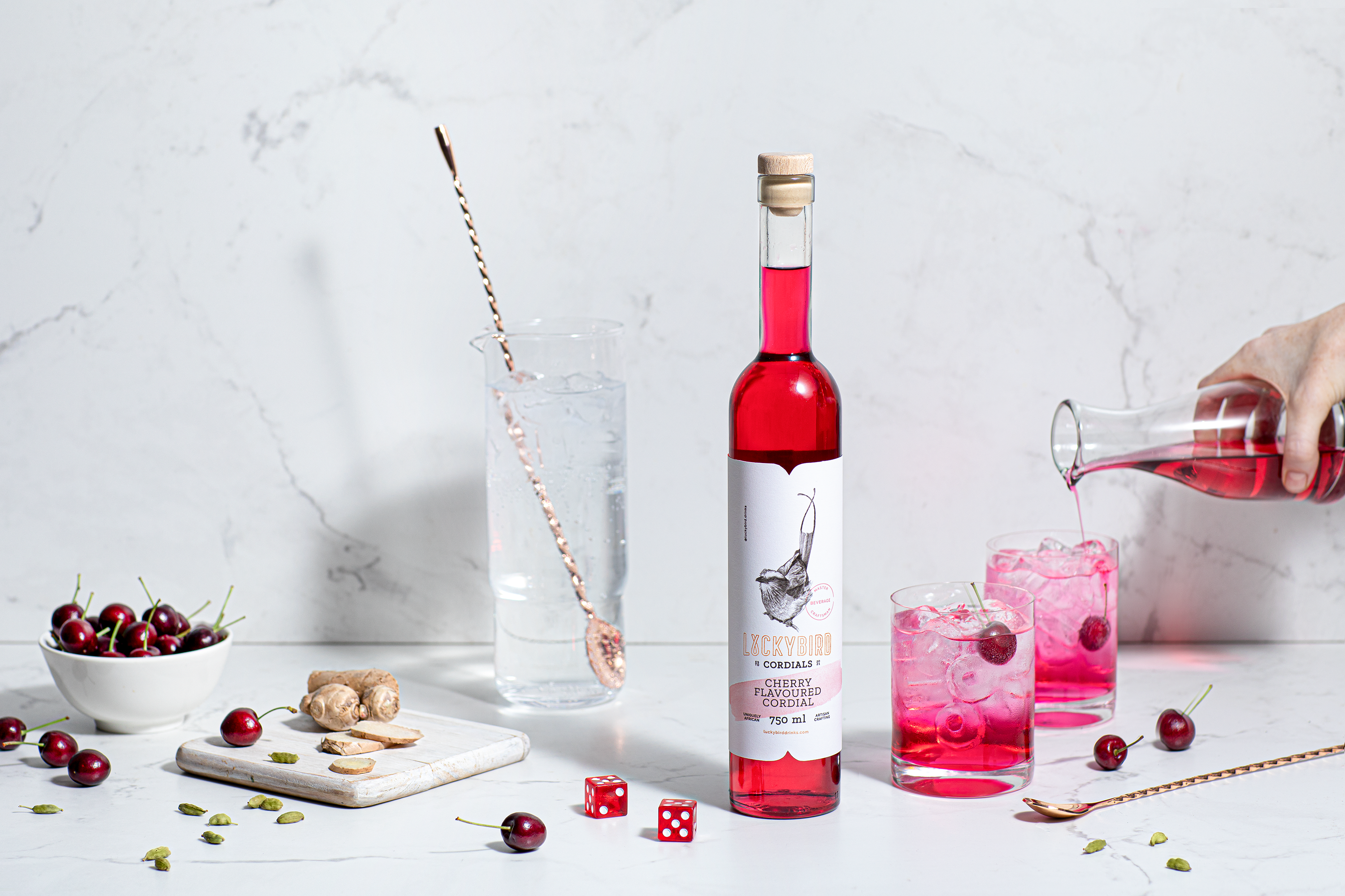
Ginger Storm wanted to pay attention to detail and emphasise the craft of the brand in the typography, stamps, etchings, and overall composition. Everything has been masterfully crafted to convey the traditional elements of the brand category in a contemporary and fresh way.
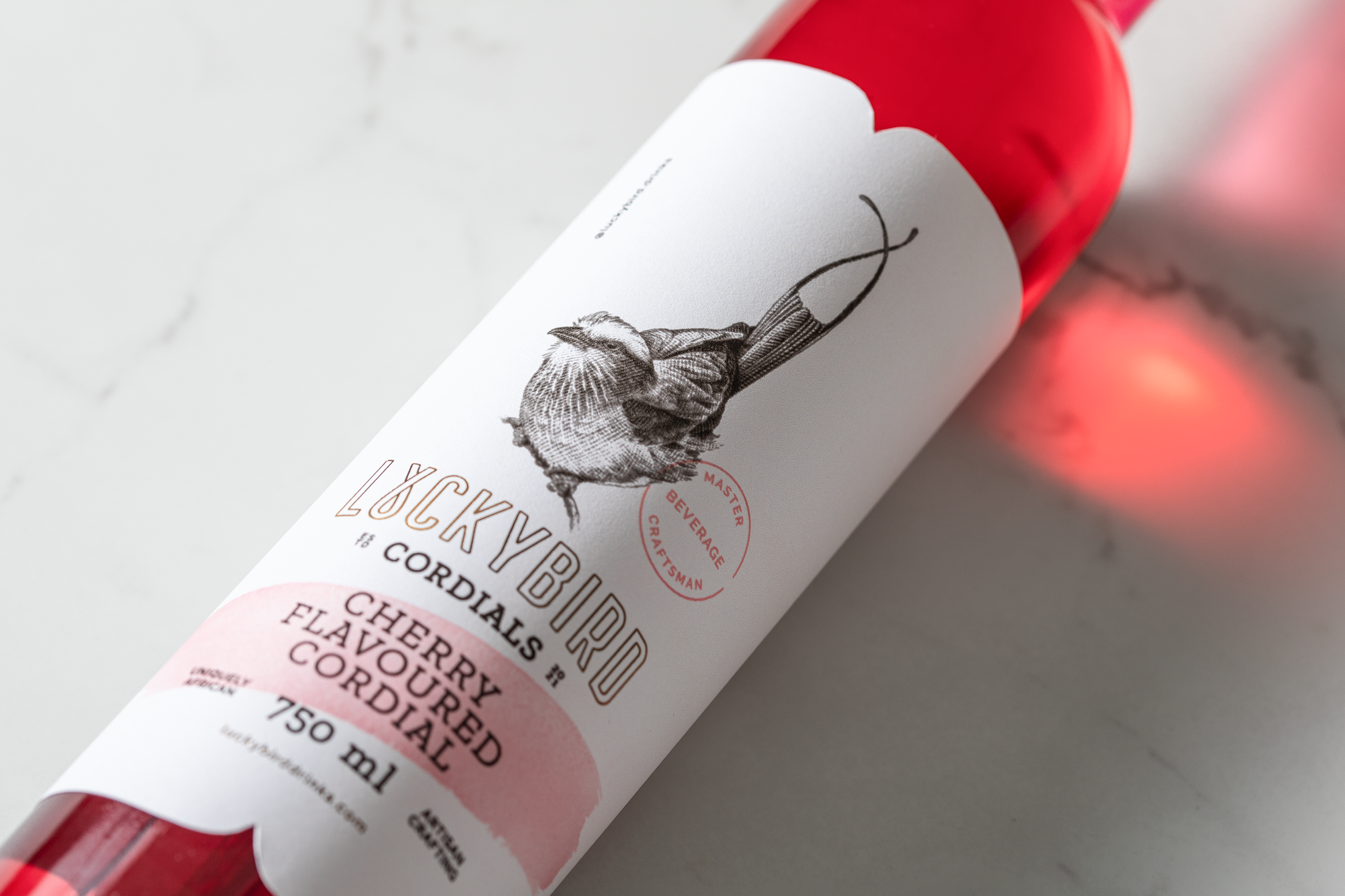
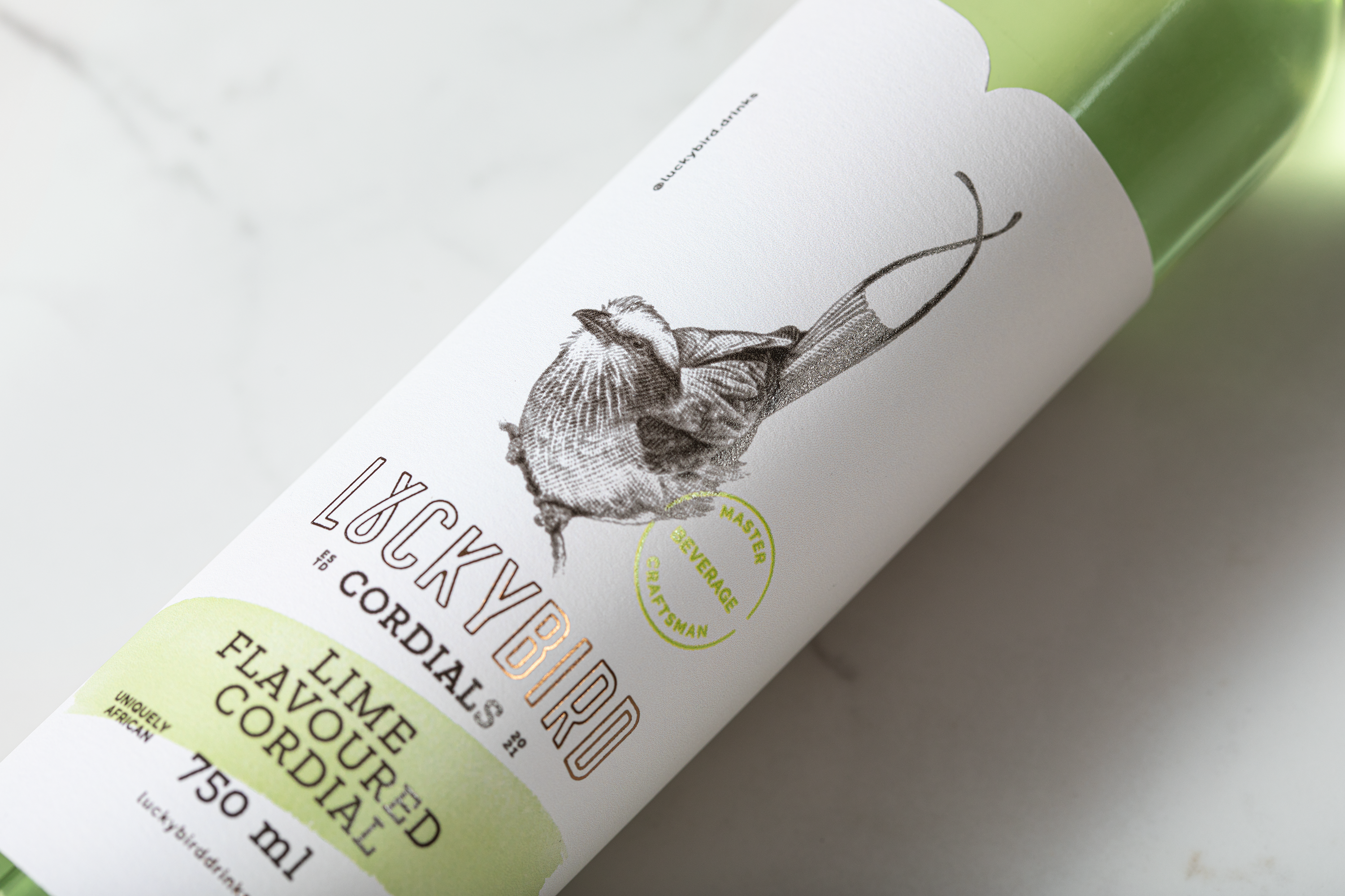
The logo visually represents luck, with the lettering mimicking crossed fingers. This action is echoed in the crossing of tail feathers on each of the unique and distinct “luckybird” etchings. This provides an interactive element to the packaging because it invites consumers to explore and discover.
The syrup label is a colourful, bold, and contemporary design with nods to traditional stamps, typography, and etchings. The combination of these elements differentiates the brand from the competition.
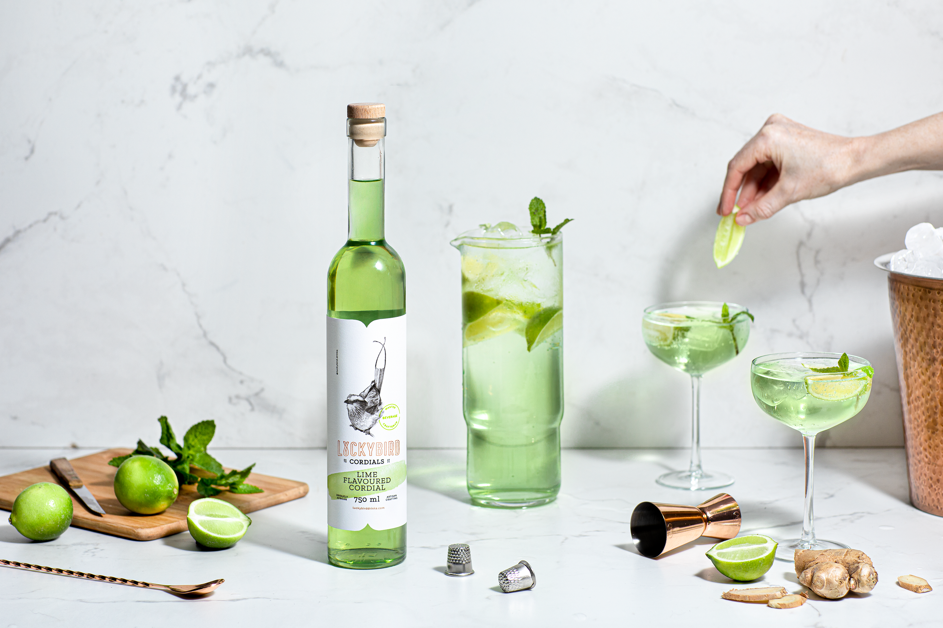
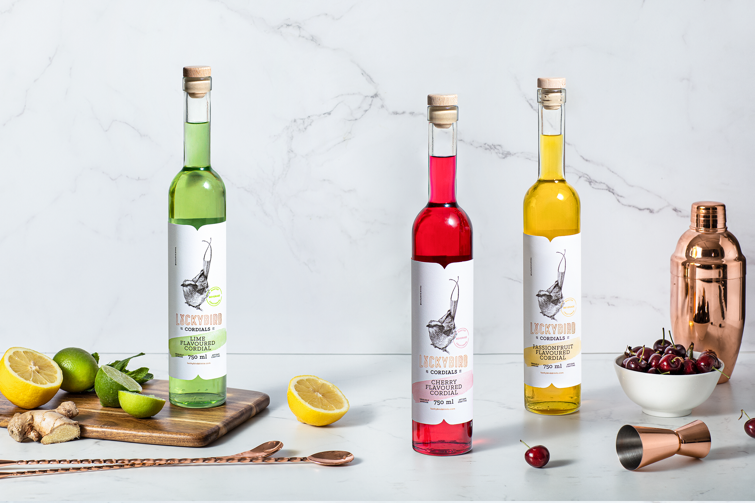
The cordial label design is a more classical typographical approach, with an elegant structure, splashes of colour, and the lucky bird etching that invites the consumer to explore the brand personality.
This is a conceptual project.