_PACKAGING_GRAPHIC DESIGN
Maxi's
Just because you’ve been successful for decades doesn’t mean your branding should stay the same.
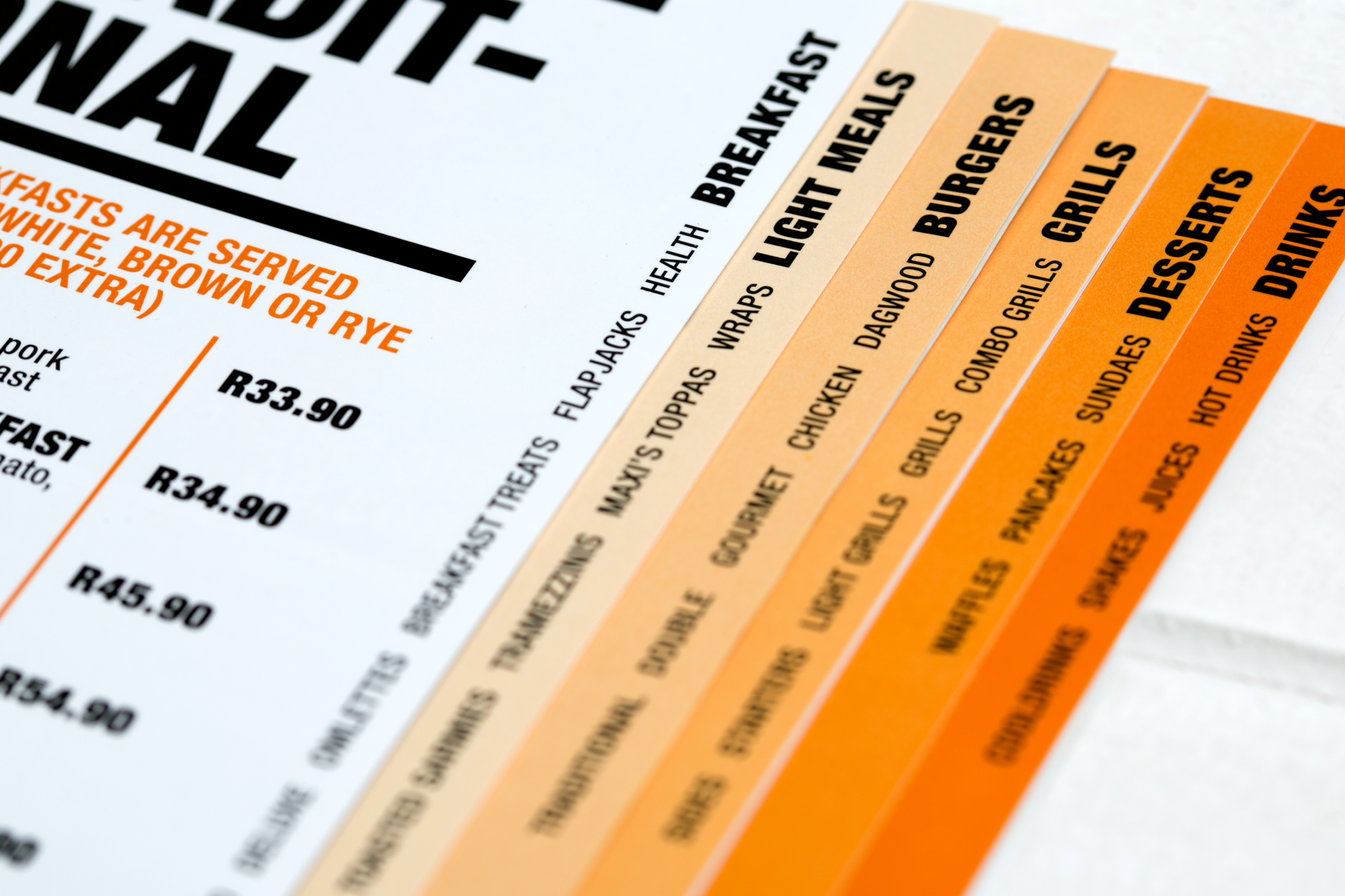
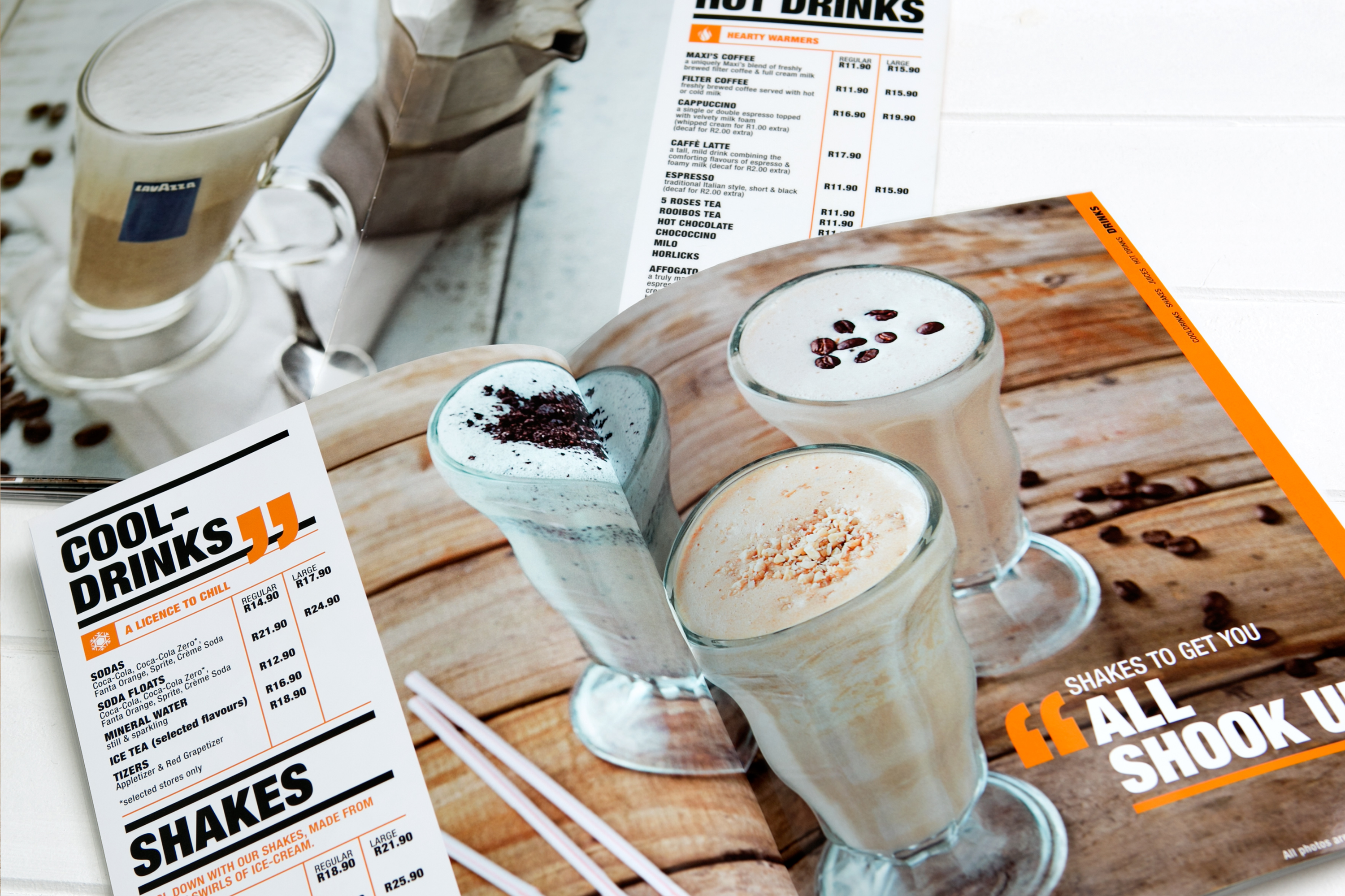
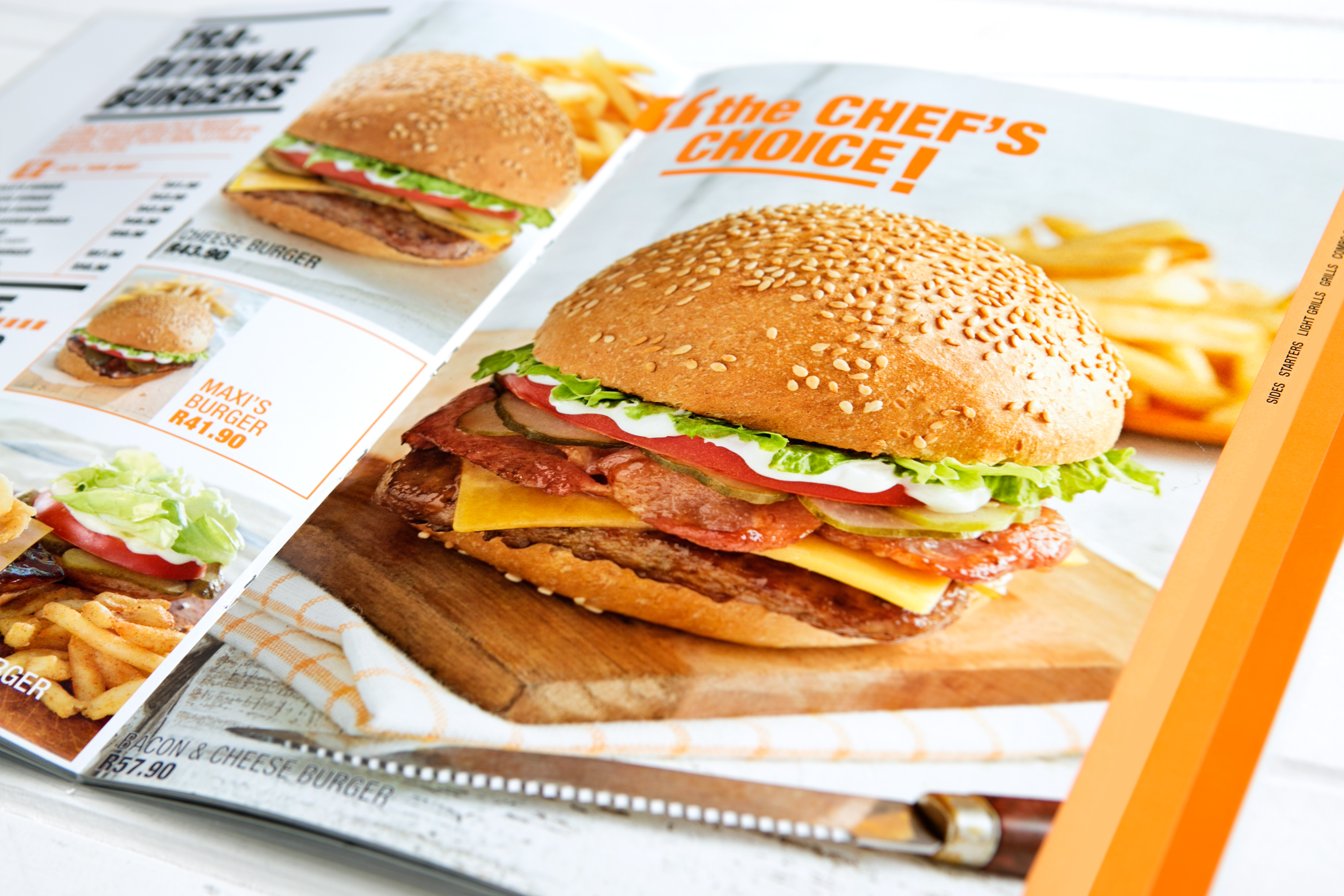
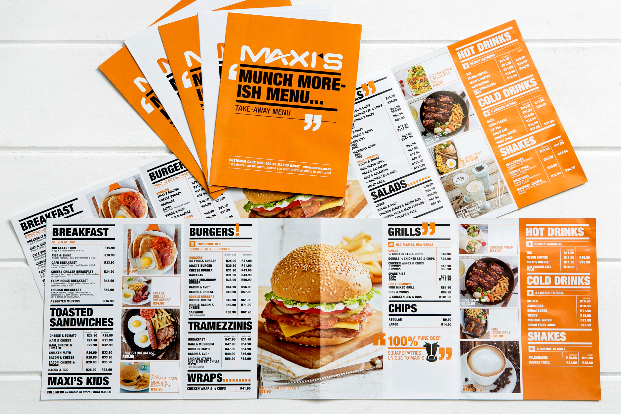
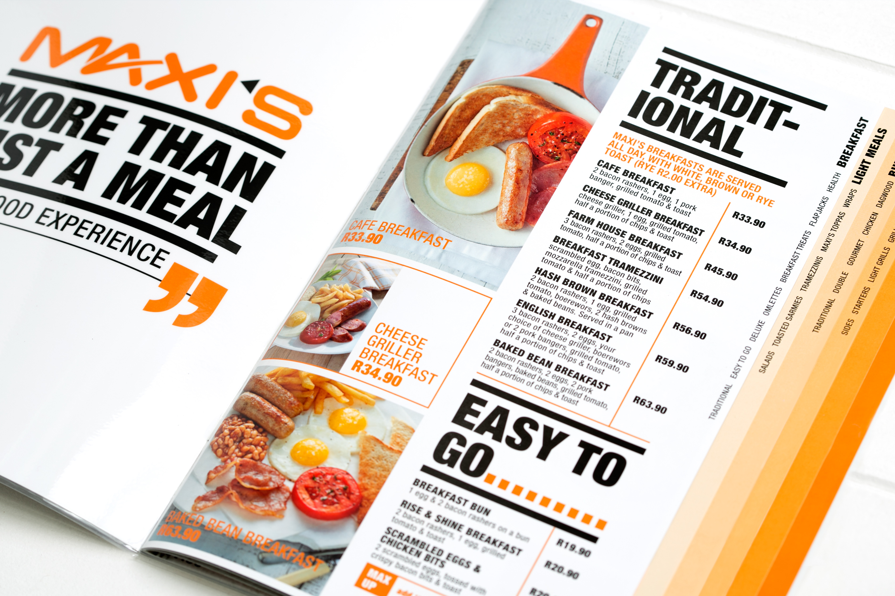
Maxi’s is a trendy, value-for-money, quick-service, sit-down family restaurant franchise, that has been operating for 26 years. The welcoming brand embodies quality, service, and value that keep customers coming back for more.
Photography
@russmithphotography
Styling
@eatwithemms
The Maxi’s brand was dated and desperately needed to be revamped and brought into the 21st century. Consumer habits change and competition is fierce, which is why you always need to scrutinise your branding.
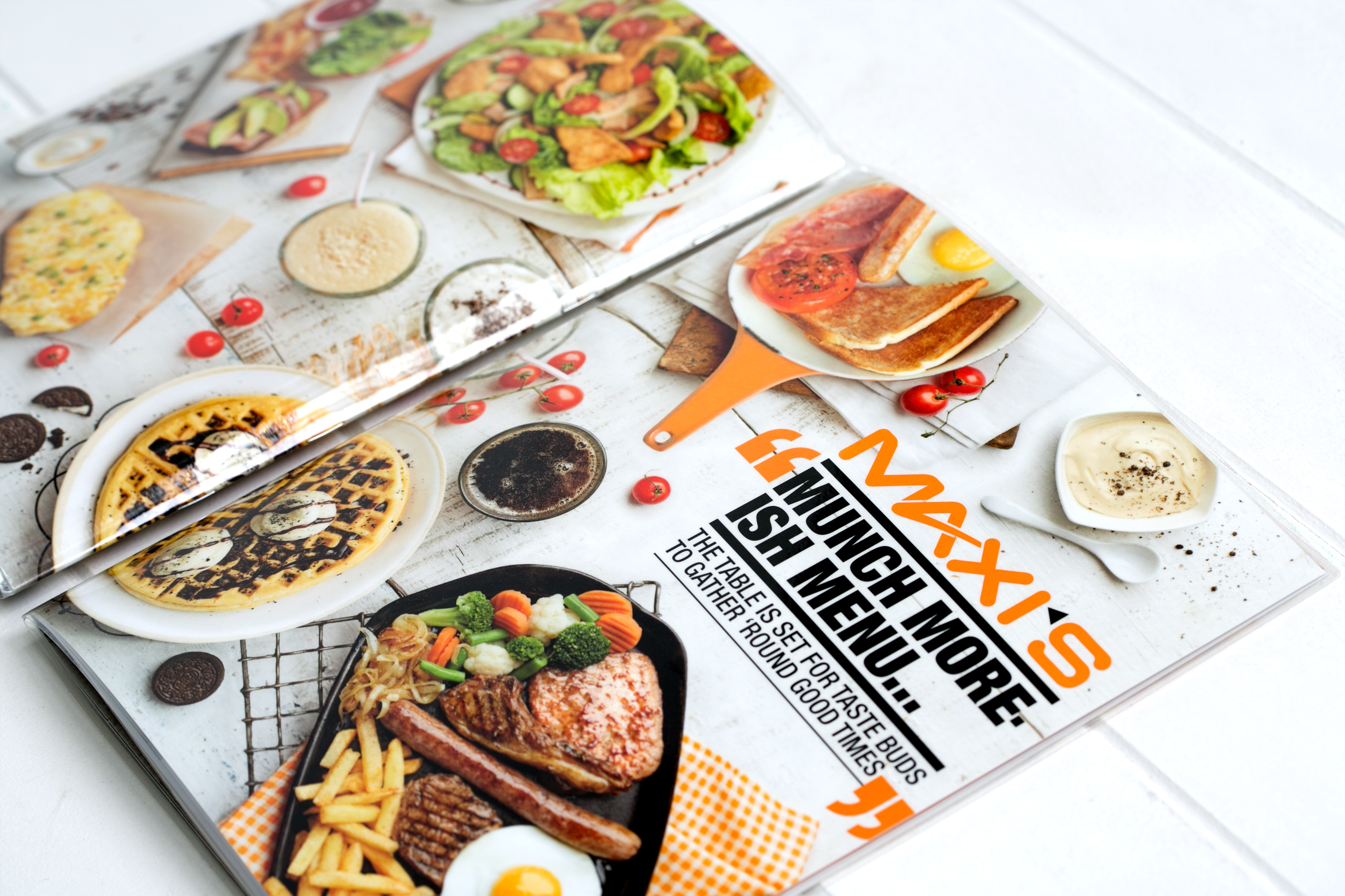
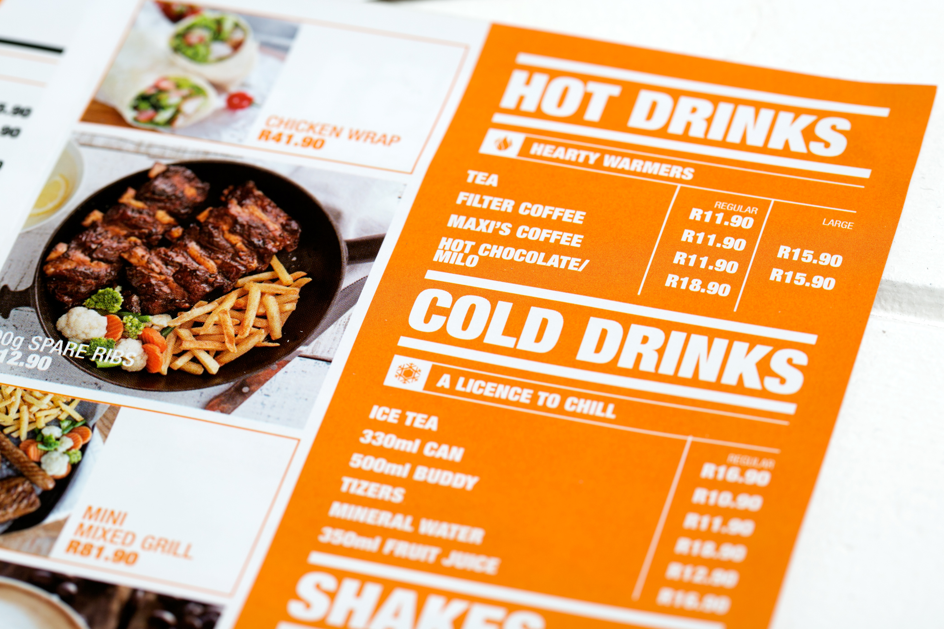
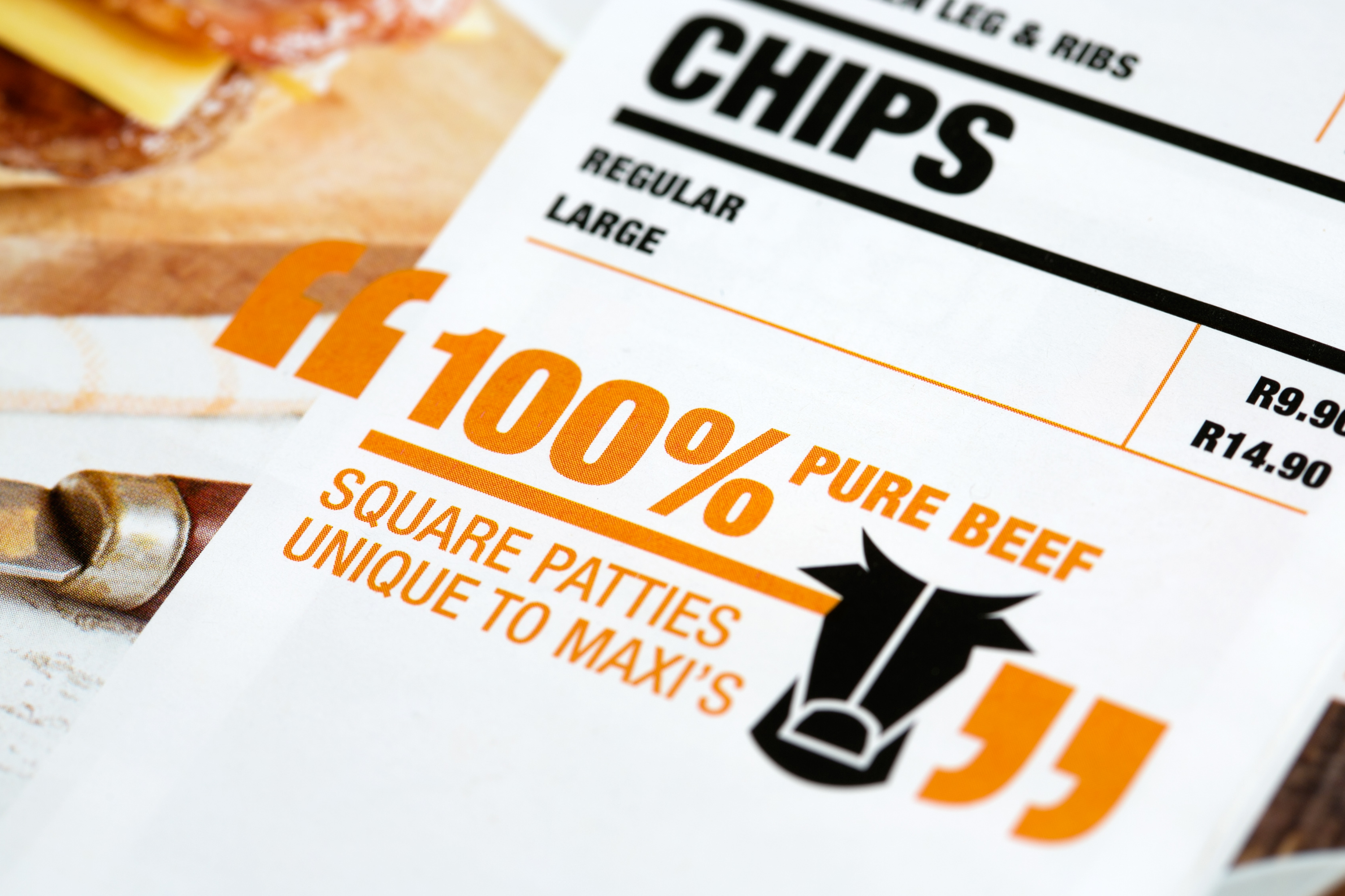
To update the brand but still retain that familiar Maxi’s feel I combined strikingly rich photography, bold and structured type and graphics, and clever iconography. The bold typographic grid-like structure, oversized type and icons, and dominant use of the brand colour together with black created a sit-down menu that generated consumer excitement after the monotony of the generic takeaway menus of the time.