_STRATEGY_PACKAGING_IDENTITY_LOGO
Pharmacy at Spar Vitamins
How I created a South African own brand design that competes on an international stage.
Pharmacy at SPAR is a group of over 104 independently owned and run pharmacies within the SPAR Guild Group of South Africa.
Photography
@justin_photography
More often than not “own brand” packaging design is dull, unimaginative, and it usually looks cheap. This leading pharmaceutical brand recognised the need for a makeover and I was chomping at the bit to show South African pharmaceutical brands that they don’t need to play it safe.
My goal was to create a new look and feel that was trendy, upmarket, and edgy without costing a fortune.
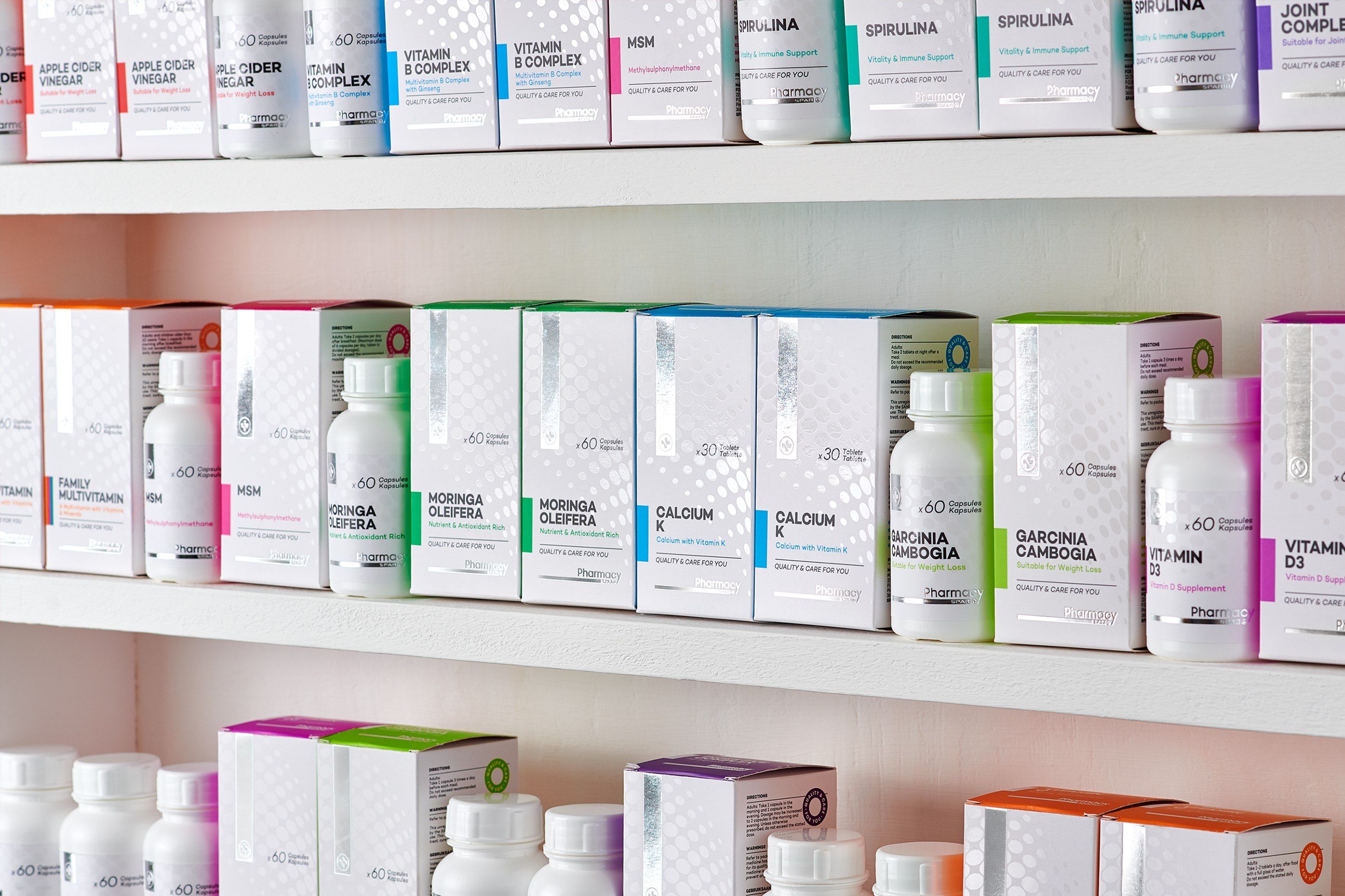
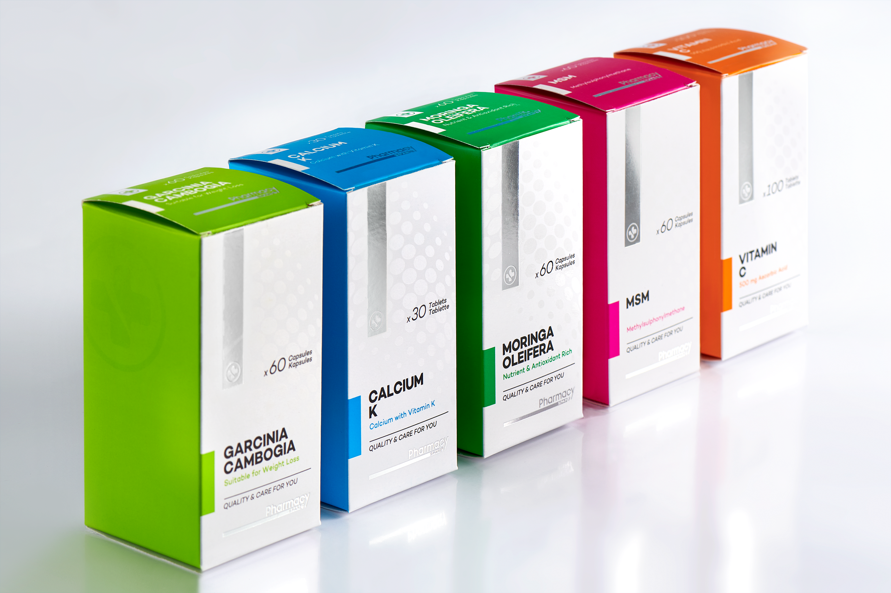
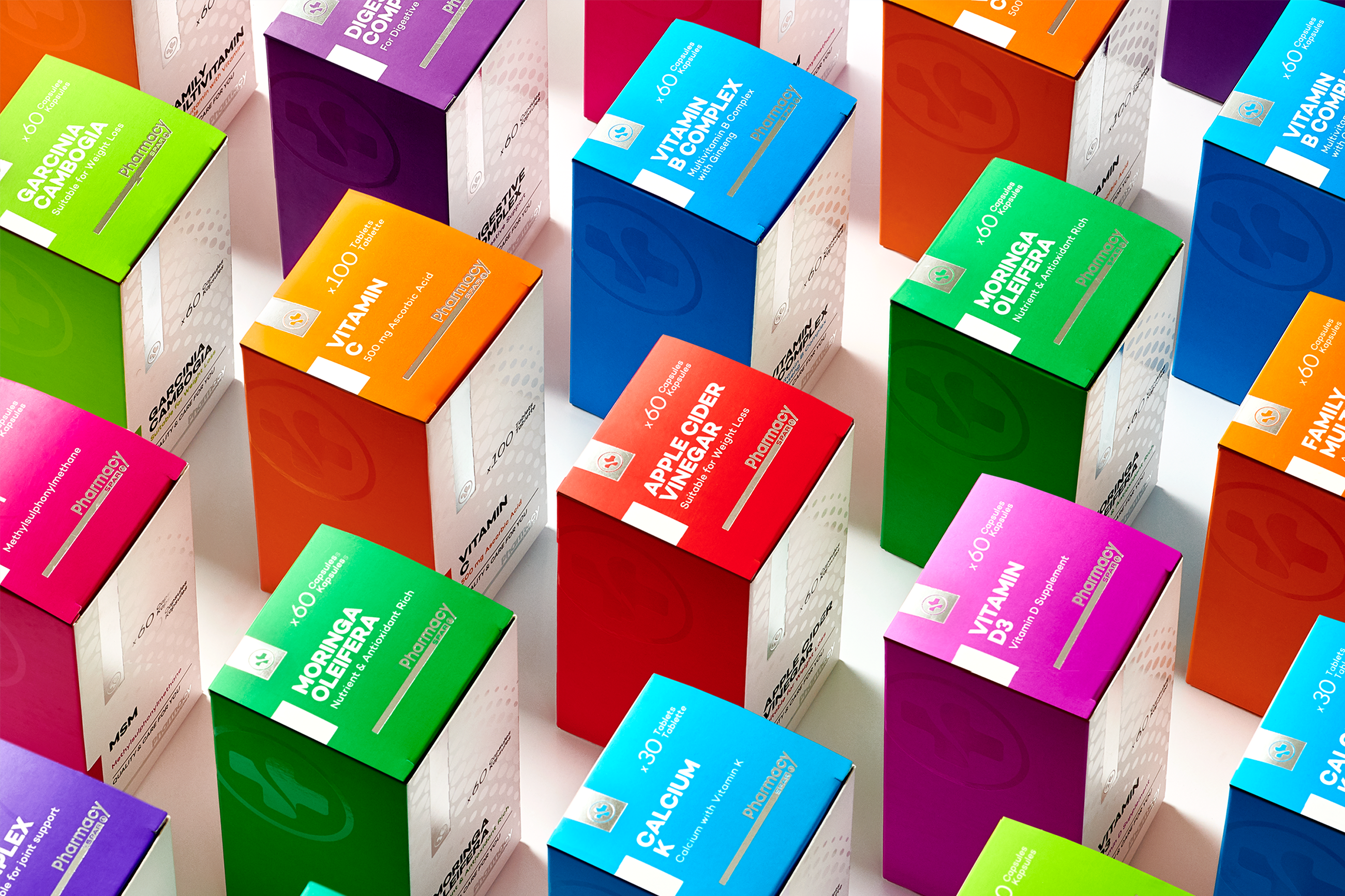
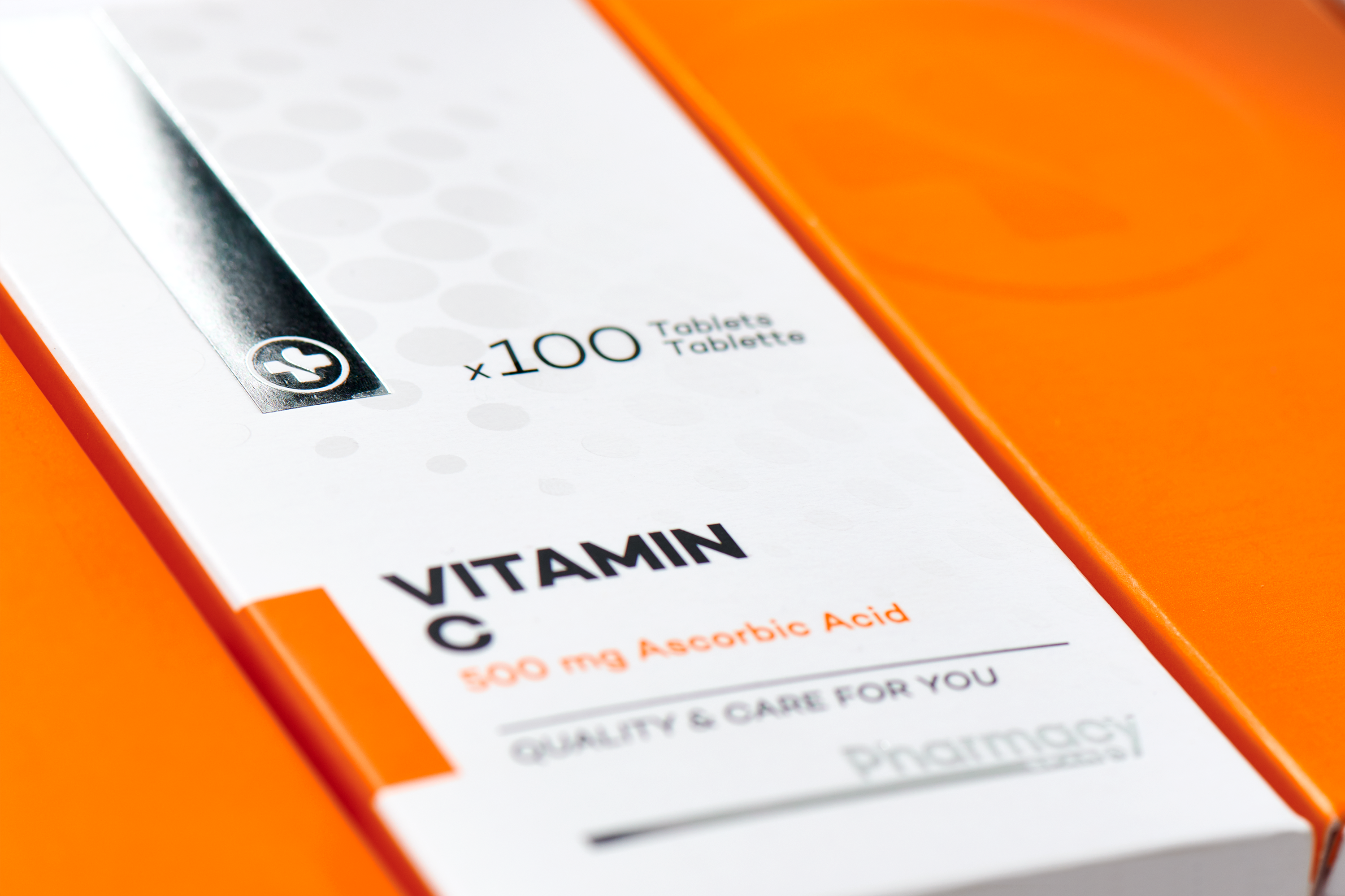
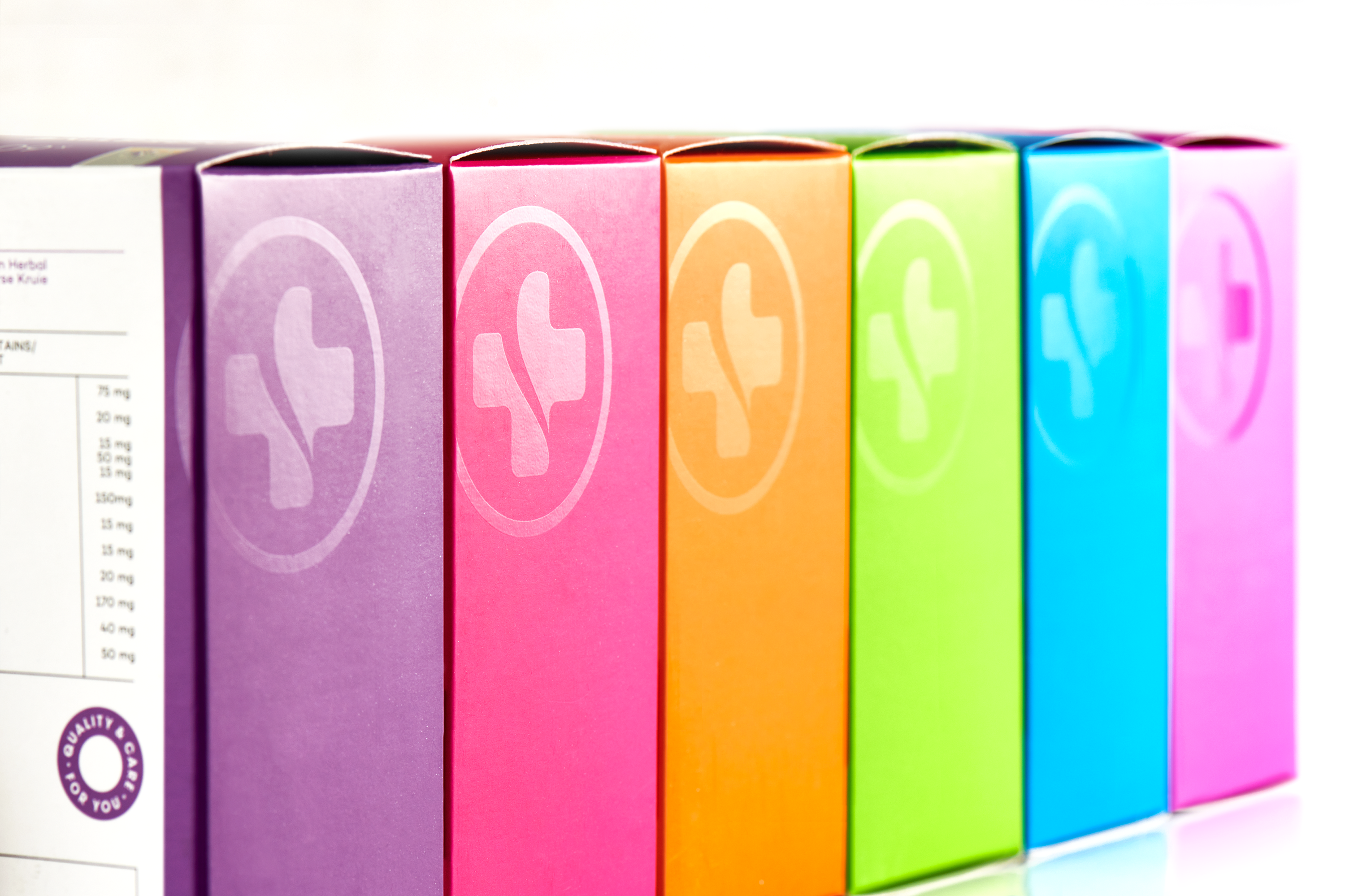
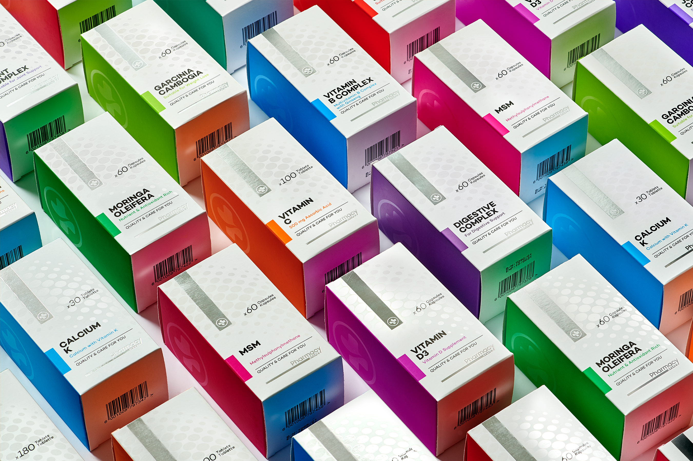
Ginger Storm kicked things off with their vitamin range - the flagship for SPAR Pharmacy’s new identity. I wanted to give these vitamins a vitamin boost so I placed the recognisable Spar icon in a ribbon-like foil seal at the top of each pack and counterbalanced this with the logo below. I then added a spot UV varnish of bubbles on the front of the package to convey effervescence, energy, and the idea of the body absorbing goodness.
Beautiful, bright colours wrap around the packaging which gives it a youthful look and a rainbow effect on the shelf. When paired with modern, elegant, and upmarket typography, it invites the customer to browse the shelf and rethink “own brand”.