_LOGO_PACKAGING_GRAPHIC DESIGN
St. Elmo's
How Ginger Storm created a storm around St Elmo’s.
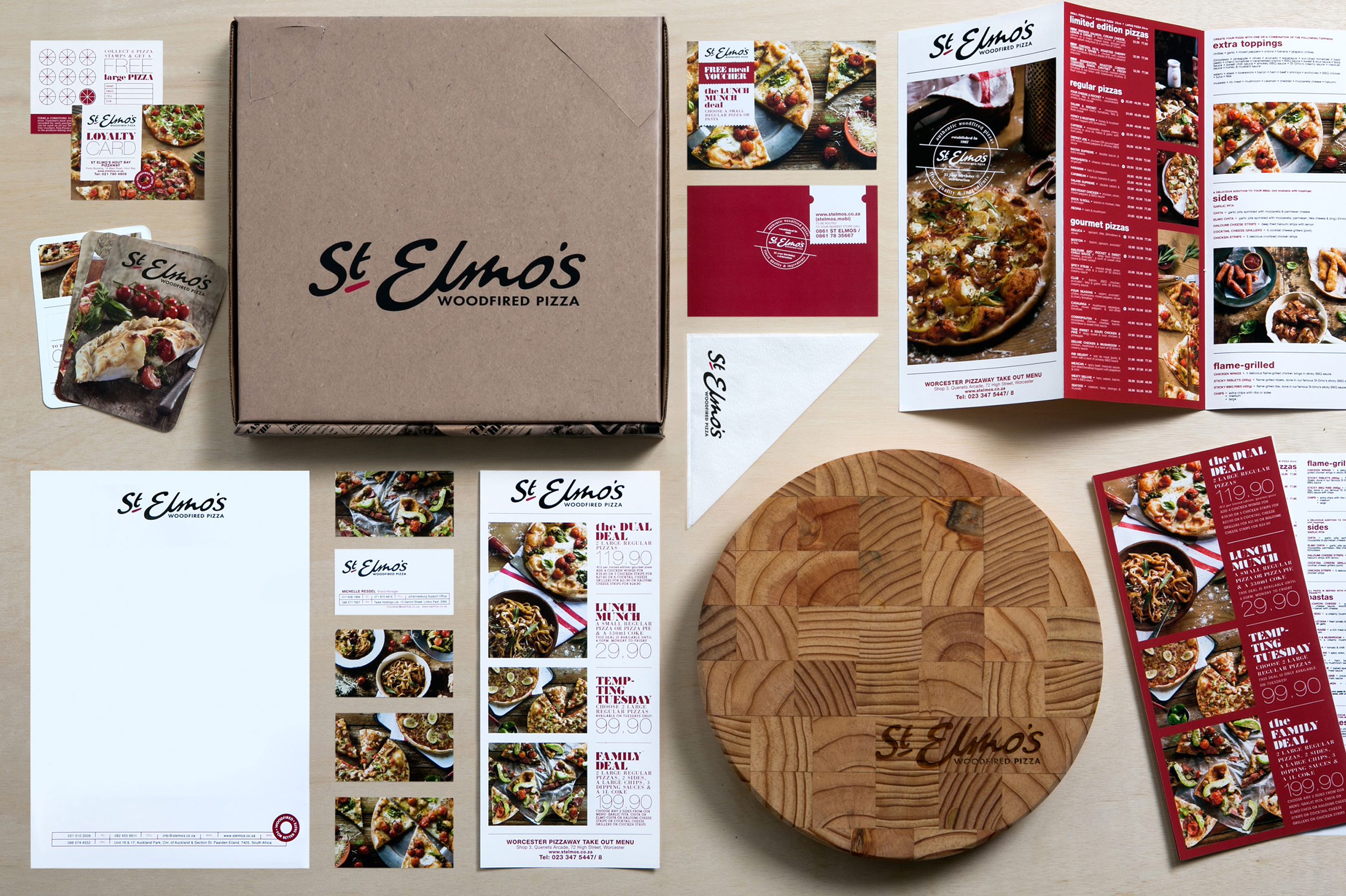
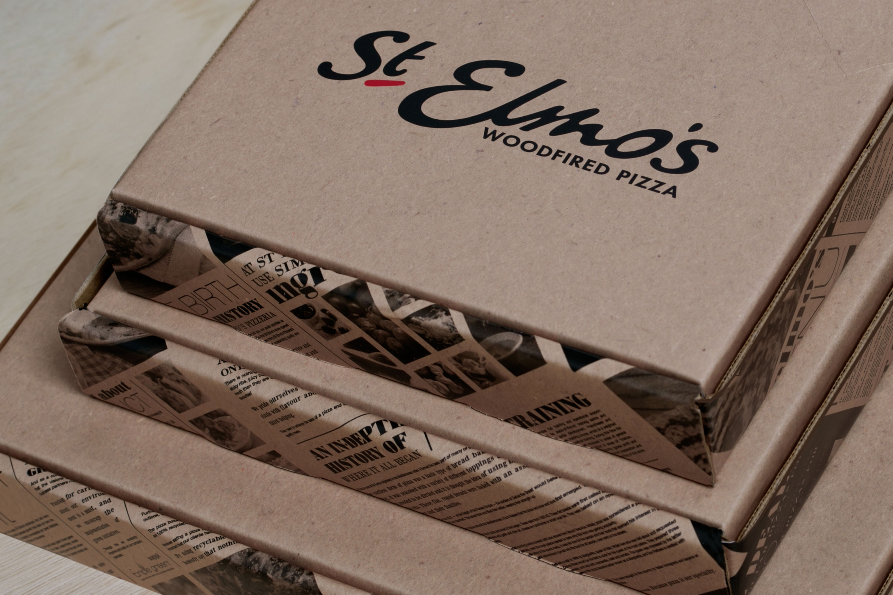
The first St Elmo’s store opened in 1987. The successful brand recipe includes providing food lovers with authentic, quality woodfired pizzas, superb service, and using only the freshest ingredients.
Photography
@russsmithphotography
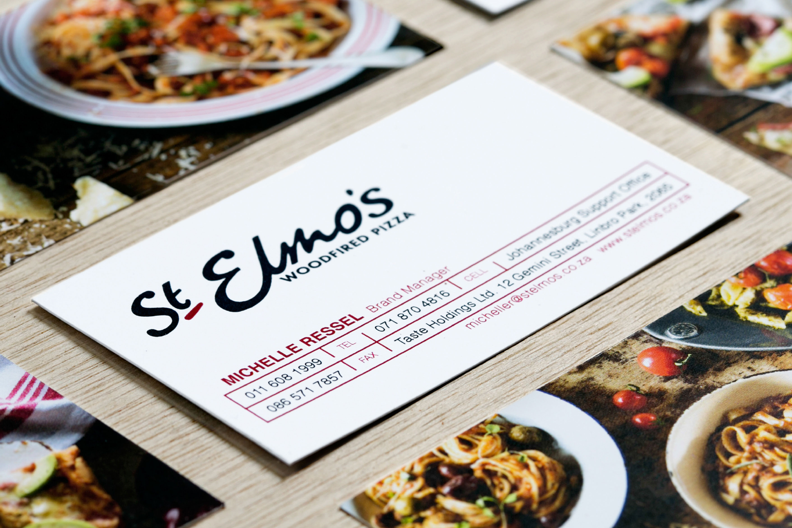
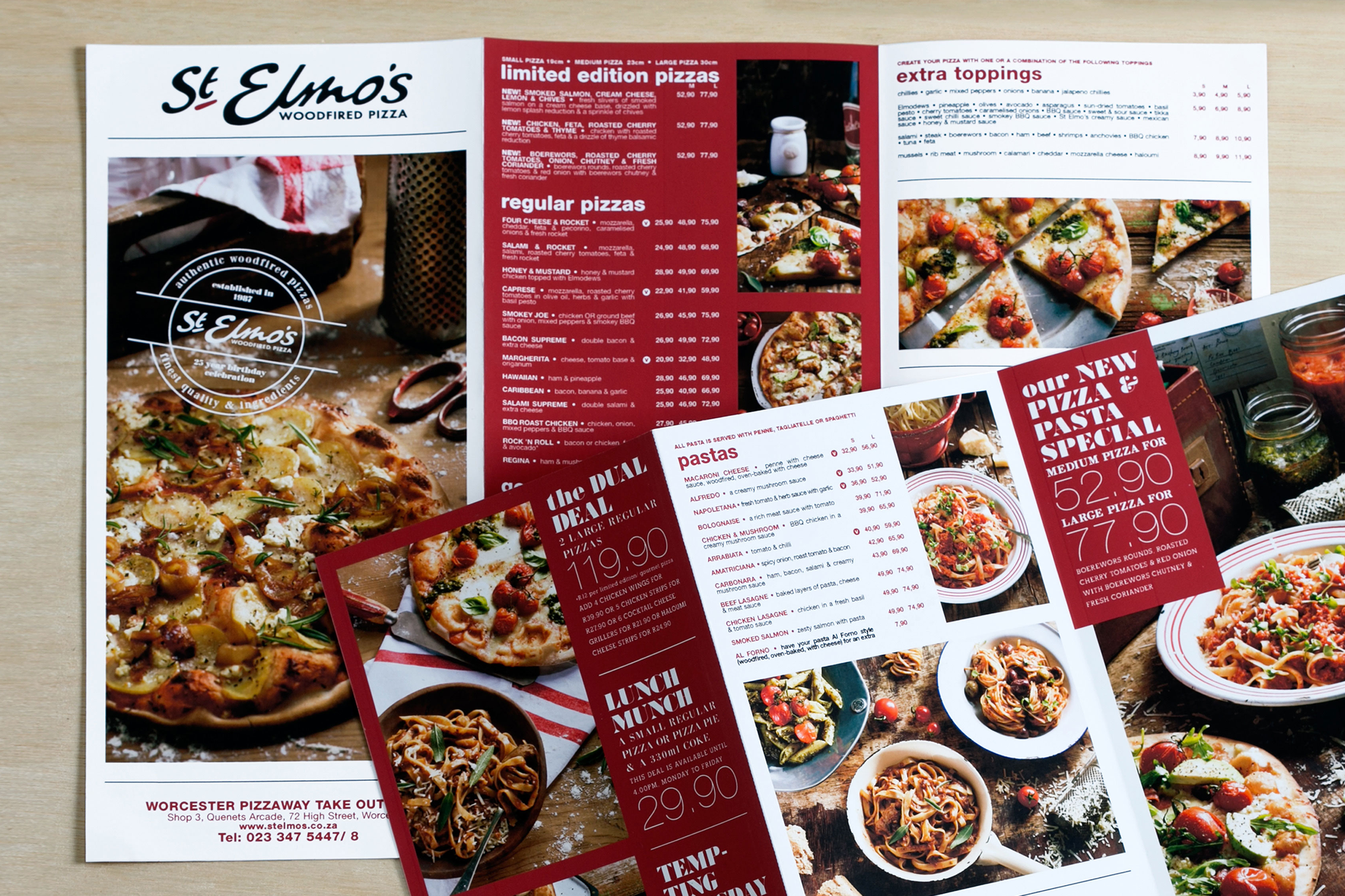
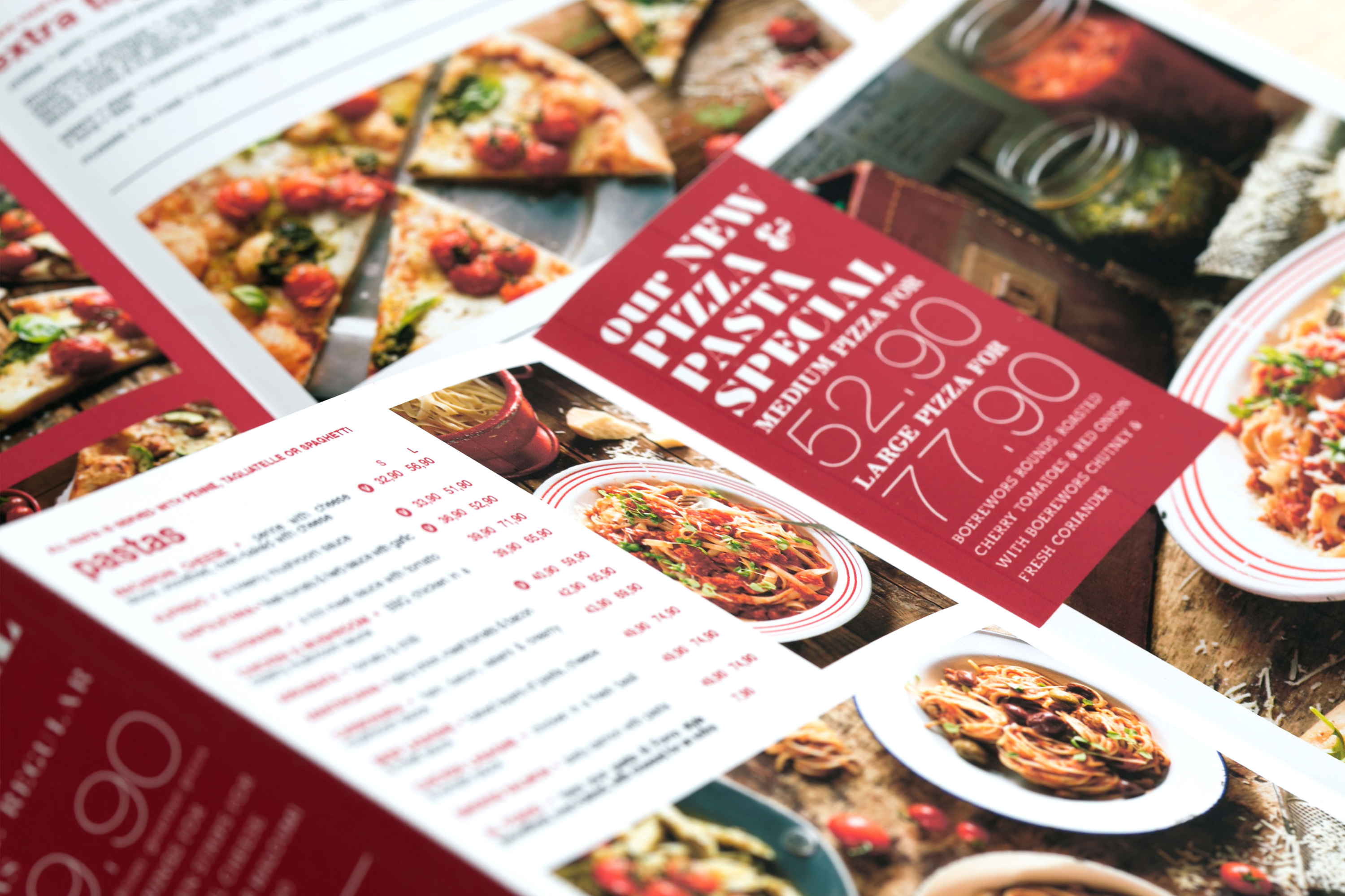
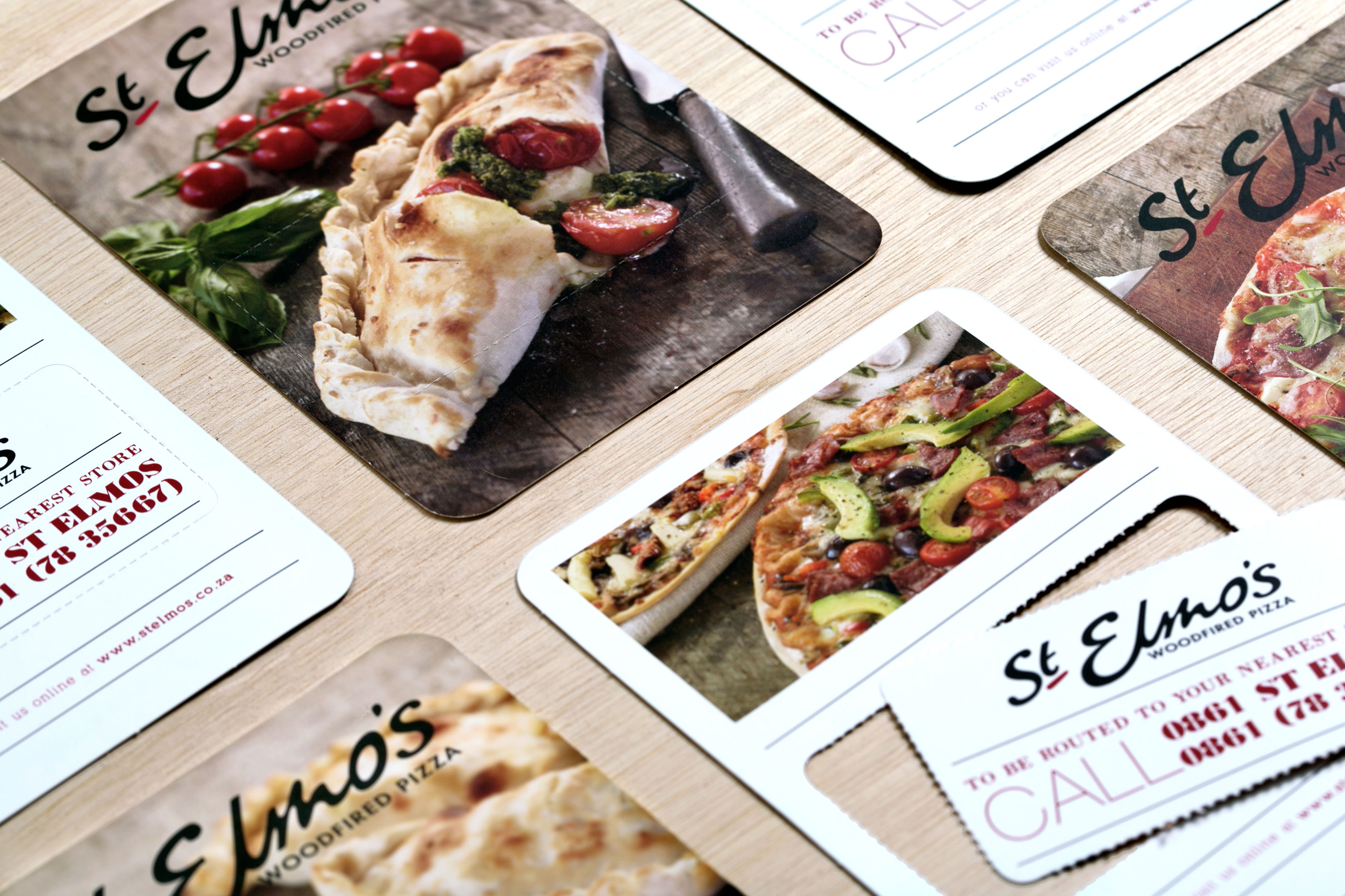
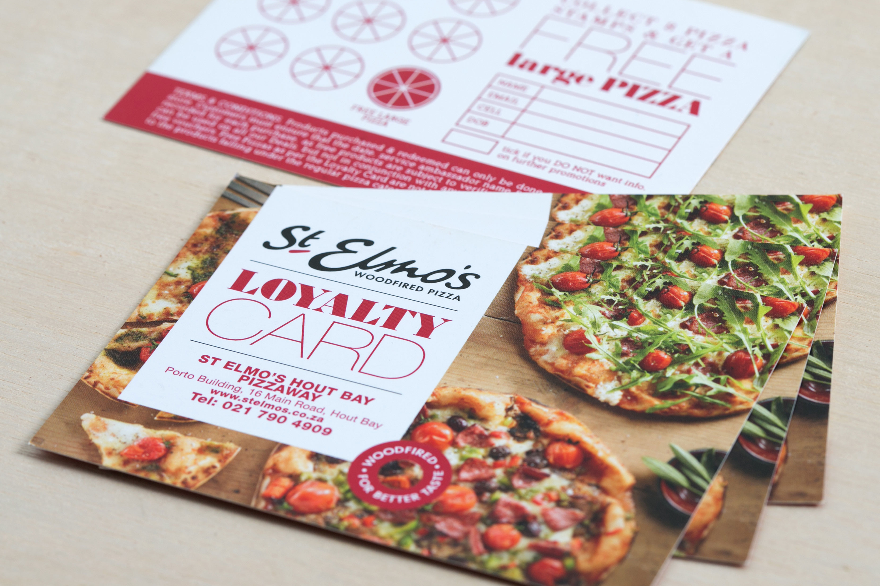
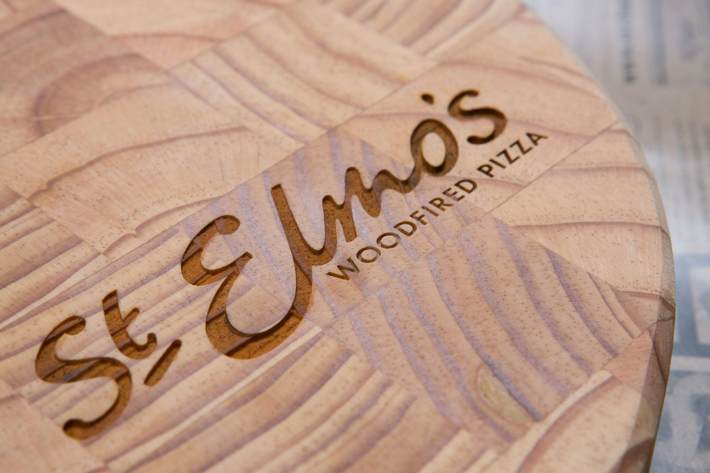
St Elmo’s rebranded when the franchise exploded in the Western Cape. I evolved the logo to a more contemporary version of its predecessor. This redesign also allowed for print executions by limiting colour. The brand is composed of trendy, fashion food photography that changes on a seasonal basis, a bold colour palette, beautiful type design, and contemporary layouts. The innovative executions are used across various marketing materials from menus to business cards, store signage, packaging, and stationery.
This epic rebrand resulted in St Elmo’s becoming one of the leading up-market pizza brands in Cape Town.